
29 Oct 1 Manhattan West
Posted at 02:44h
in Portfolio
1 Manhattan West.
Introduction
Working with one of the largest innovation consultancies in the world, our team at Britelite Immersive was brought in to conceptualize, design, and develop a 55′ wide interactive wall within the cafe of the consultancies brand new office space at 1 Manhattan West located near Hudson Yards in Chelsea. I served as creative lead on this six-month-long collaboration during Covid-19, building upon previous successful projects with the consultancy and delivering two distinct experiences designed to invoke a sense of pride in the location and company.
Scope of Work
• Strategic Discovery
• Creative Discovery
• Creative Direction
• Digital Design
• Interactive Design
Concept Discovery
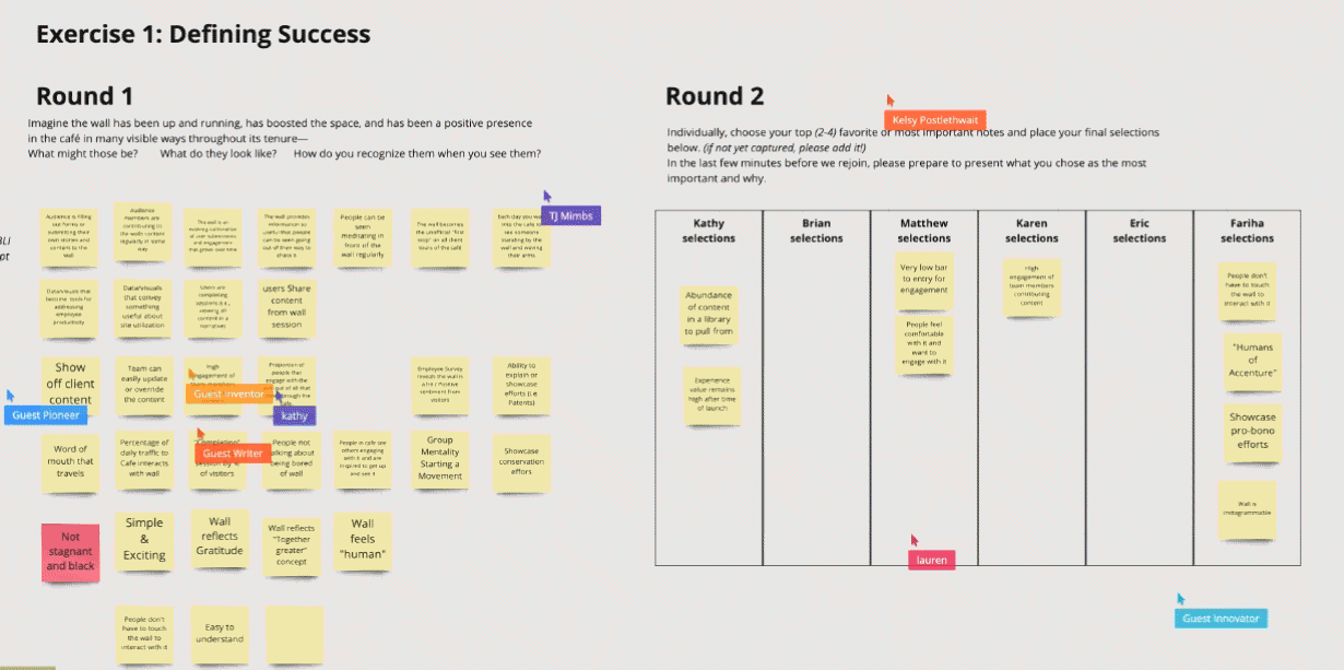
Kicking off this project in the times of Covid-19 meant that we had to rework our discovery processes and contend with teams spread across several time zones. Our tried and true post-it note sessions became Miro board sessions through which we defined the metrics for success, potential challenges, and specific audiences who would eventually be interacting with the space once returning to the office. A key observation that came out of these sessions was how much thought had been put into the design of the space in regards to making it feel like it was an extension of New York itself. This led us to develop creative that had a strong sense of belonging.
Creative Discovery
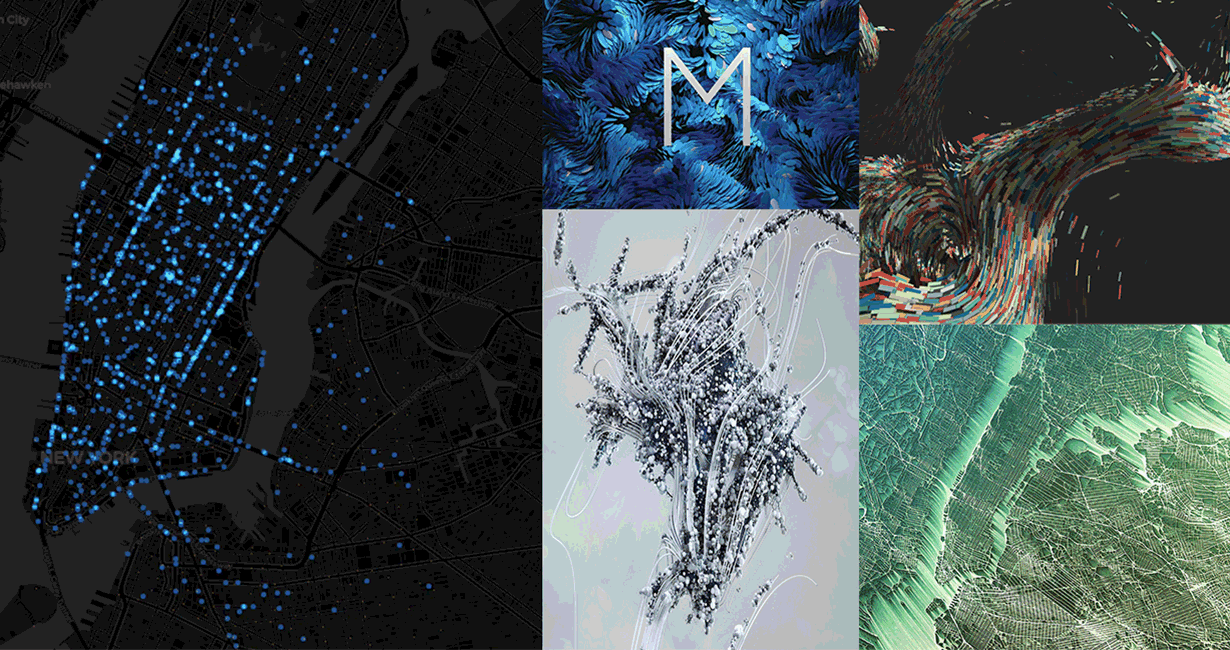
Following our discovery session, we identified four broad platforms that mapped to key takeaways we learned along the way. First, there was a desire to speak to the power and size of the global consultancy and its 500,000 employees—and second, there was a magnetic attraction to the idea of creating an experience that celebrated New York as a whole. These broad concepts became the basis for two distinct experiences that would live in tandem on an interactive LED wall powered by seven sensors stitched together seamlessly—we named these experiences City Stream and Harmony Wall.
City
Stream.
Inspired by the rich history and activity that permeates New York City— City Stream takes users on a journey through the city’s past and present with the consultancy playing the role of host. As the creative lead, it was my responsibility to take our initial findings from discovery and develop the early concepts into compelling experiences that accomplished the goals of our client and set our engineering team up for success. Throughout the process, we brainstormed and pressure-tested iterative ideas that could combine into an experience that truly played into a local’s sense of pride. City Steam is comprised of several layers, each with their unique story and challenges.
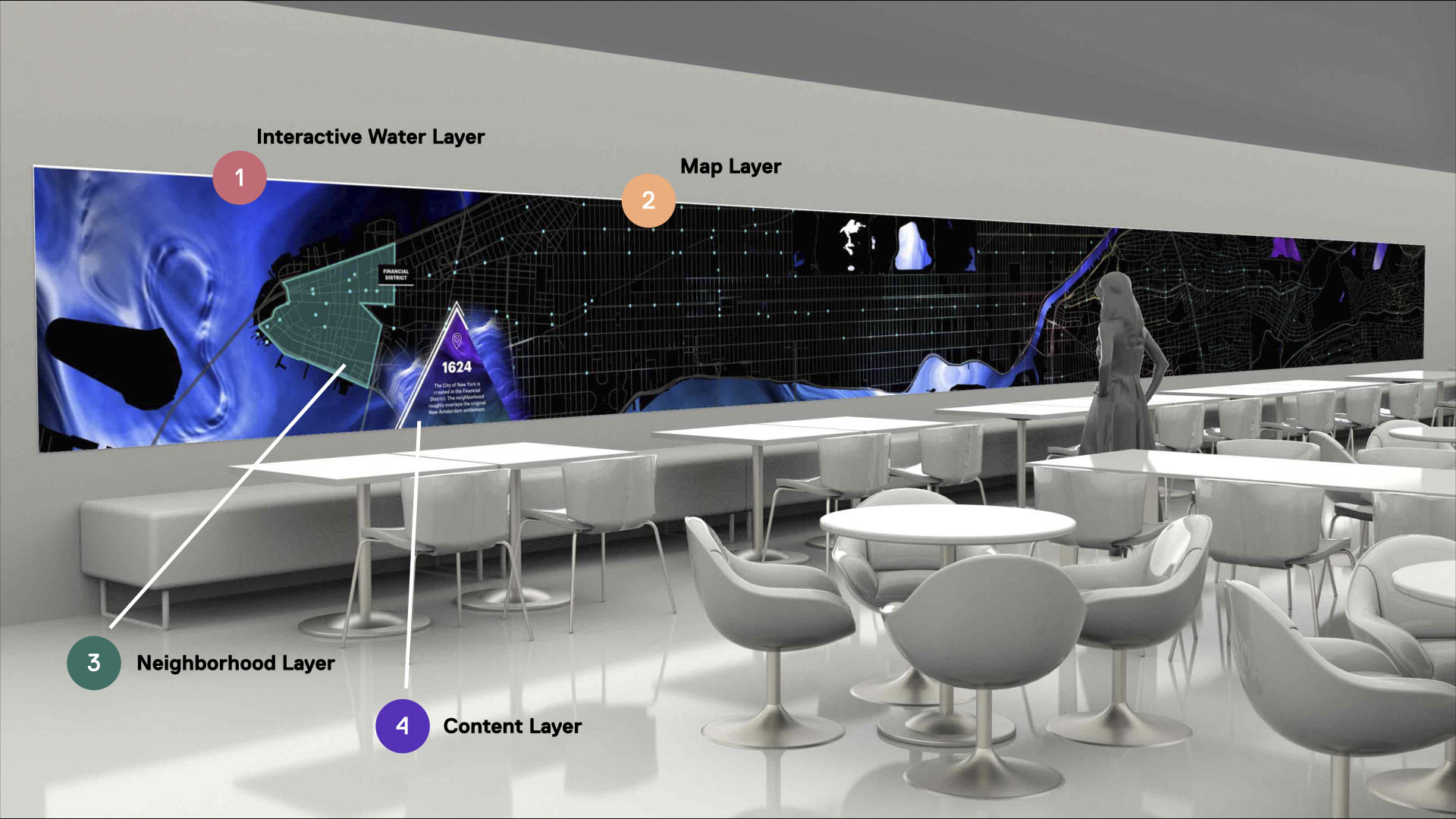
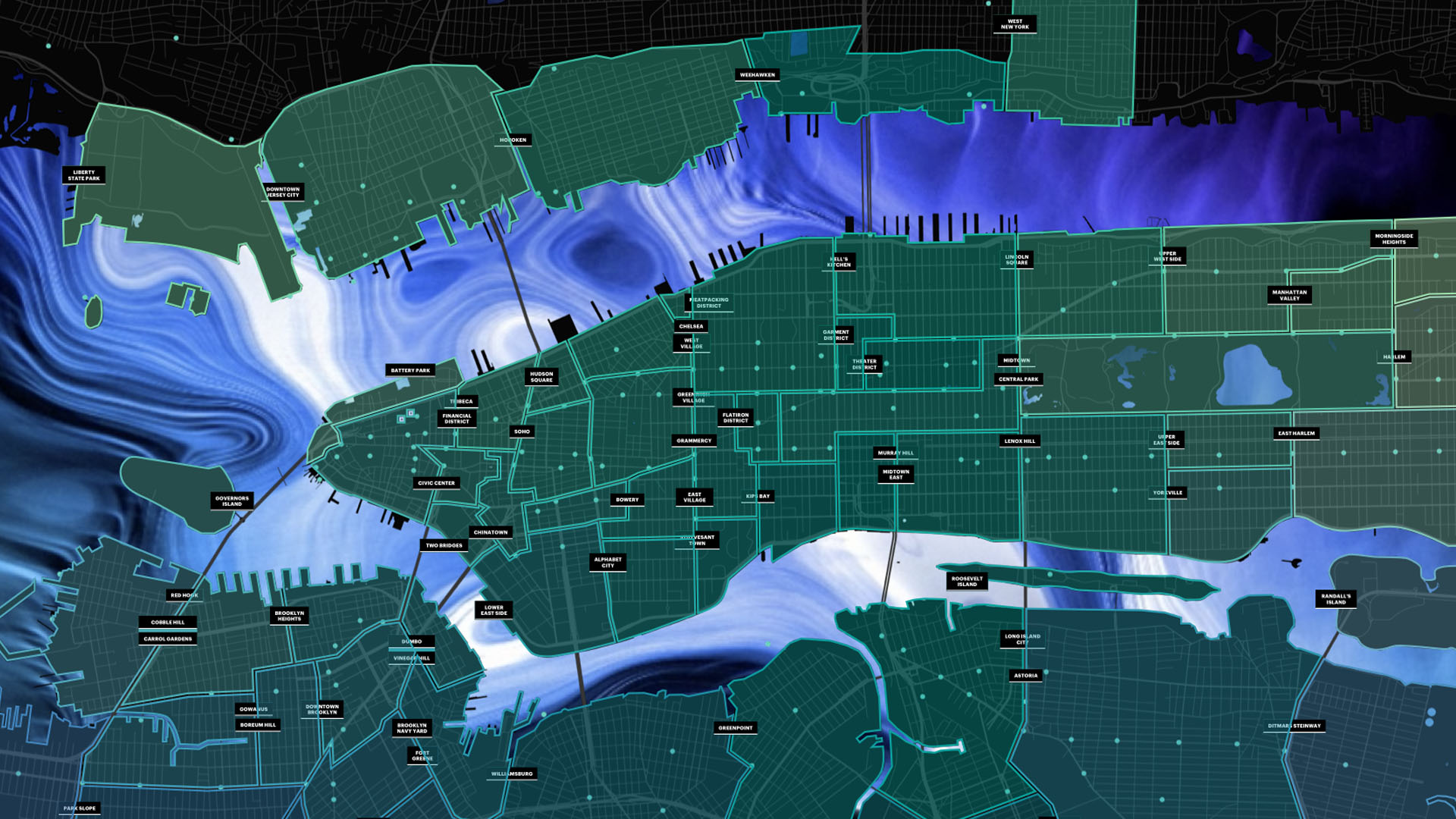
1: Water Layer
Grounding the full experience is an interactive water layer that represents the ever-changing flow of people, businesses, and energy throughout New York. This layer features a bright amorphous flowing visual that tracks users as they walk past the wall. Creating this layer first required managing a motion designer to define the movement and style and then closely collaborating with our engineering team to replicate the look and feel in Touch Designer.
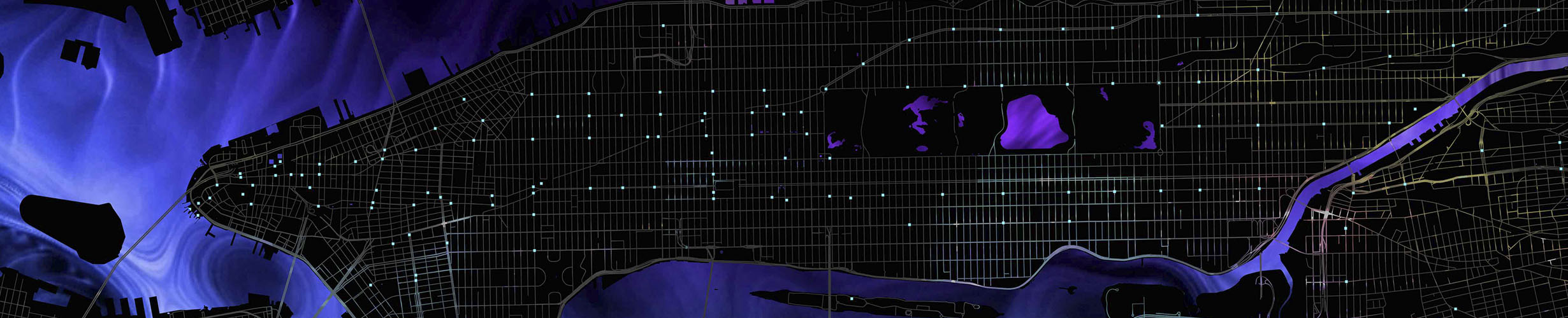
2: Map Layer
The creation of the map layer required a fair amount of research and development between myself and the engineering department. With over 14 million pixels to render, the map asset had to be light enough to ensure smooth playback and detailed enough to remain recognizable when zoomed in and out. Visually, I stylized the map to retain major streets, subways, and landmasses—which anyone familiar with New York and surrounding regions would recognize. Also—we embellished the street layer with a passive animated texture to convey a sense of flowing activity and energy.
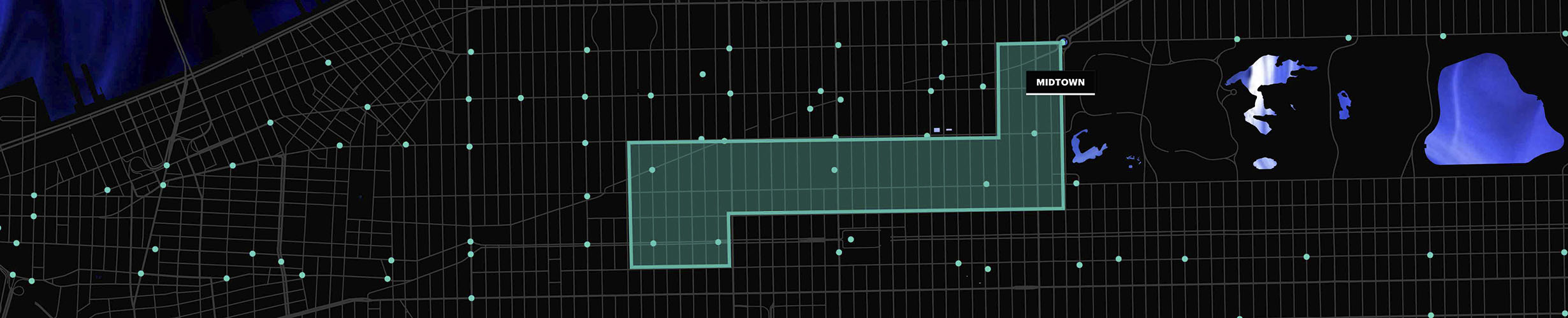
3: Neighborhood Layer
Those who live in cities like New York, strongly self identify with their neighborhood of choice. It’s a unique characteristic that I wanted to build into the content sequence as a way to ground the user in the space and give them a recognizable frame of reference for content paired with that neighborhood. To accomplish this, I illustrated most of New York’s nearly 300 neighborhoods in tandem with creating a detailed spreadsheet of neighborhood-specific data to ensure our engineering team was equipped with the information they needed to procedurally move from one neighborhood to the next.
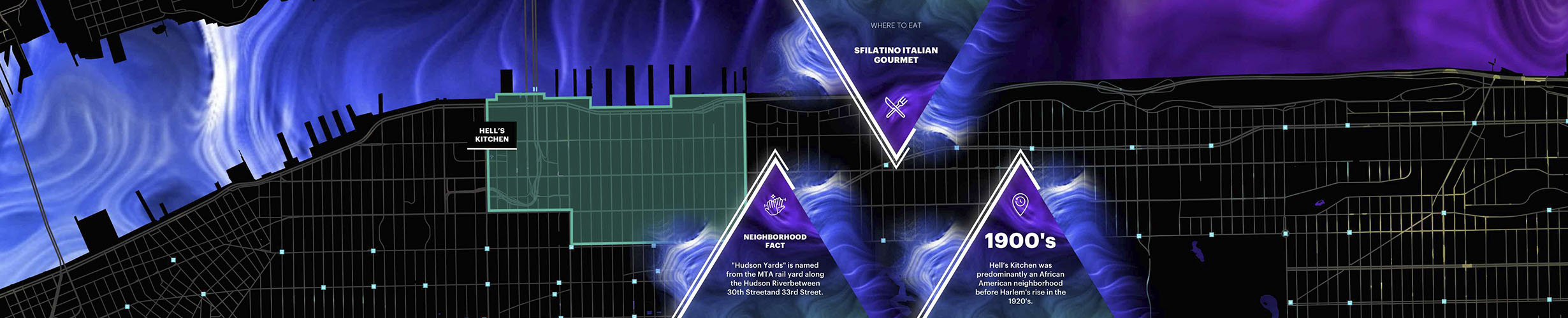
4: Content Layer
Following each neighborhood, were snippets of content featuring localized facts and stories from that specific area. The content management system was built to ingest unlimited amounts of future content—ensuring that City Stream would always feel fresh no matter if it was your first or fiftieth day watching the wall cycling through neighborhoods. City Stream was designed to enable our client to treat New York as a whole and craft rich meaningful inclusive content. One day you may learn something about Arrochar in Staten Island and the next day Morrisania in the Bronx.
Harmony
Wall.
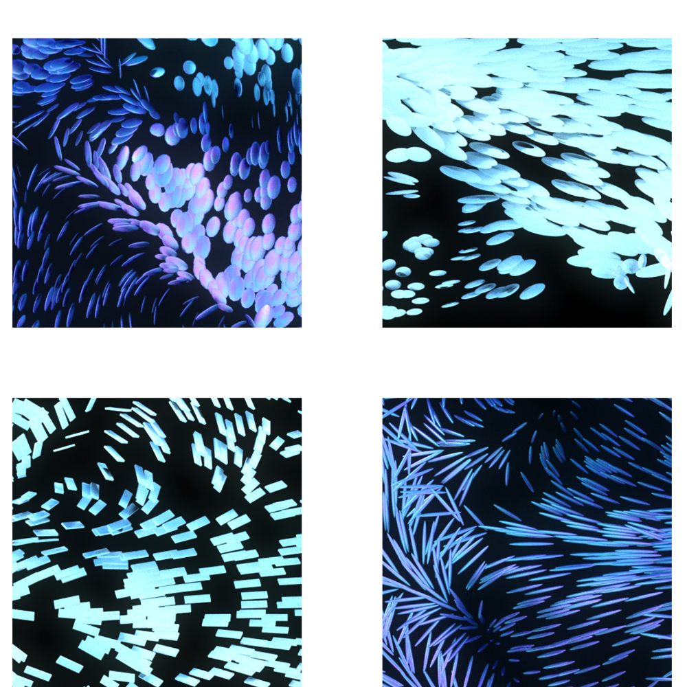
Inspired by nature, the intent of the Harmony Wall was to communicate the incredible power of our client’s half-million employees moving together in unison. We envisioned this experience as a “murmuration” of people, places, and ideas—and designed it to move organically and visually feel futuristic while retaining an overall sense of harmony. This experience was built as an interactive particle system in Touch Designer and featured a question and answer content system that allows users to submit a reply to a weekly question that is then be displayed on the wall.
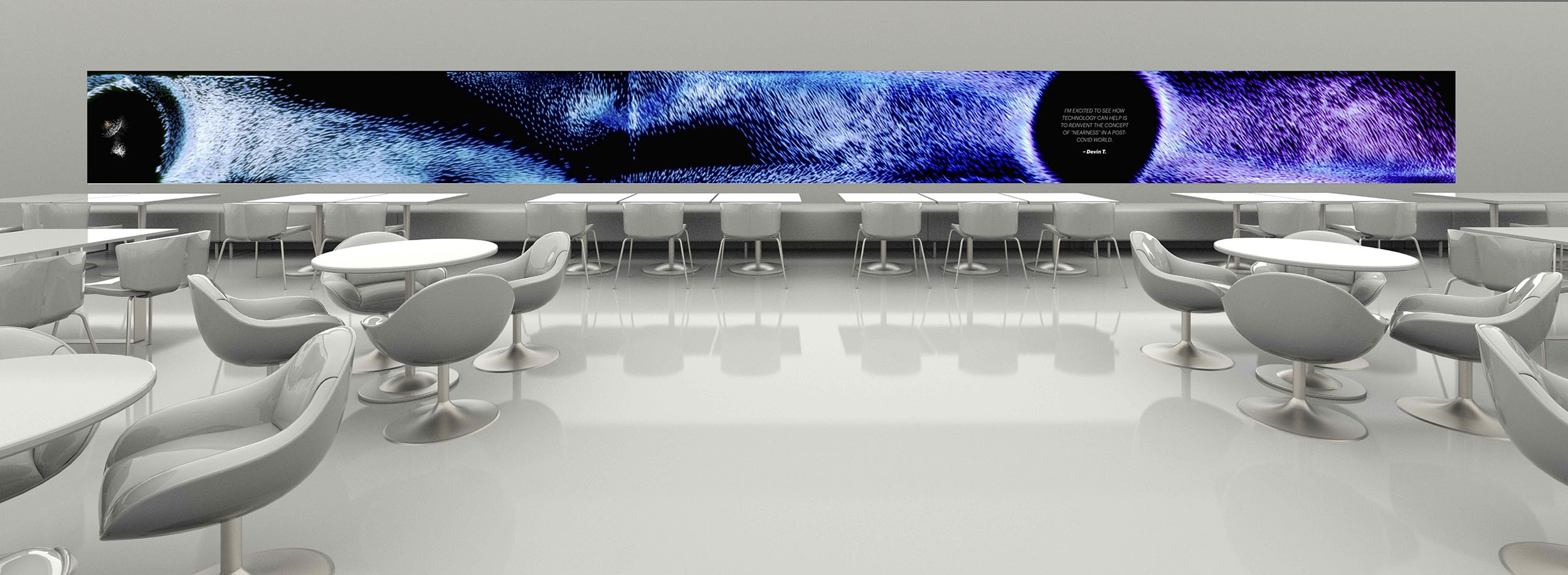
Creating the Particle System
Conceptualizing a particle system requires a crystal clear plan from day one. We approached the visual design of Harmony Wall with two goals: maintain the organic movement of a murmuration of birds and infuse futurism into the design. To do this, I directed a motion designer on the overall particle design, motion reference and content reveals. Once our visual plan was in place, creative direction transitioned to working with our engineering team to recreate our concept in code. Beyond the visual specifics—we created a strategy to keep the particle system fresh by changing the color and shape of the particles over time. Each day the system would cycle through time-mapped color families—and each season the particle shapes would change, ensuring that no two days ever felt the same for the user.