Biotech Innovation Lounge

Biotech
Innovation
Lounge.

Introduction

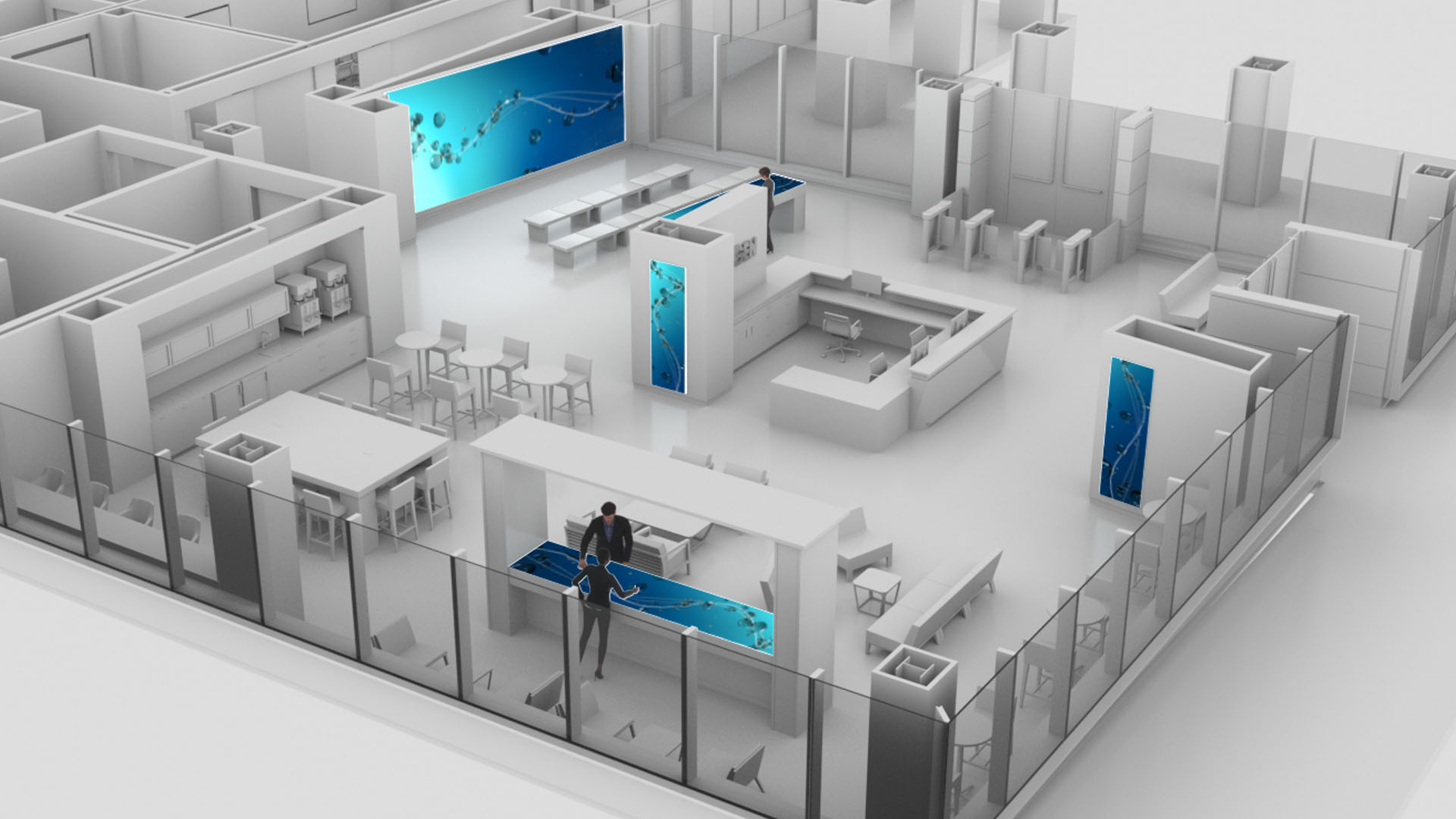
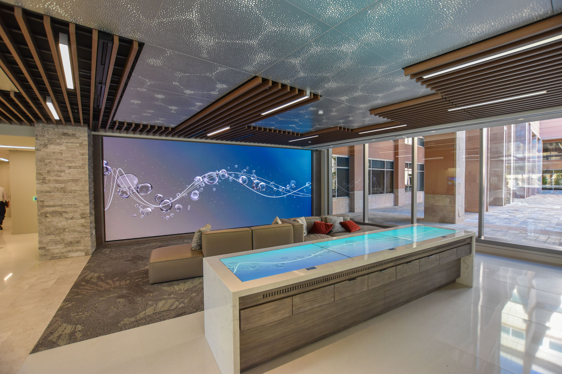
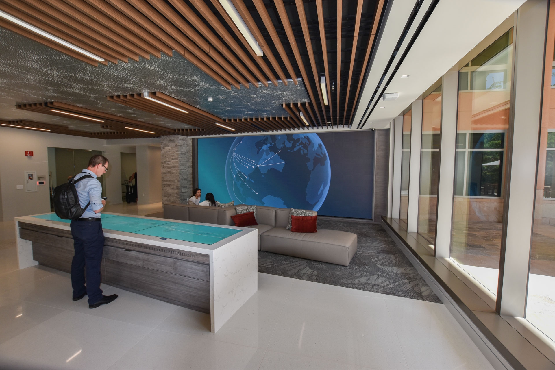
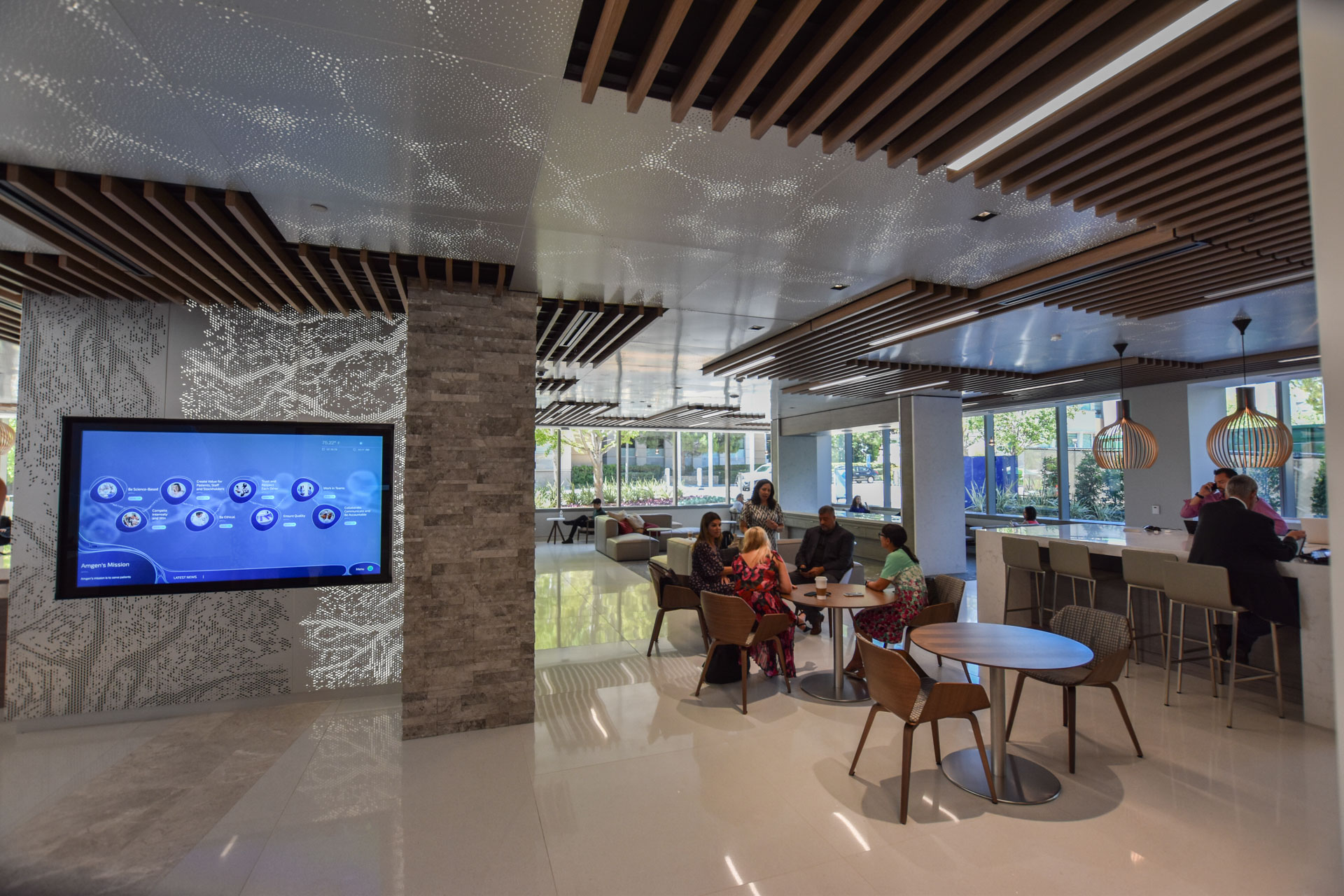
In preparation for a completely redesigned campus welcome center, our team at Britelite Immersive was engaged by one of the world’s largest biotechnology companies to create an immersive welcome center from the ground up. Our challenge was to deliver a meeting space that engaged everyone from dignitaries to the countries smartest scientific minds in a compelling high-tech manner. From Multi-Taction Table arrays to a 30′ LED wall—we delivered an interactive space that recognized the science happening and the great minds behind some of our most important healthcare innovations. As creative lead, I was responsible for all creative direction, design concept development, client presentations, design contractor management, creative/strategic fidelity, and interaction design.

Scope of Work

• Creative Direction

• Visual System Design

• Strategic Research

• User Journey R&D

• Digital Design

• Interaction Design

• 3D Design Direction

Defining the Visual Direction

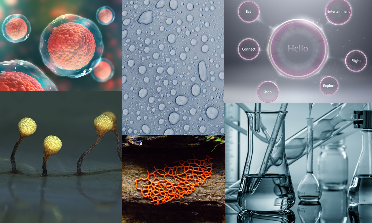
Those who have worked with me know that I find inspiration in the often-overlooked crevices of the world—especially in the microscopic world. Outside of the office, a favorite hobby of mine is mushroom and mold identification, which became an early visual inspiration for how we would approach the visual system. I encouraged the team to identify key things that our audience may encounter in their day to day jobs and look deeper at the microscopic worlds beneath these everyday things. That encouragement led us to pursue a design system based around glass, cell biology, microscopic organisms, and water.
Visual
System.

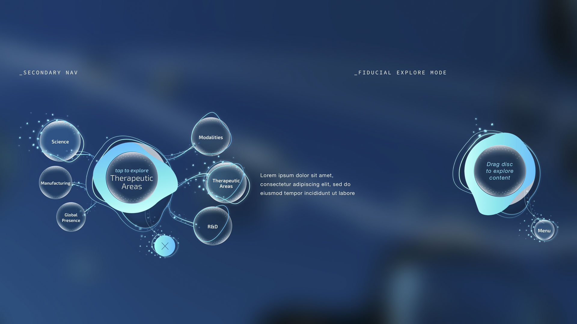
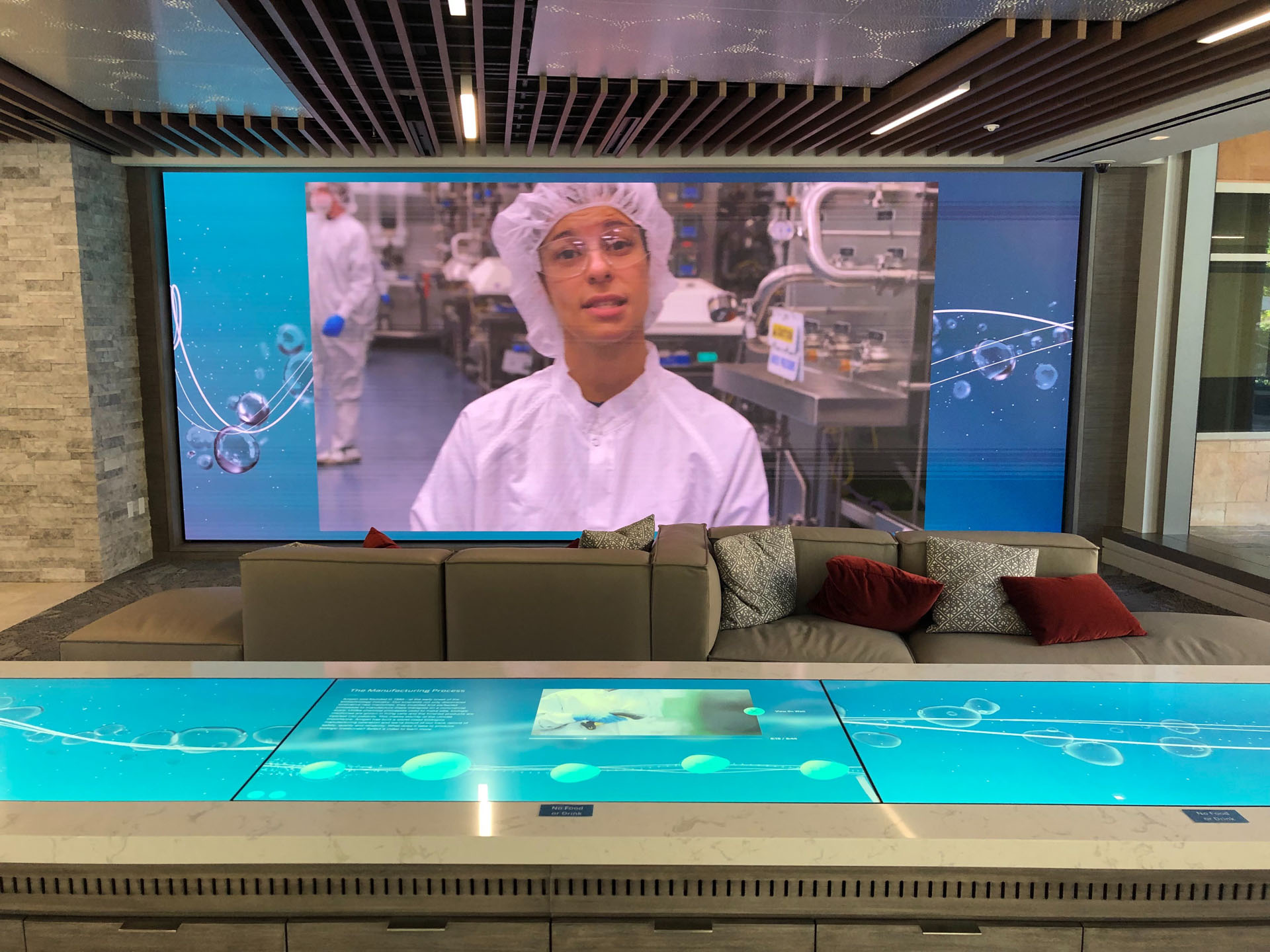
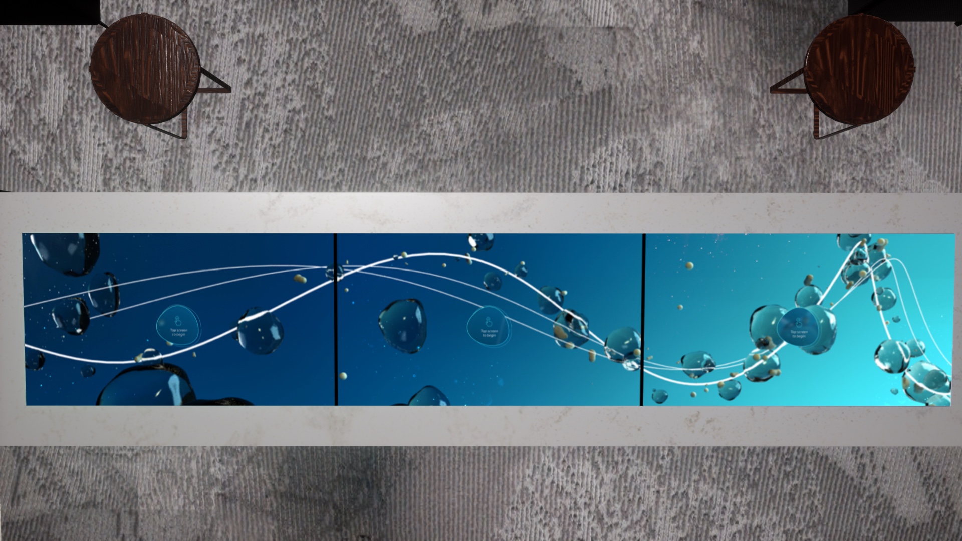
Using glass, water, and cell biology as our inspiration—we set out to create a fluid design direction that brought cohesiveness to each installation. Working with a 3D animator, I set the tone for the experience idle states exploring a flexible animation that combined ultra-fluid bubbles weaving around connective lines. That transparent fluidity was carried through each frame, interaction, and UI element throughout the space.

Science
Theater.
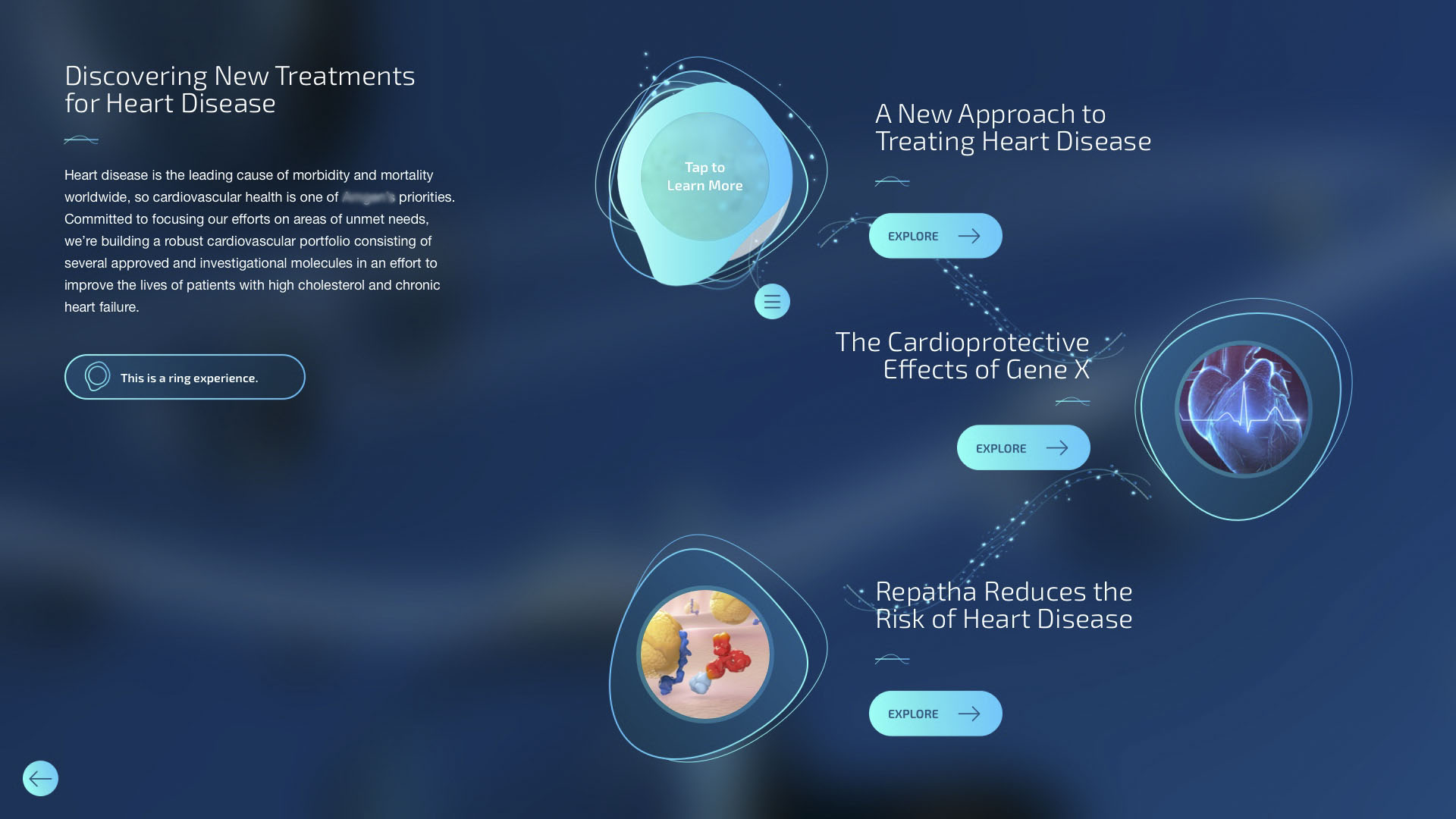
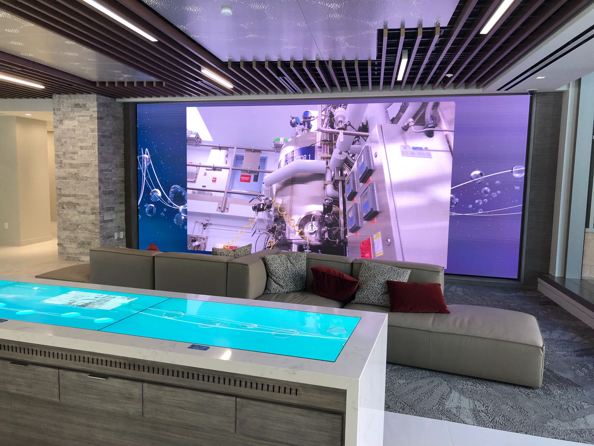
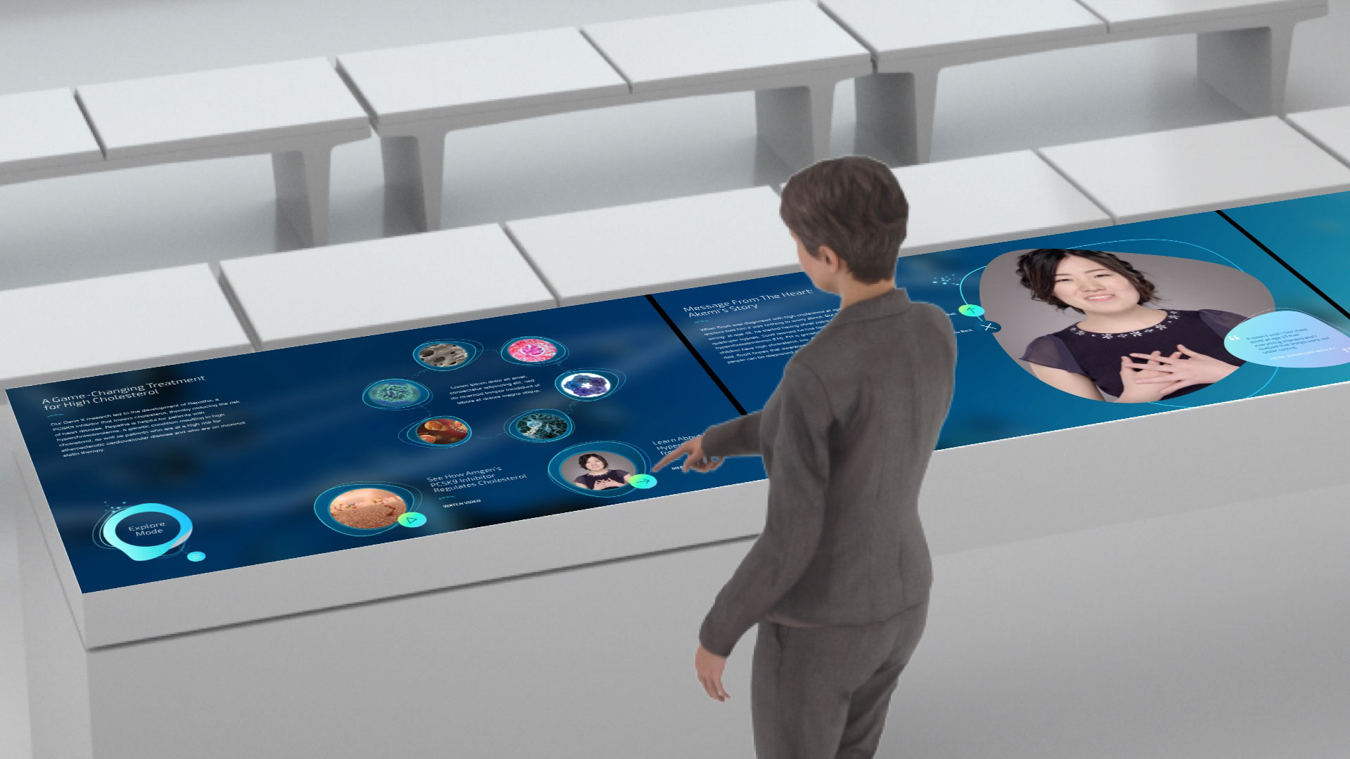
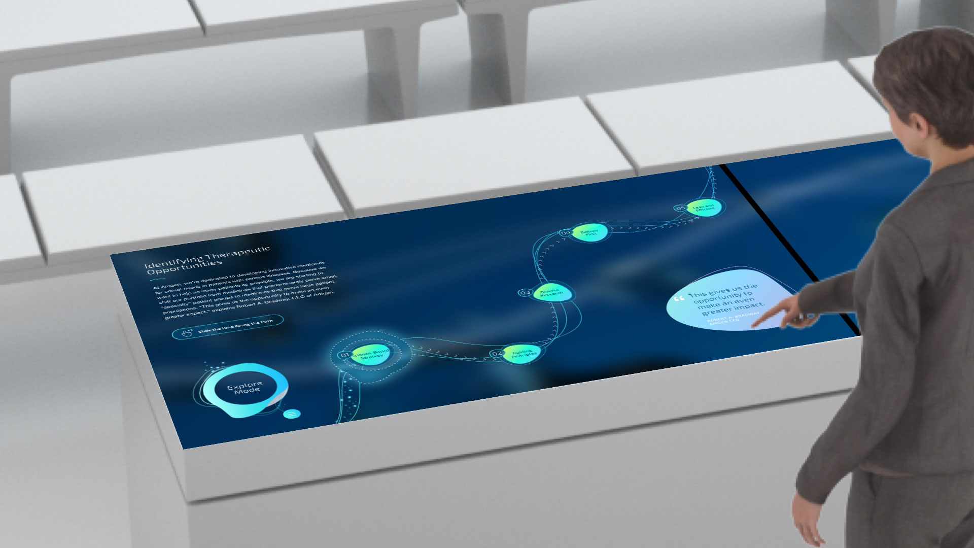
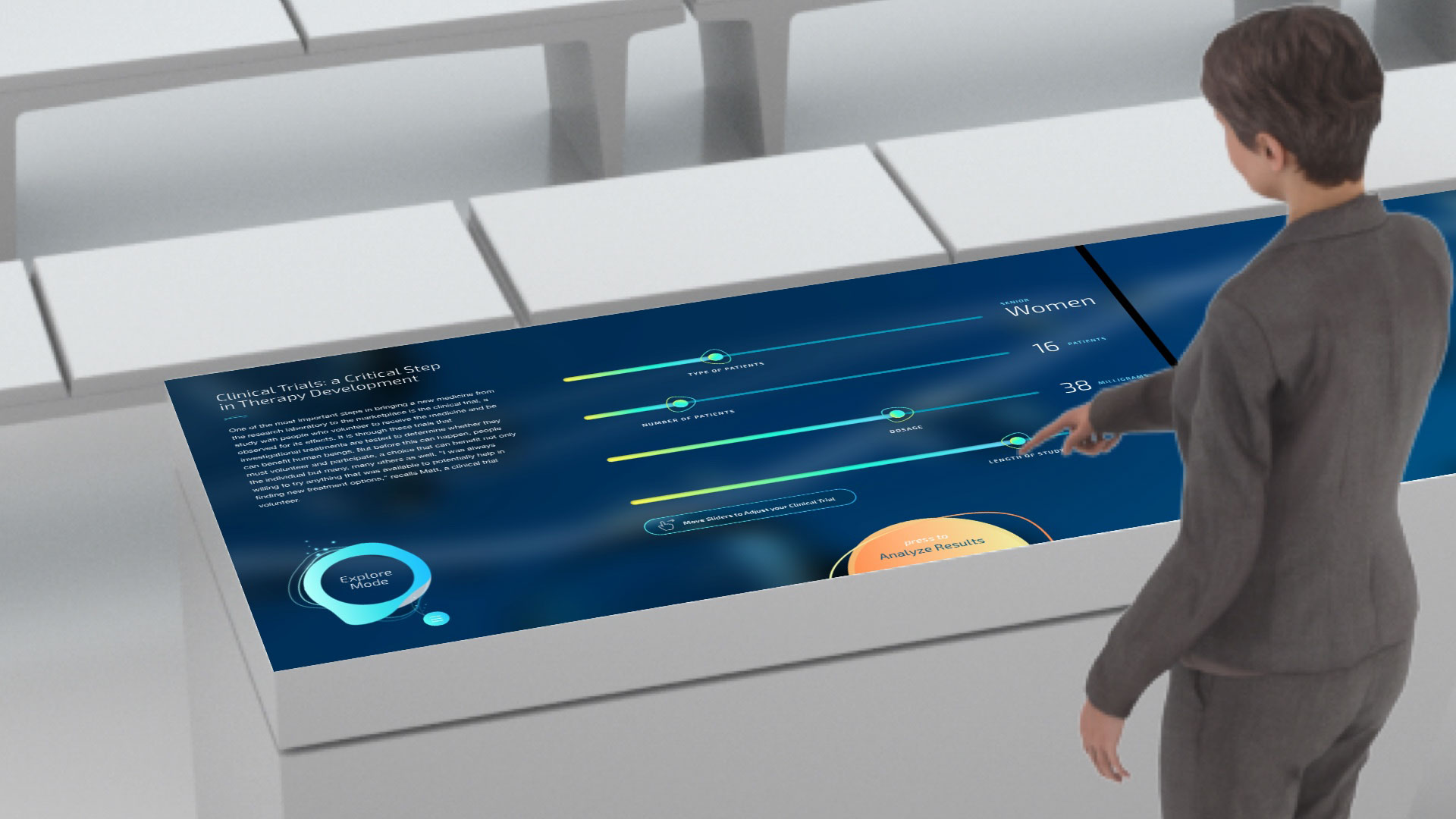
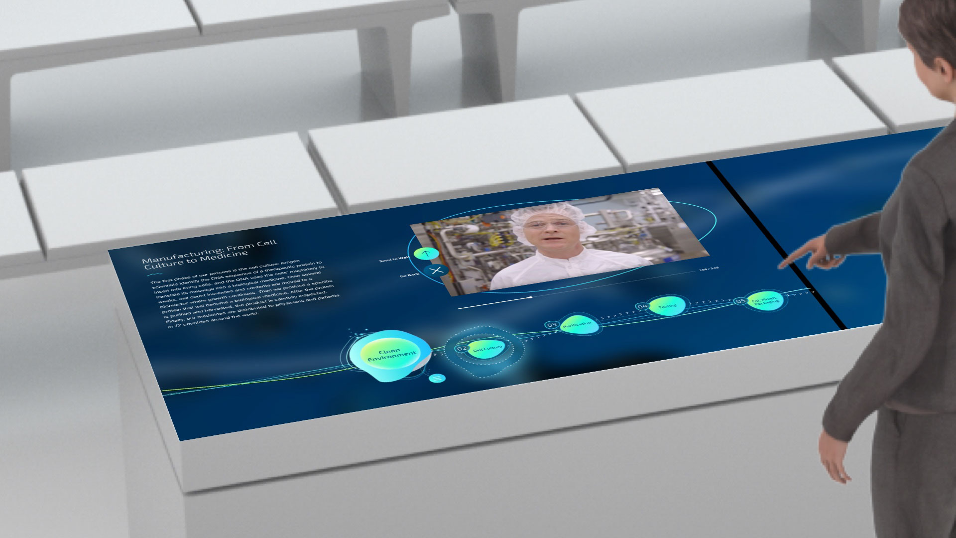
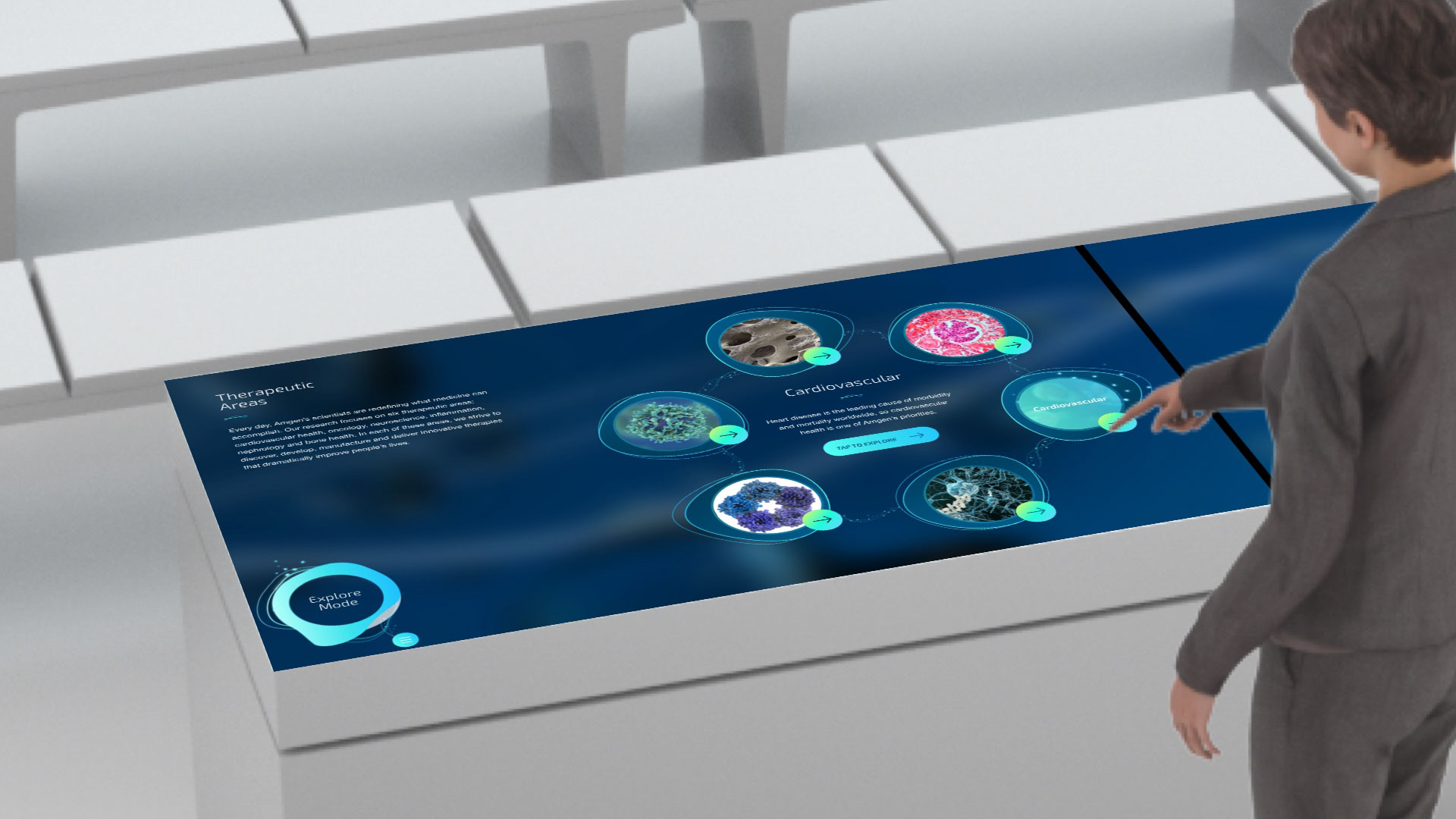
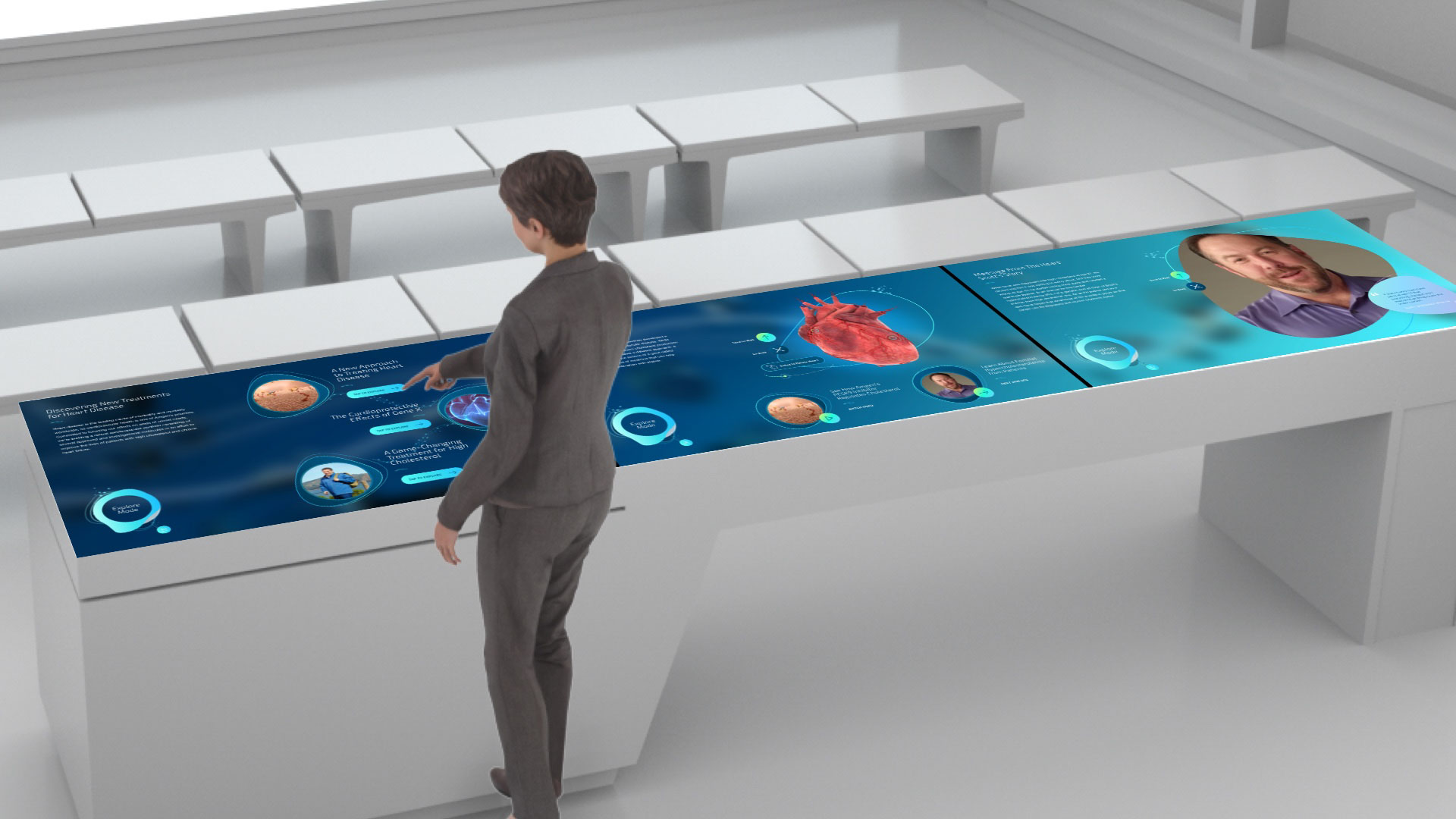
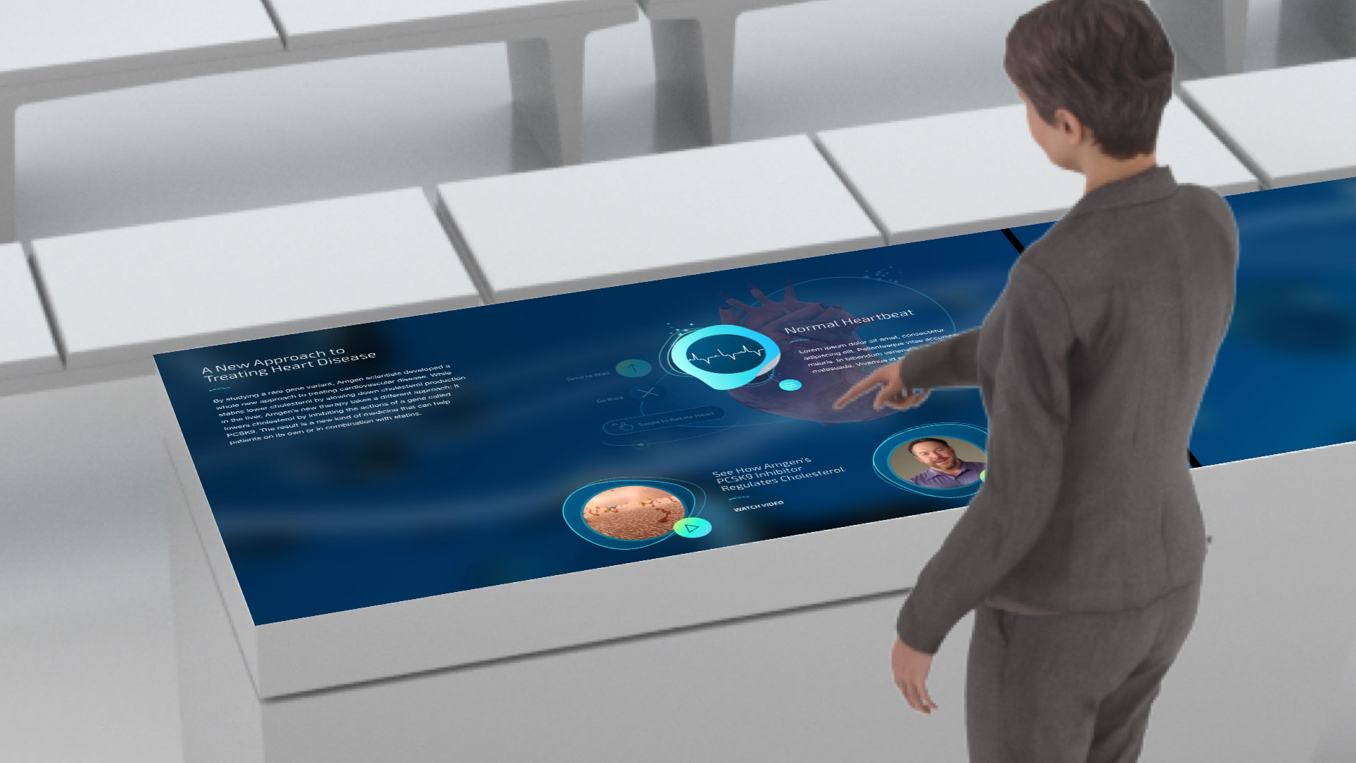
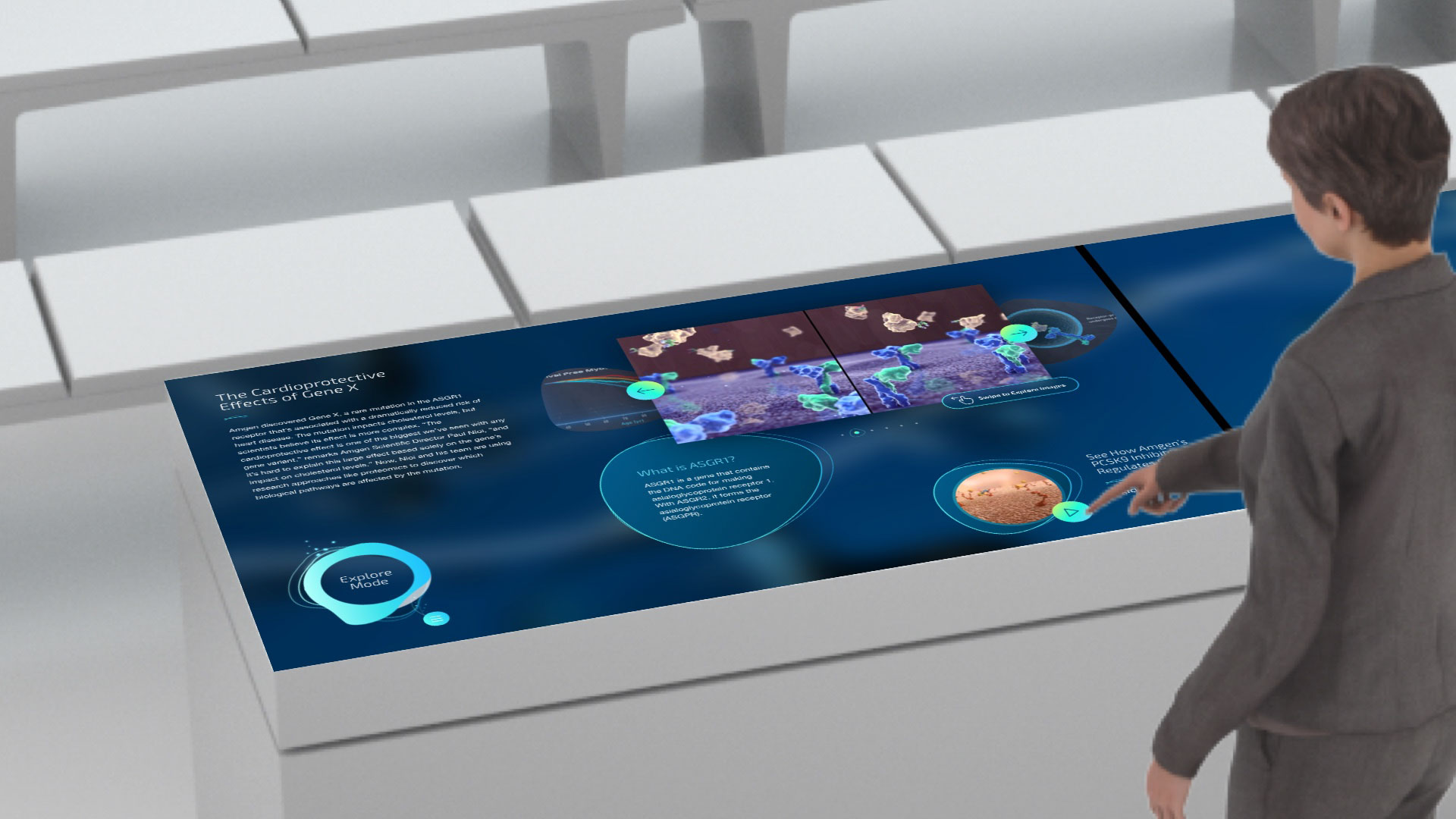
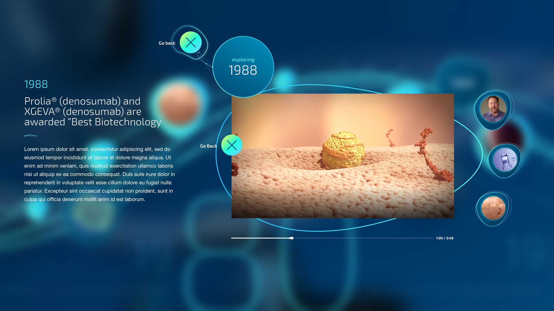
The science theater was a two-experience installation comprised of a 30′ LED wall and a Multi-Taction Table array that would control and display content on the theater wall. Leading a team comprised of a Copywriter, UX Designer, and Visual Designer, we conceived of a multi-user interactive experience that dove deep into the scientific achievements and research occurring on campus every day. Our goal was to pay respect to the scientific achievements and the scientists doing the work—which we accomplished by scaling our fluid design system across each UI element and interaction design. My role specifically as the ACD was to push the team to think of new and interesting ways to present recycled content. I felt that even though we were working with traditionally corporate content—we could achieve new levels of excitement by bringing new interactions and game-like thinking into the user journey. To bring this experience home visually, I managed a design contractor on the high-level UI design then completed and scaled the look and feel once content was locked. The MTT array was built on a Unity-based application and was controlled by a custom-designed control ring called a fiducial.

Heritage
Table.

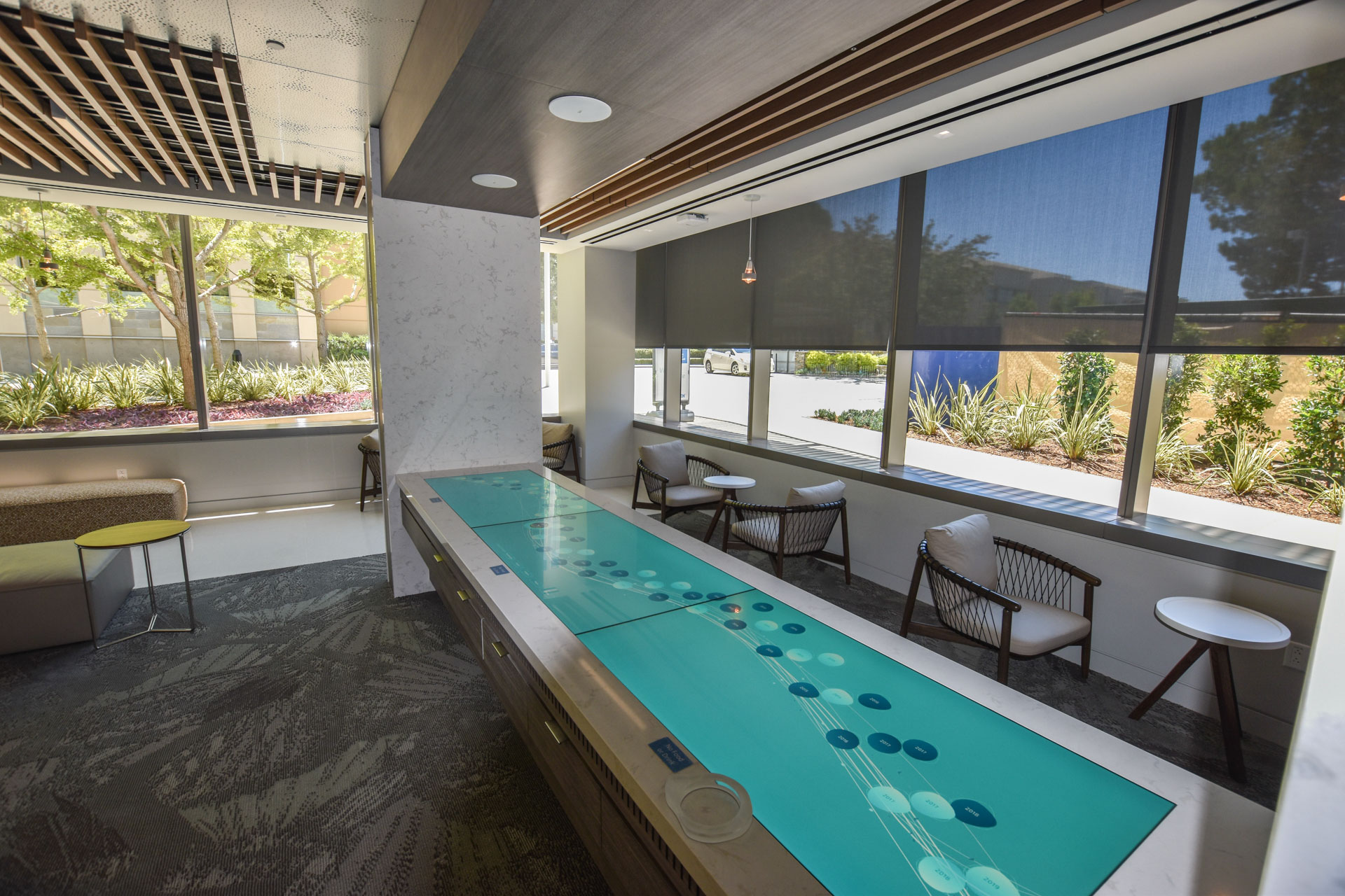
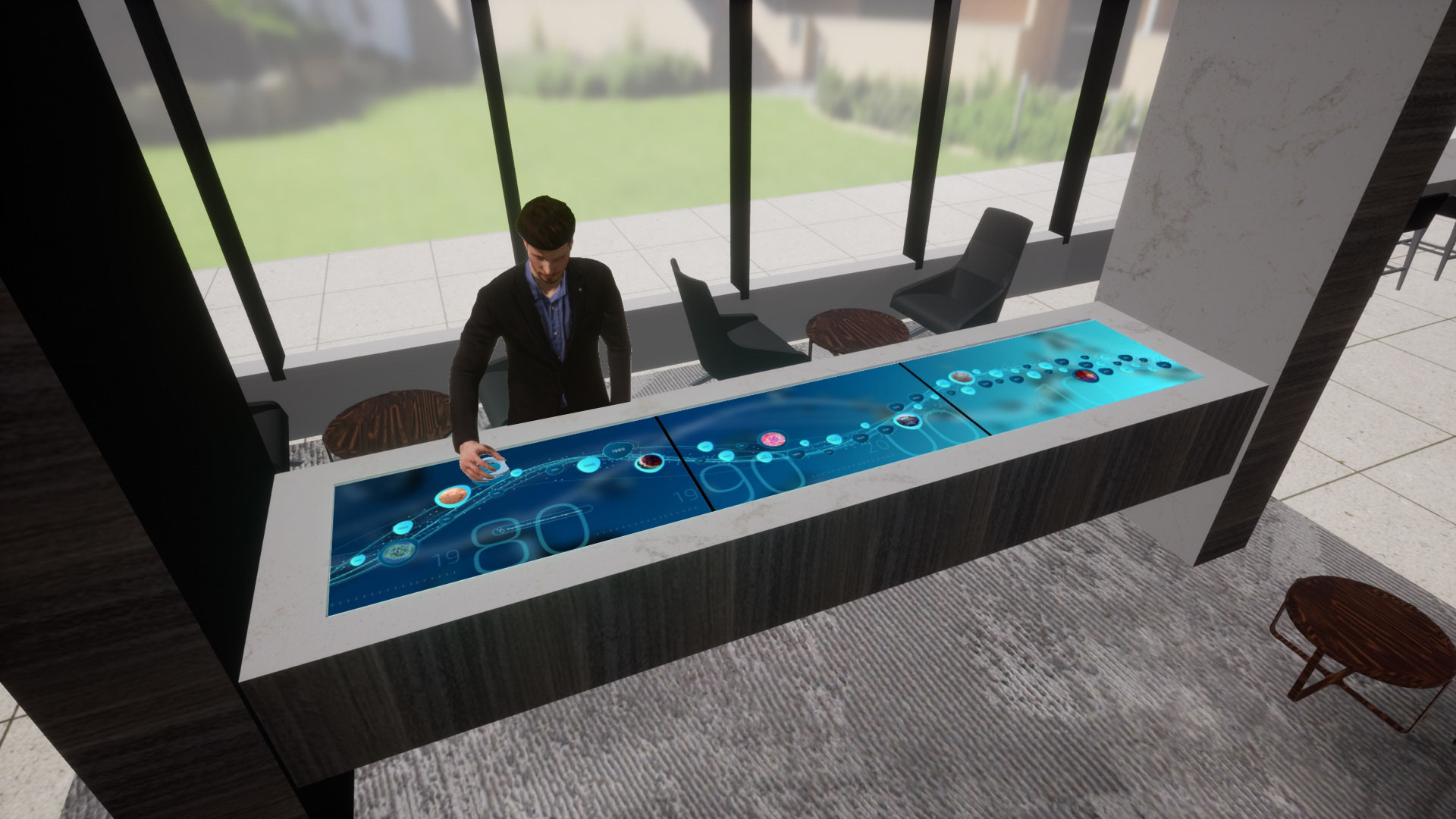
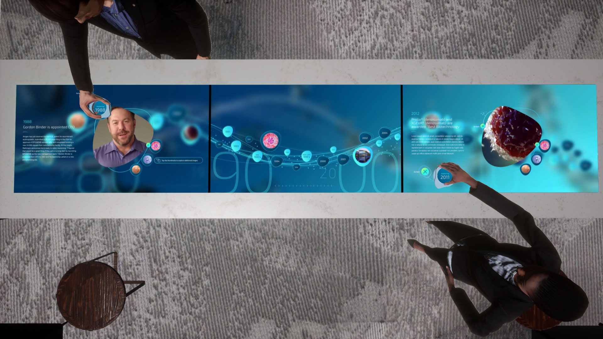
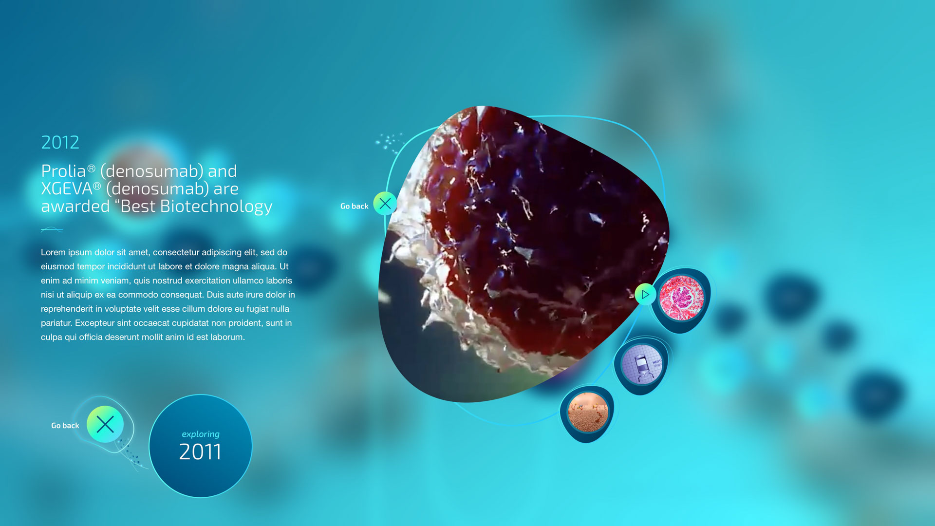
The Heritage Table was a 3-screen Multi-Taction table array built on a Unity-based platform. Our challenge here was to present the rich history of our client’s scientific achievements over a 50-year period in a new innovative way that engaged everyone from the cafe staff to the veteran scientists. We achieved this by scaling our fluid design system across a multi-user interactive experience. At any given time, 1-3 users could walk up to the table and tap a bubble or use a fiducial ring to quickly scan through stories. My role in this installation was the overall creative direction and design contractor management. Together we conceived the high-level interface design look and feel, interactive elements, and user journey. A key feature to call out is that we were designing for two different interaction styles simultaneously—finger taps and fiducial interaction. We leveraged the fiducial to add emphasis and additional features versus a less interactive experience when finger taps were in use.

Values
Screen.

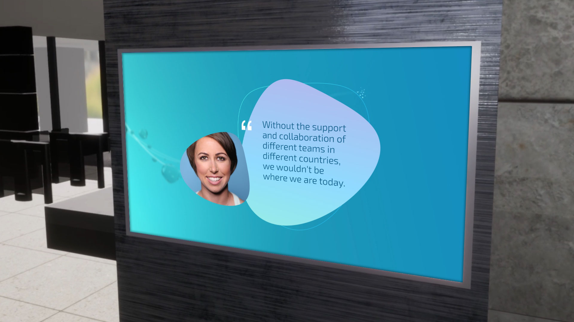
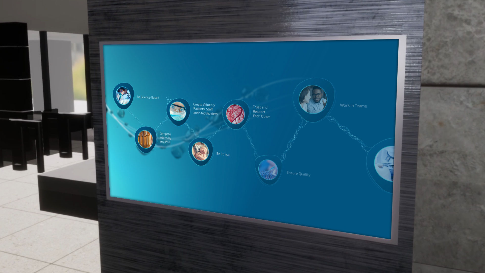
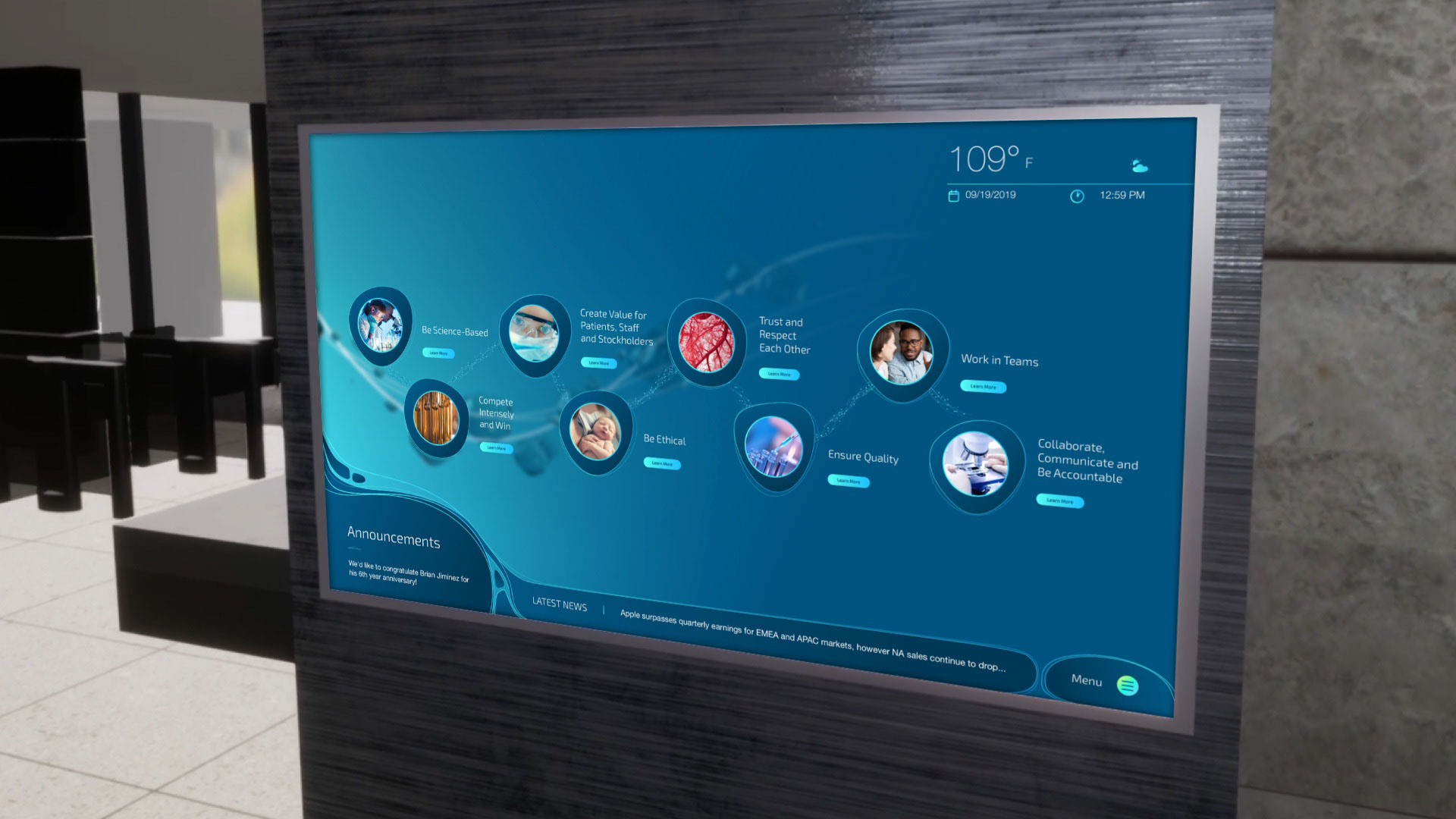
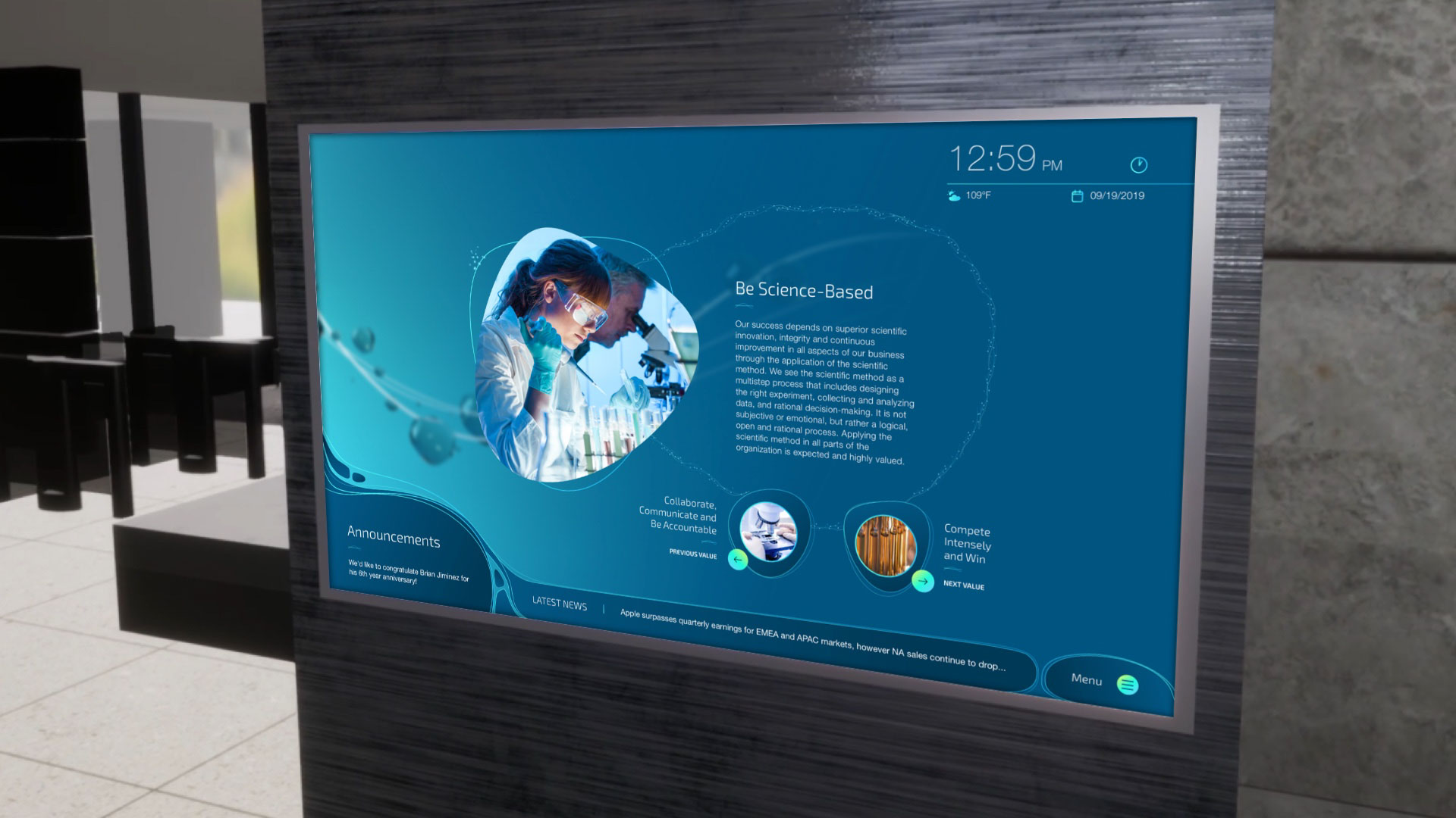
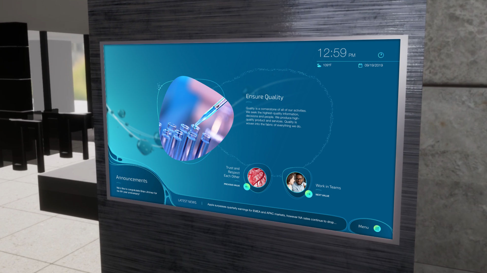
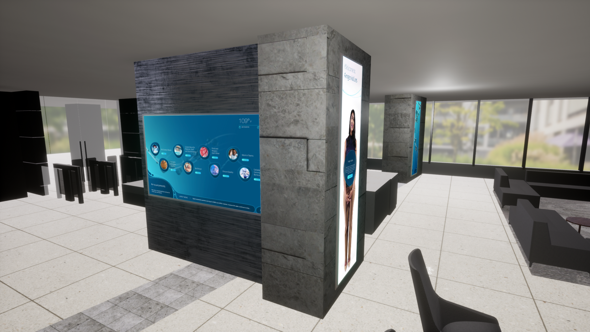
The values screen was a stand-alone web-based touch screen interface that displayed our client’s company values. My role in this installation was the overall creative direction and management of a visual designer. Our goal for this installation was to present common knowledge content in a visually compelling manner using our fluid visual system design. Together we conceived an amorphous design infused with water like animations that engaged users’ curiosity. Cycling through in the beginning were employee testimonials that would animate in as a spiraling DNA sequence. Pinned to the corners were at-a-glance useful content such as recent company news, time of day, and temperature.
Innovation
Pillars.

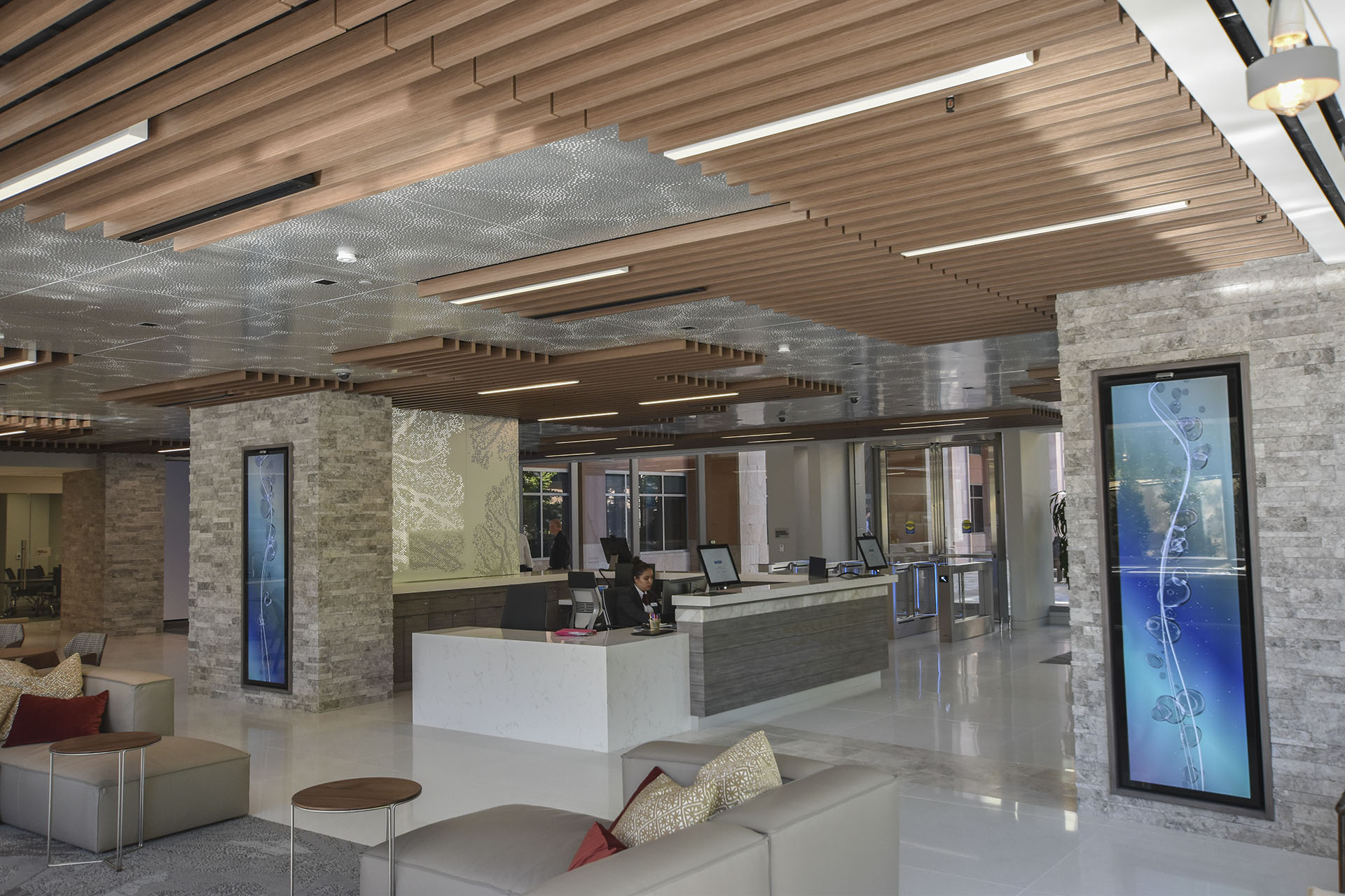
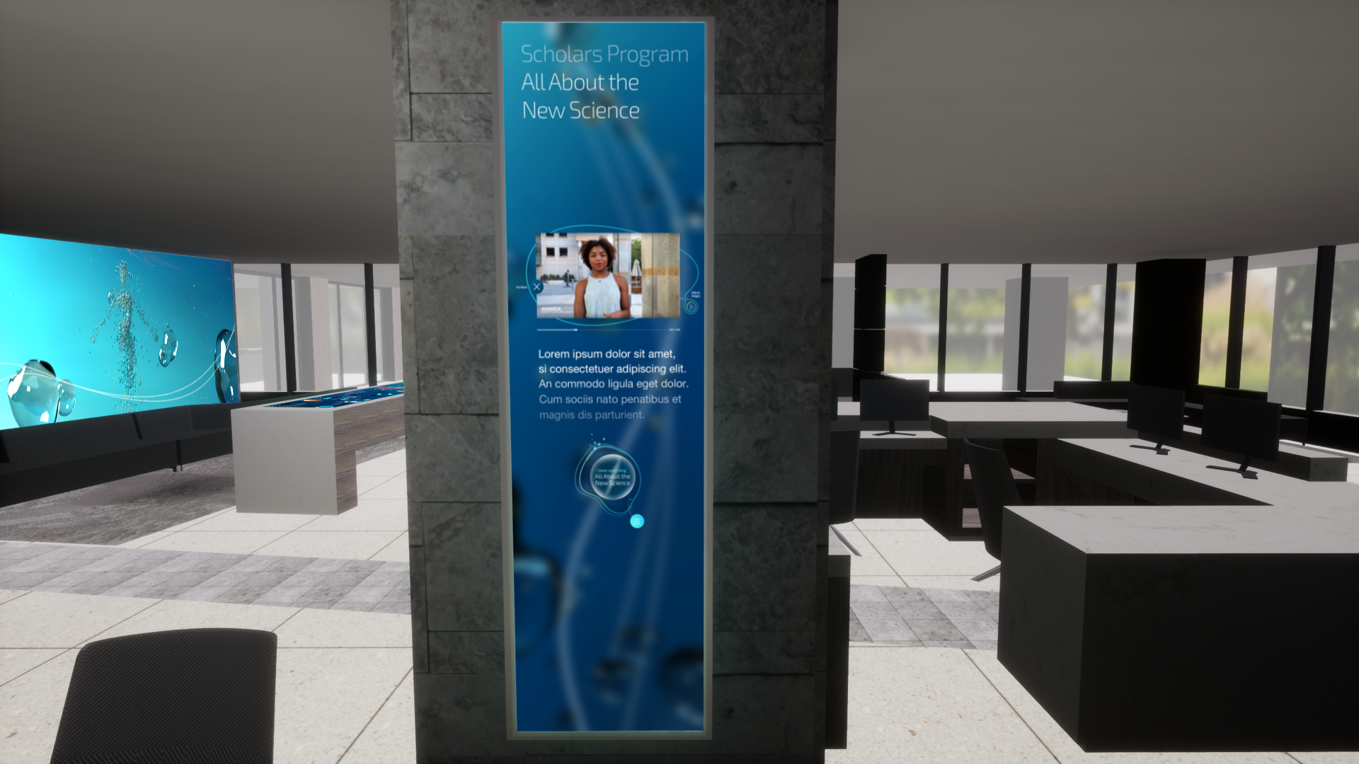
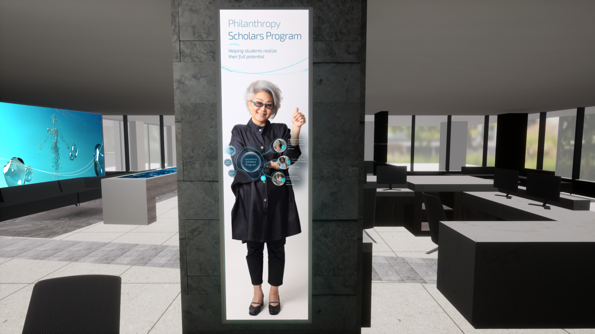
The Innovation Pillars were two distinct ultra-stretch HD portrait screens that we used to create 1:1 moments with our clients’ employees and scholars. Each pillar featured a cohesive navigation system similar to the MTT arrays as a means of familiarizing users throughout the space with how to interact with each installation. The narrative with these sister installations was told by employees themselves, via video interviews our team created. My role in this installation was to manage a visual designer on the high-level design approach and eventually finalize the design system to ensure a cohesive and consistent experience throughout the space.

Launch.

The Biotech Innovation Lounge continues to be an impressive space that has infused the values and work of a global brand into a physical space. We were proud to deliver an experience that not only delivers upon the goals of the brand but also works to give employees and visitors a sense of pride and awe. Two years later, we have been asked to bring our visual design system into sister locations around the globe—which couldn’t be a truer testament to the success of this project.

Van Ness Gala
Blockchain Mural
Tags:
,