19 Jan Good Mojo
Posted at 01:01h
in Uncategorized
Good
Mojo.

Introduction
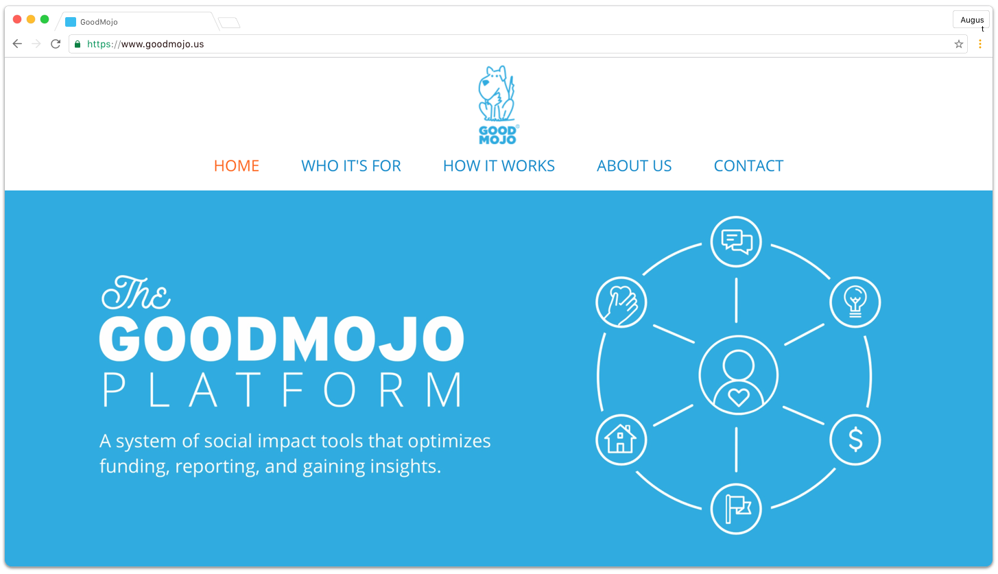
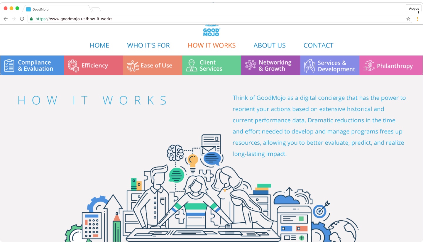
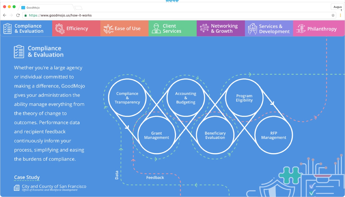
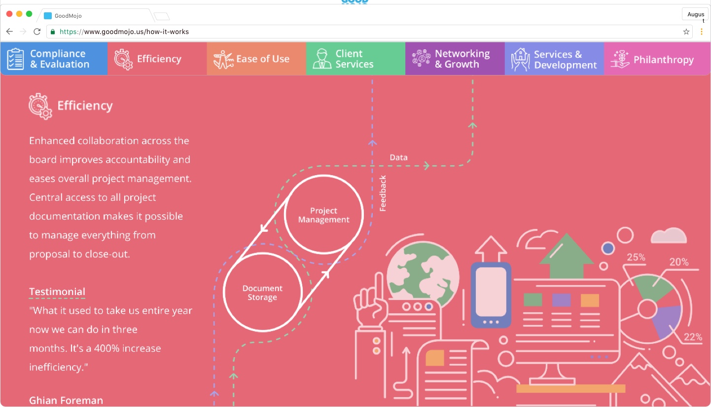
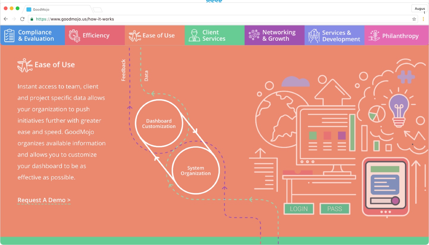
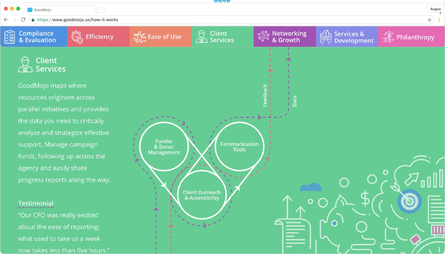
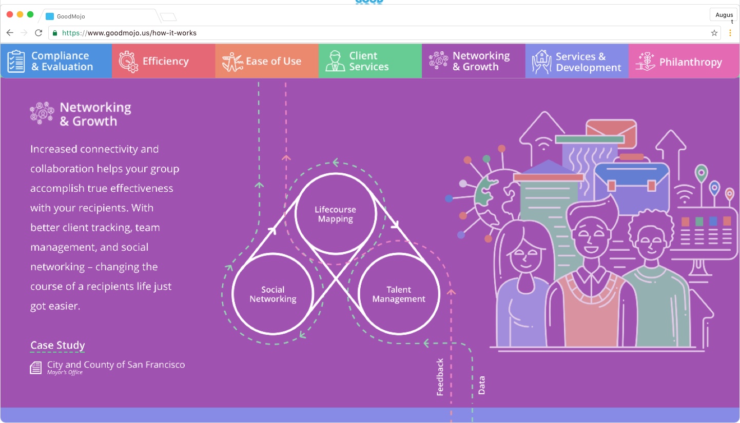
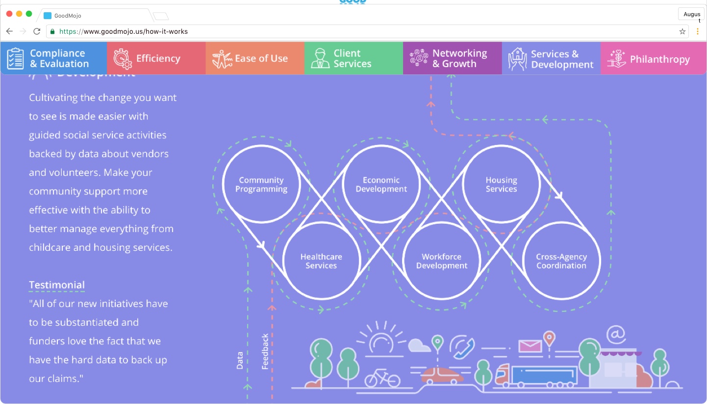
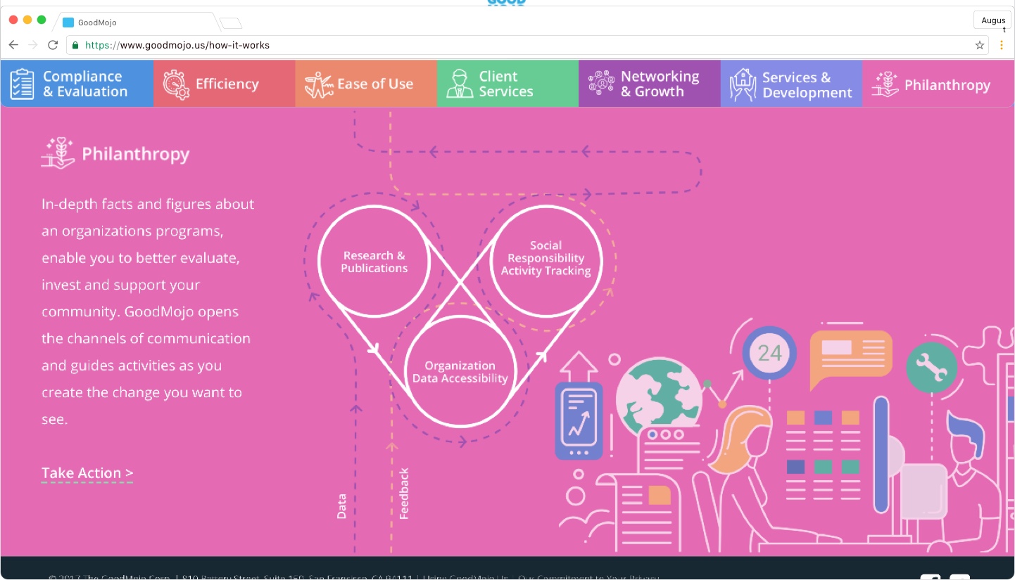
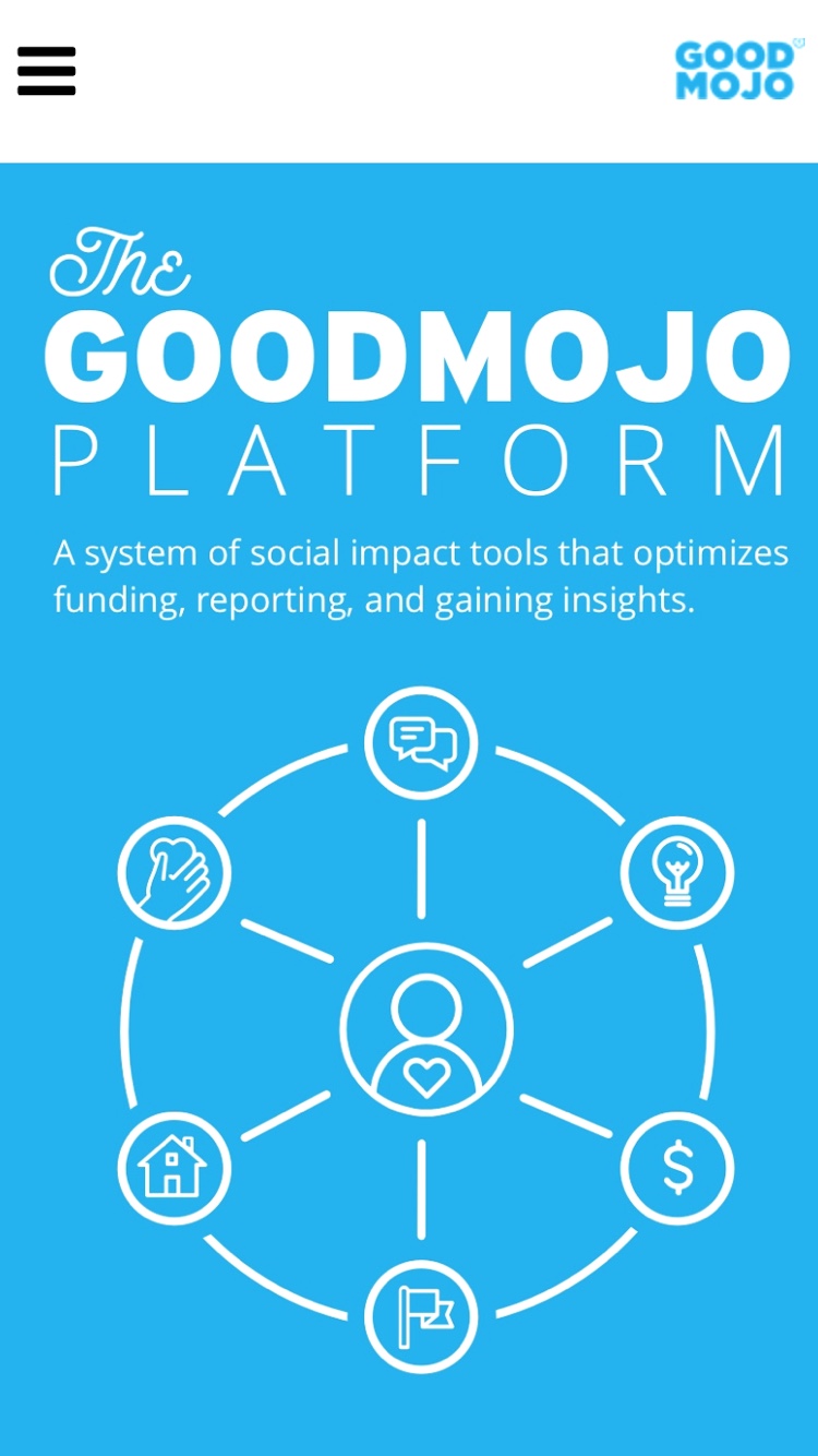
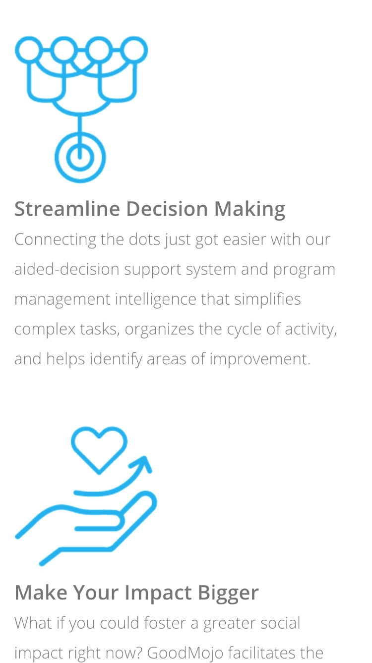
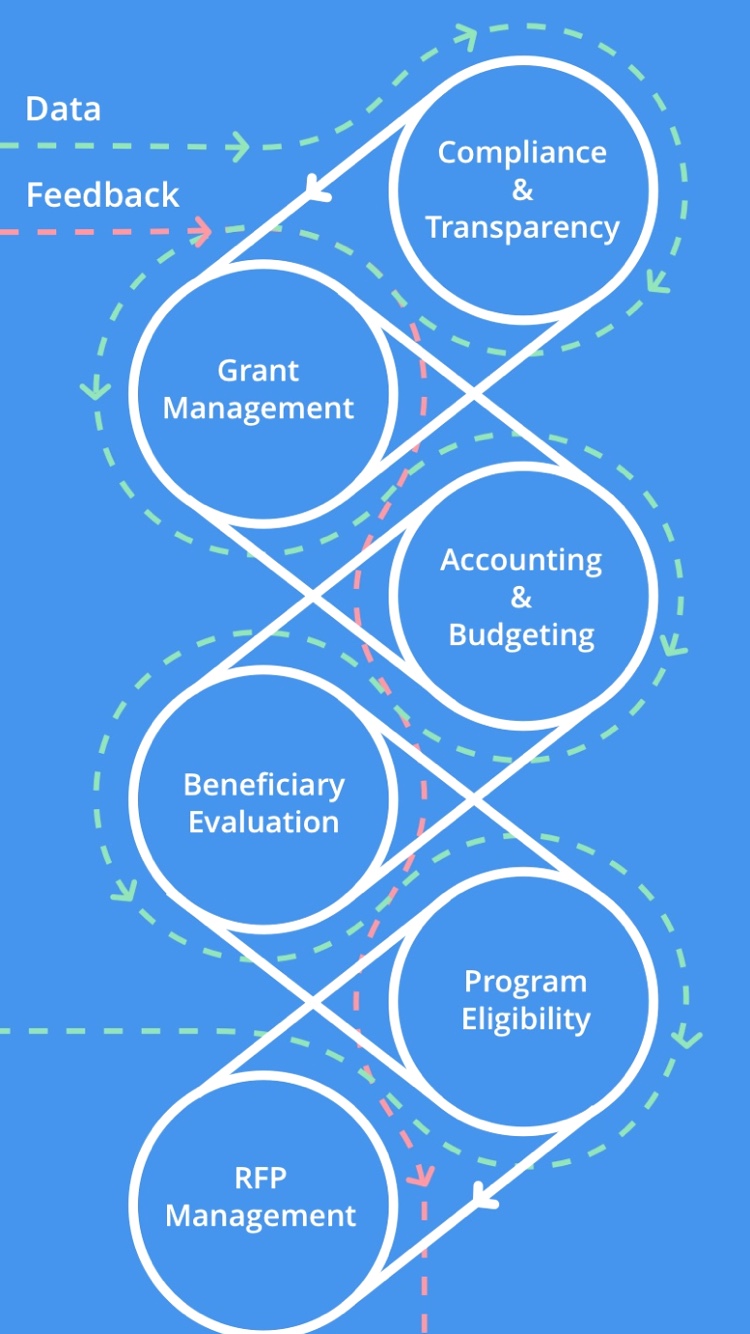
GoodMojo is a web-based fund and project management application built specifically for the social impact sector. Working directly with the founders and developers, I helped them narrow, organize and focus their story with copywriting and visuals. Their product simplifies the notoriously complex process of government funding, allowing agencies and organizations to focus on effectiveness more than compliance. Coming full-circle, citizens are given a voice within the GoodMojo system with the ability to directly support local in-progress initiatives, essentially strengthening community bonds.
Scope of Work
• Brand Consulting
• Copywriting
• Design Research
• Creative Discovery
• Digital Design
• Illustration
• HTML/CSS

Understanding the Why
GoodMojo’s purpose is to provide groups working in social impact with a tool-set that exponentially increases their ability to make effective change. That purpose was born from numerous roadblocks experienced by the founders in their own experience as program managers. Their story begins with eliminating frustration and turning a laborious linear process into a distributed collaborative ecosystem.
Sort, then Steer
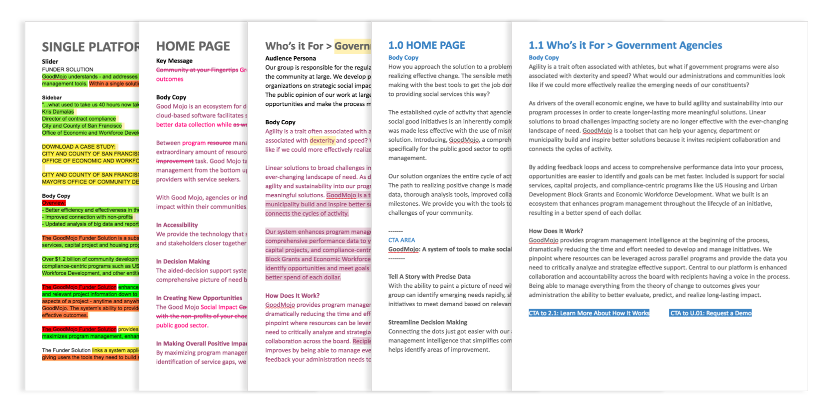
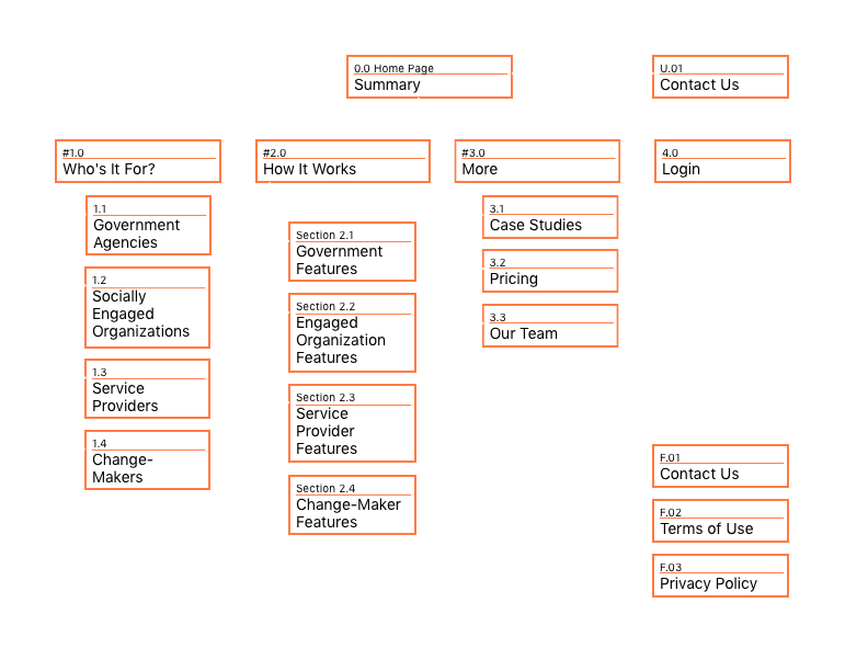
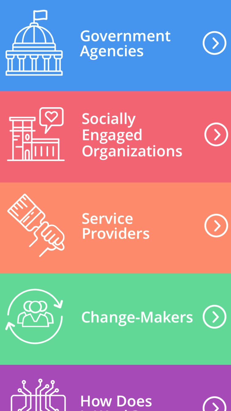
My process began with extensive editing to identify core messages that could serve as building blocks for the larger story. Essentially, it was 52 card pickup in a few thousand words. But the key challenge was figuring out how to write distinctively and cohesively for four unique audience personas. Each persona was based on how they would interact with the product, their key motivators, and aspirational goals. In the end, it was my knack for witty analogies that subconsciously said to the user “I get you.”
