07 Mar Van Ness Gala
Posted at 19:00h
in Portfolio
Van Ness
Gala.
Introduction
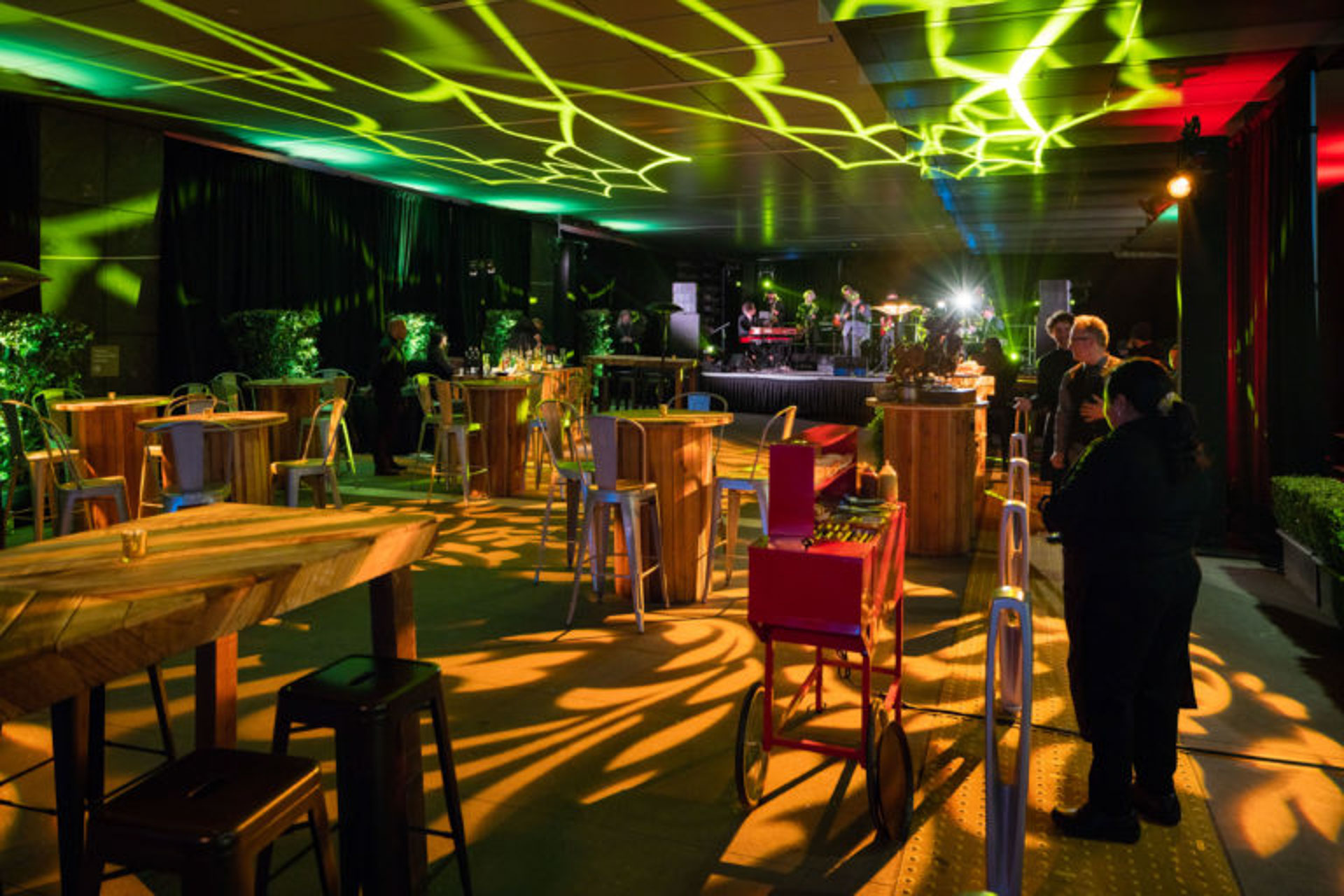
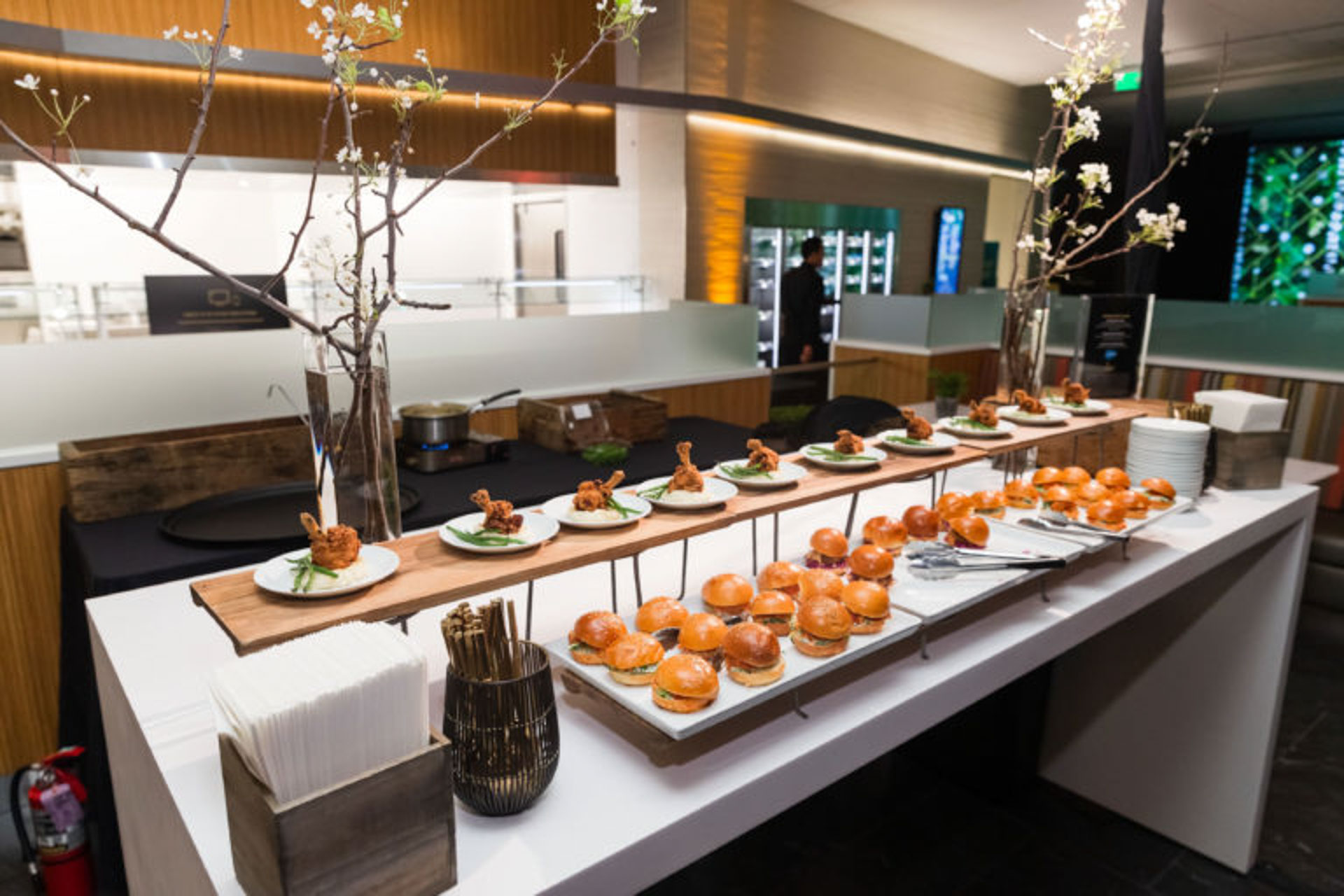
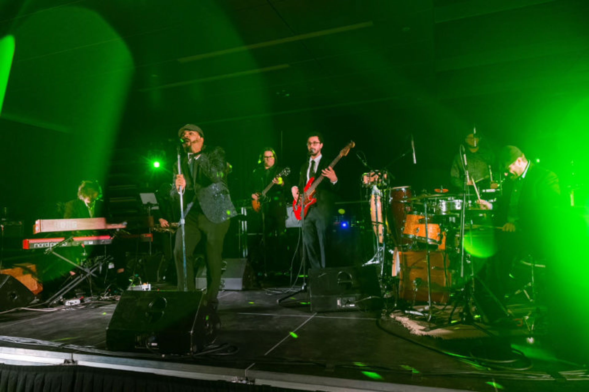
To celebrate the debut of their groundbreaking new Sutter Health hospital, the CPMC Foundation engaged our team at Britelite Immersive to transform the physical hospital into a once in a generation immersive black-tie gala event to give their donors and partners a glimpse into a new era of personalized care. From reactive projection walls to holograms to a robotic surgery simulation game, guests navigated five floors and over 30 individual experiences with Bluetooth wearables that personalized each guest’s journey and brought to life what it is like to be a patient at Sutter Health. As creative lead, I was responsible for all creative direction, design concept development, client presentations, design contractor management, creative/strategic fidelity, and visual design of several installations.
Scope of Work
• Creative Direction
• Visual System Design
• Icon Language Design
• Photoshoot Art Direction
• Digital Design
• Interactive Design
• Game Design
• 3D Design Direction

Defining the Visual Direction
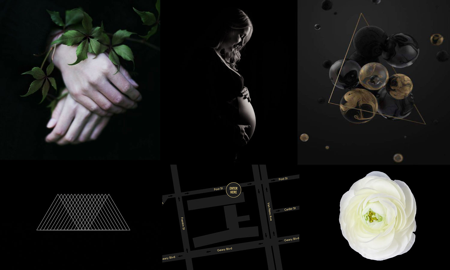
Our goal from the outset was to transform the hospital into a high-fashion luxury event—and to do this we kicked off the project with two look and feels that spoke to deep emotional bonds from two points of view: science and patient. We moved forward with a sophisticated scientific point of view that used the basic building blocks of nature as its guiding principles—each experience was paired with a natural element: earth, water, light, and fog. These elements were combined with themed geometrical shapes and high-contrast black and white portrait photography to create a cohesive design system that I scaled across each installation.
Design
System.
Photography
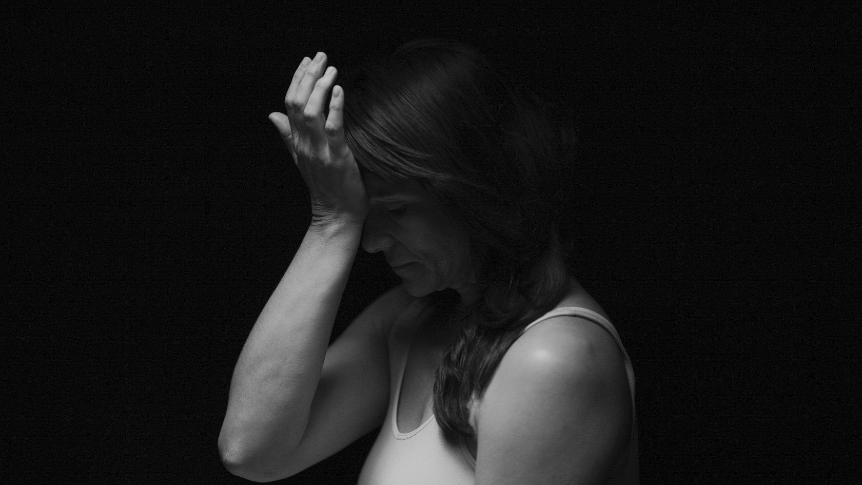
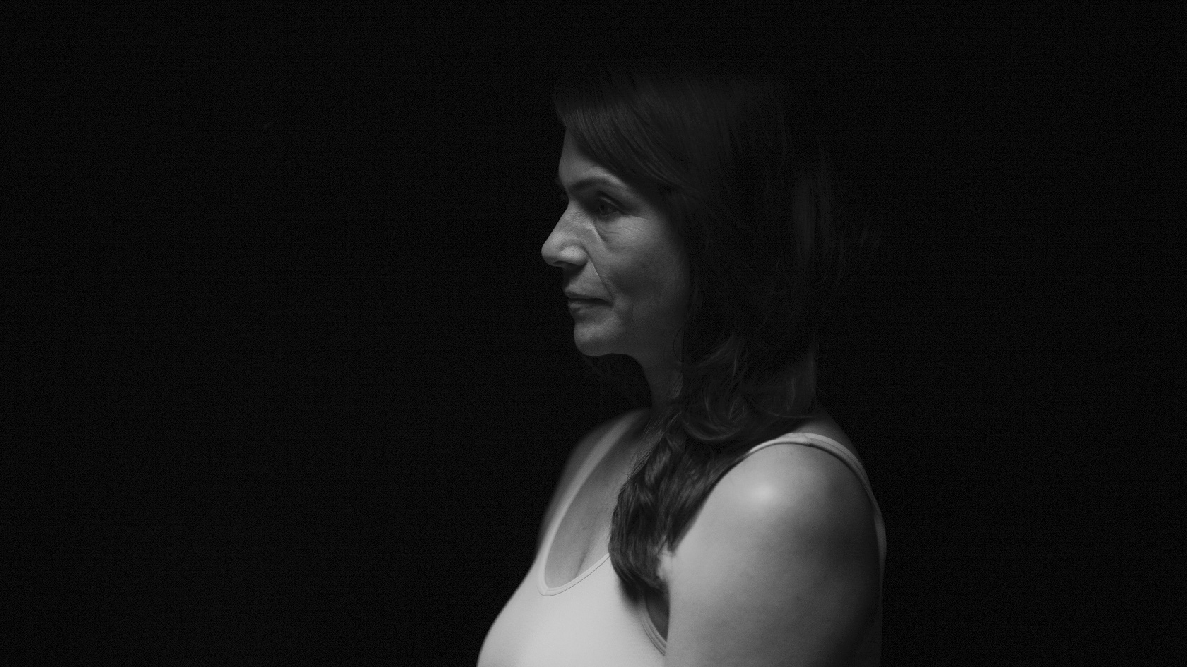
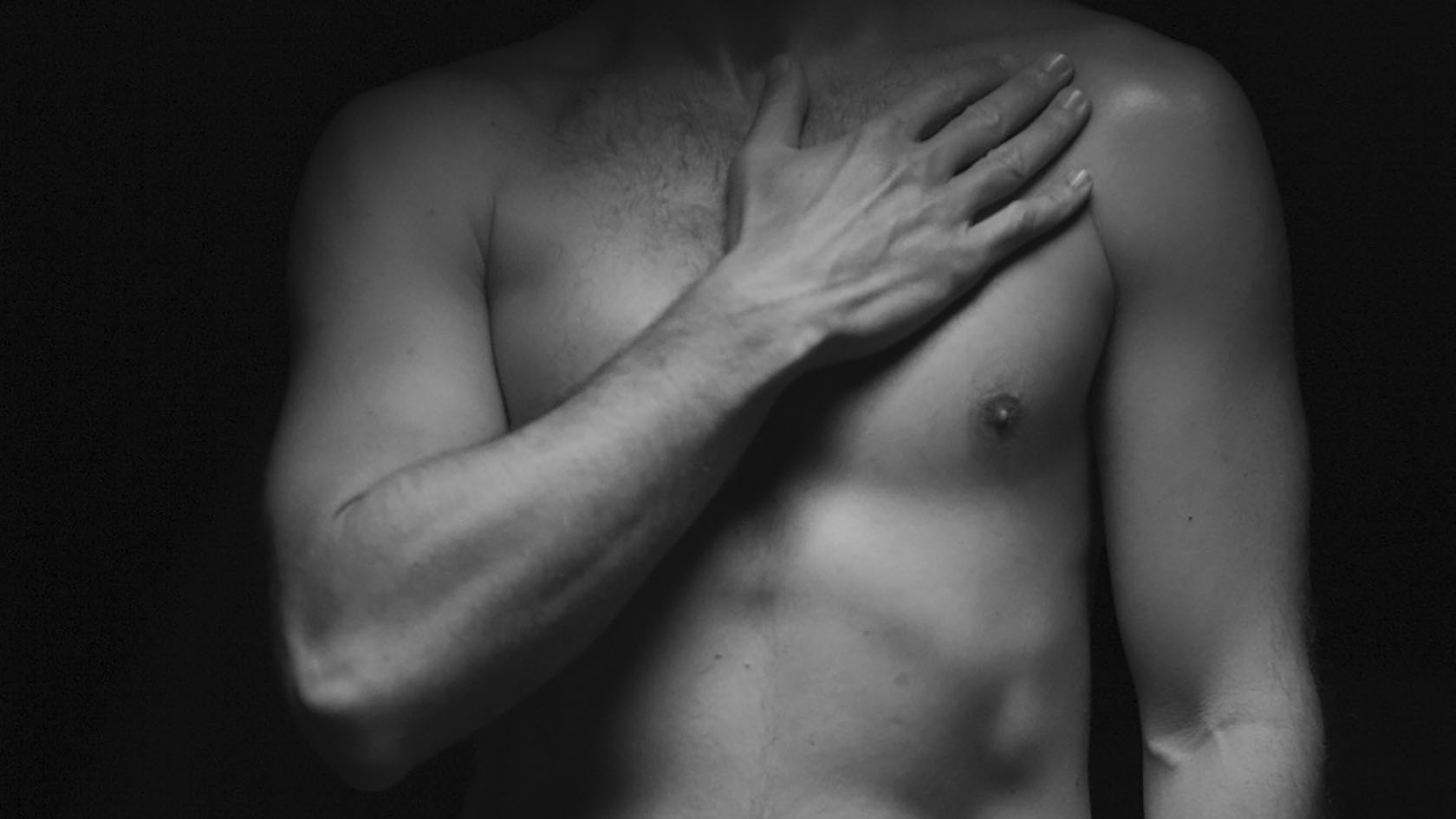
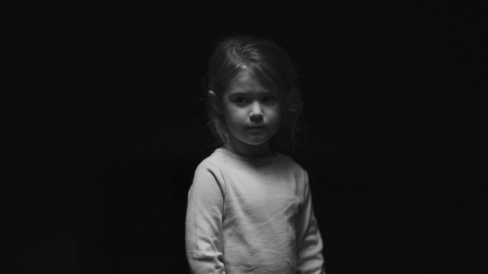
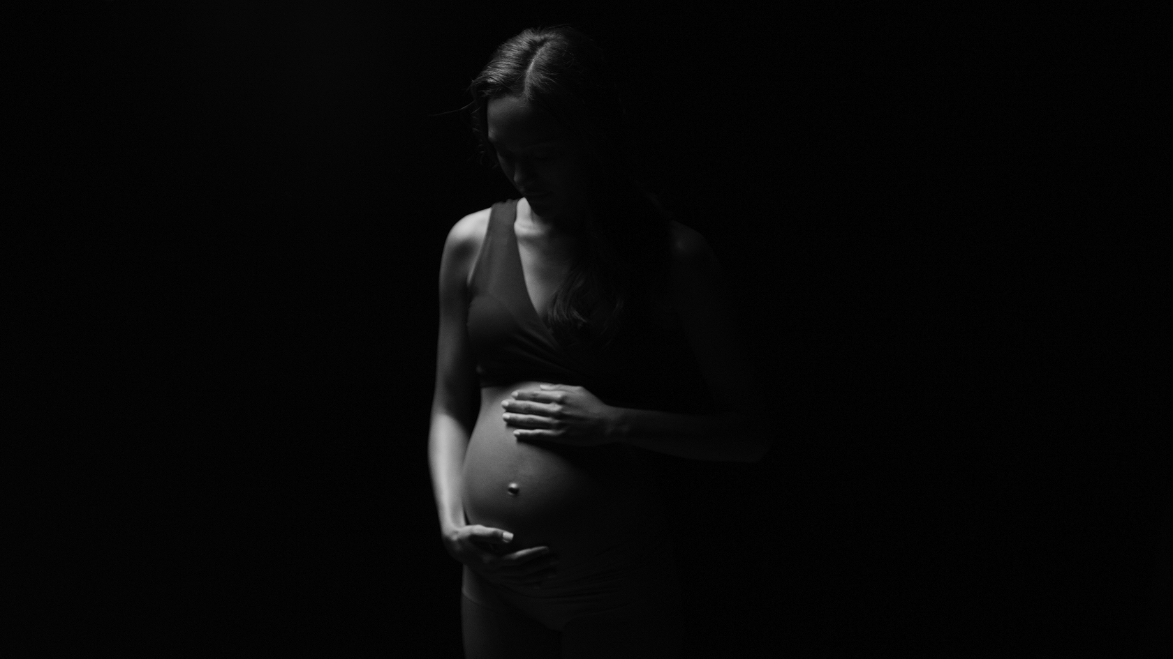
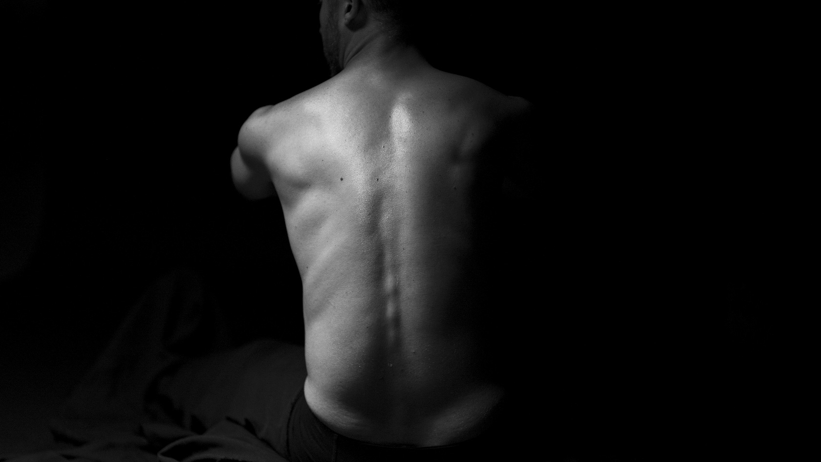
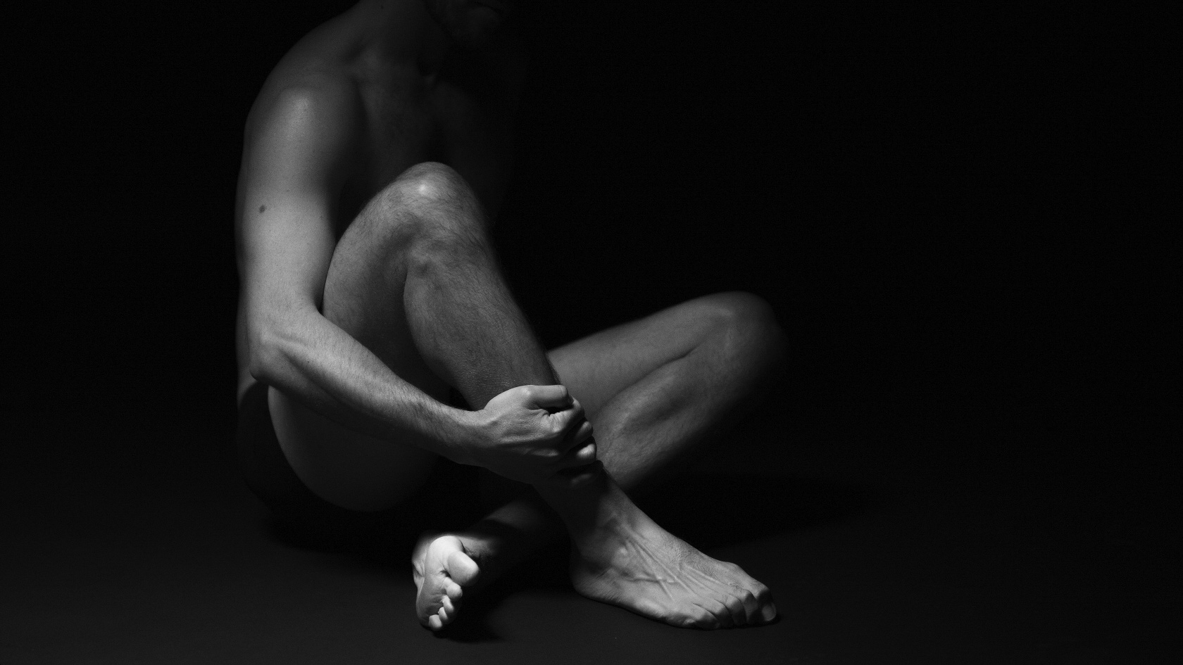
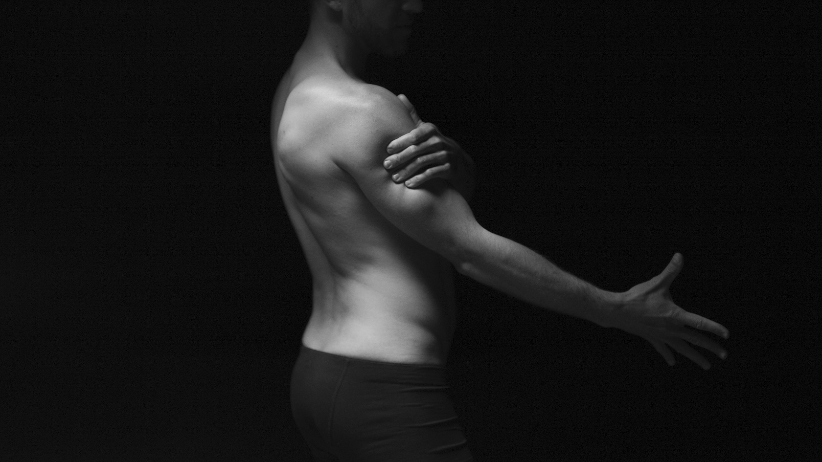
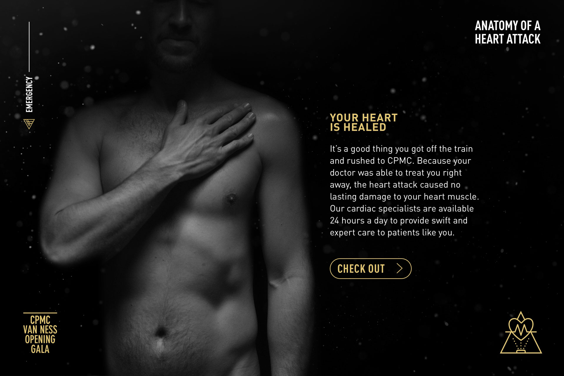
The first key component of the design system was high-contrast black and white photography which we would use to represent patients across various installations. We casted four diverse models and spent one day in the studio posing and lighting each model in intimate avant-garde poses. We deliberately obscured most of their faces to create moments that guests of the gala could project themselves into each experience situation.
Icon Language
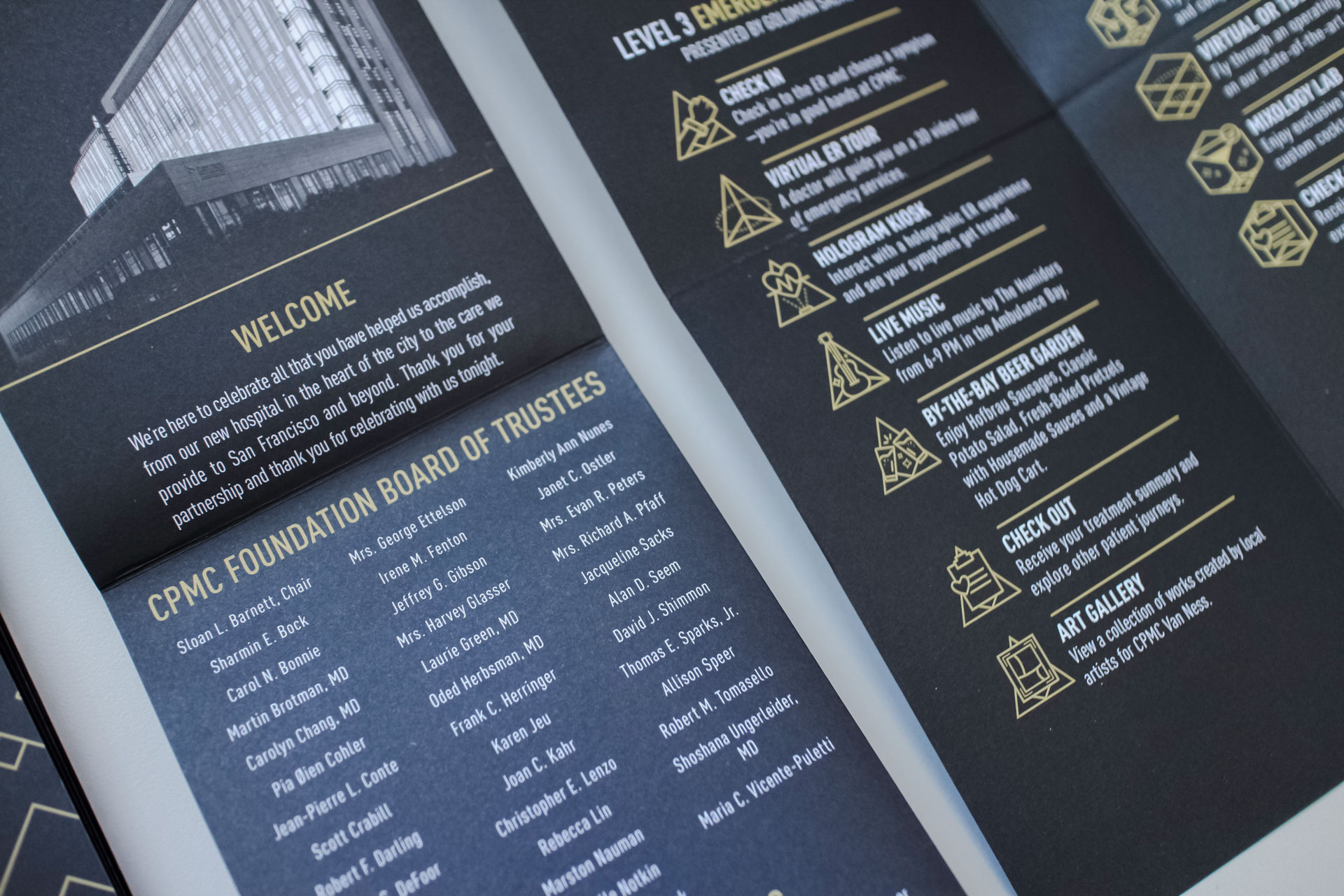
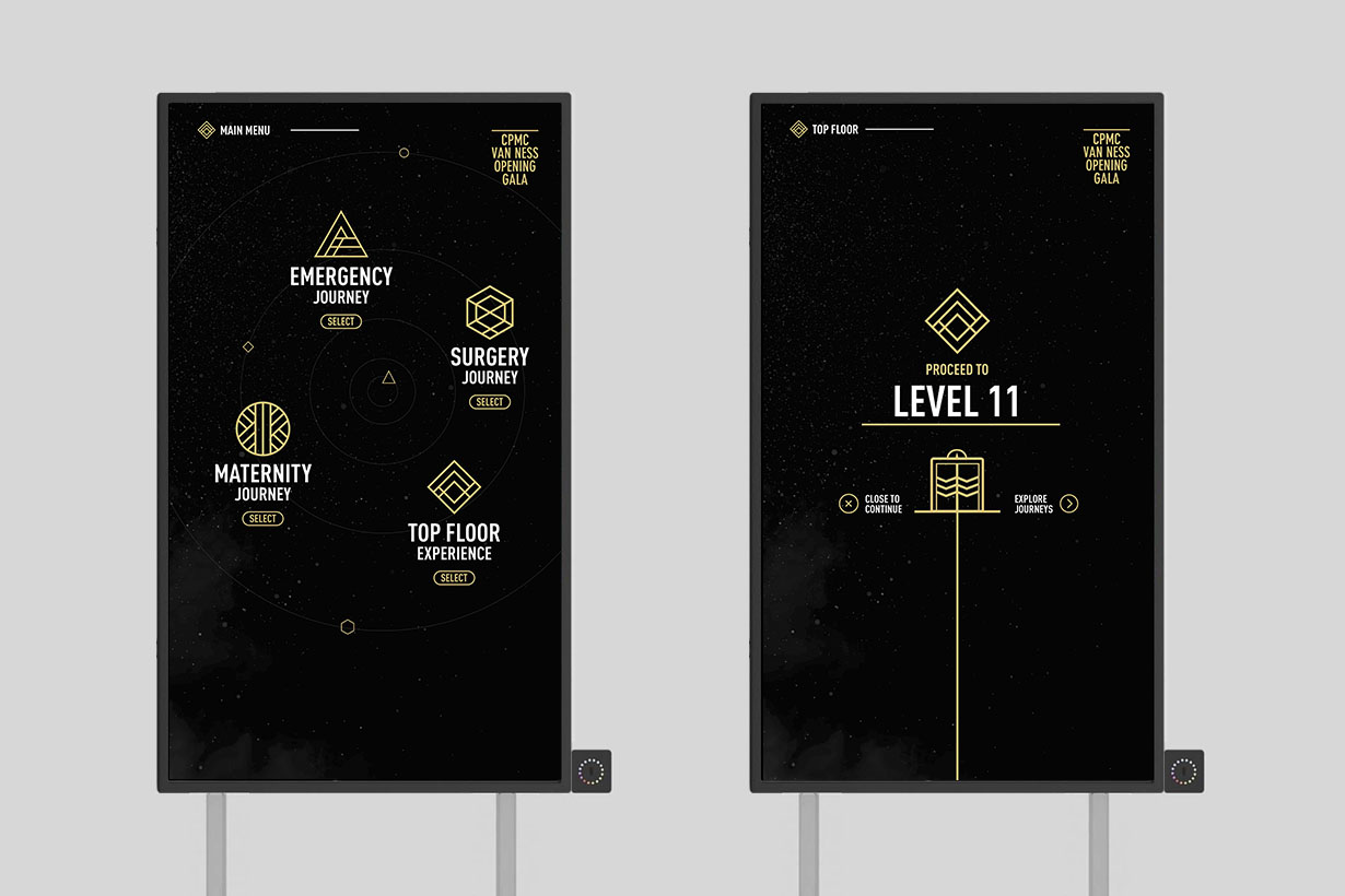
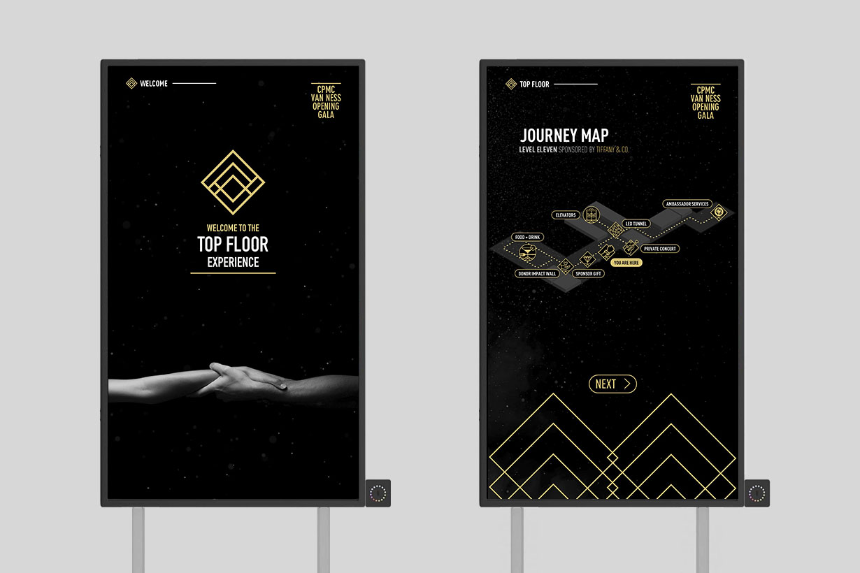
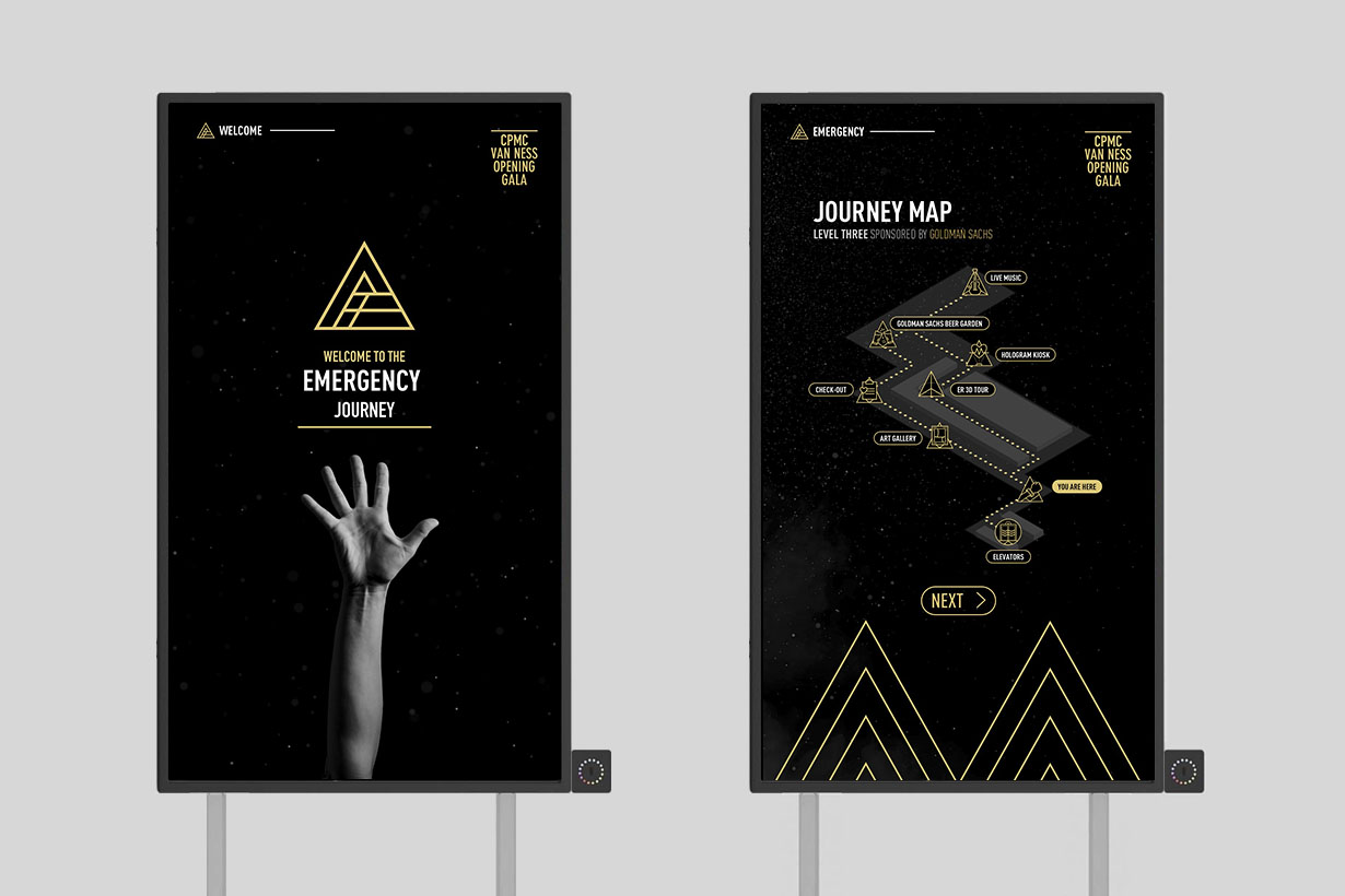
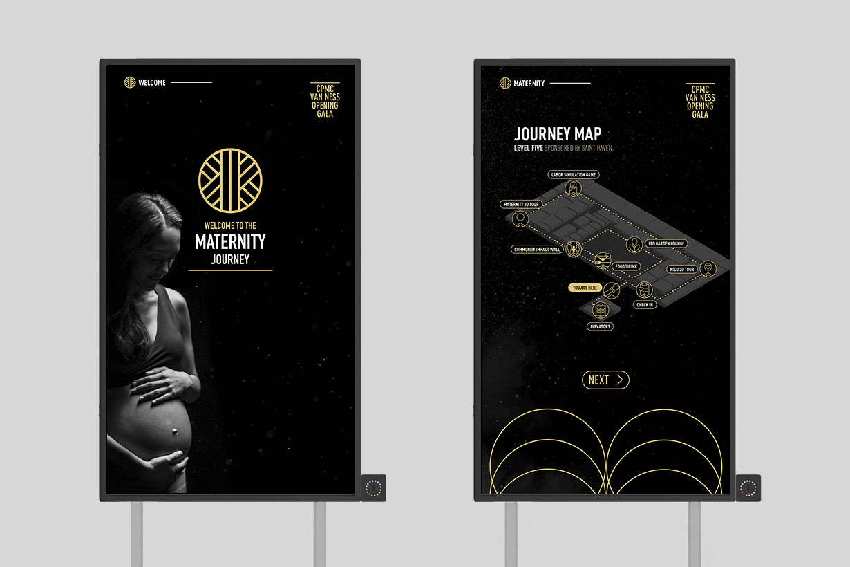
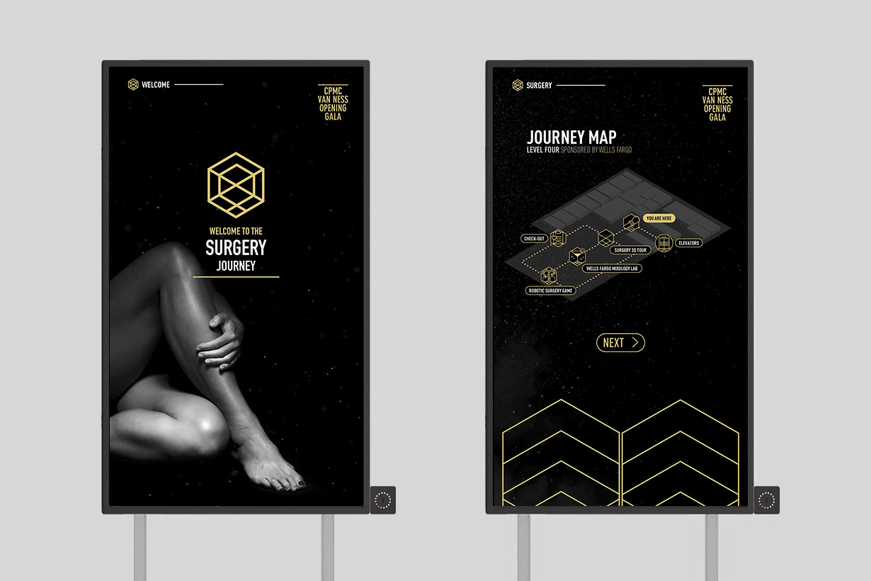
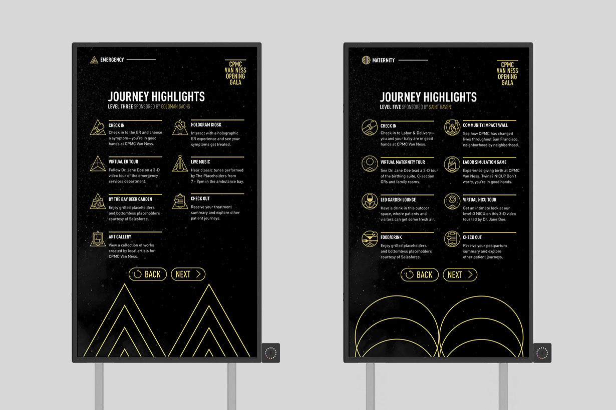
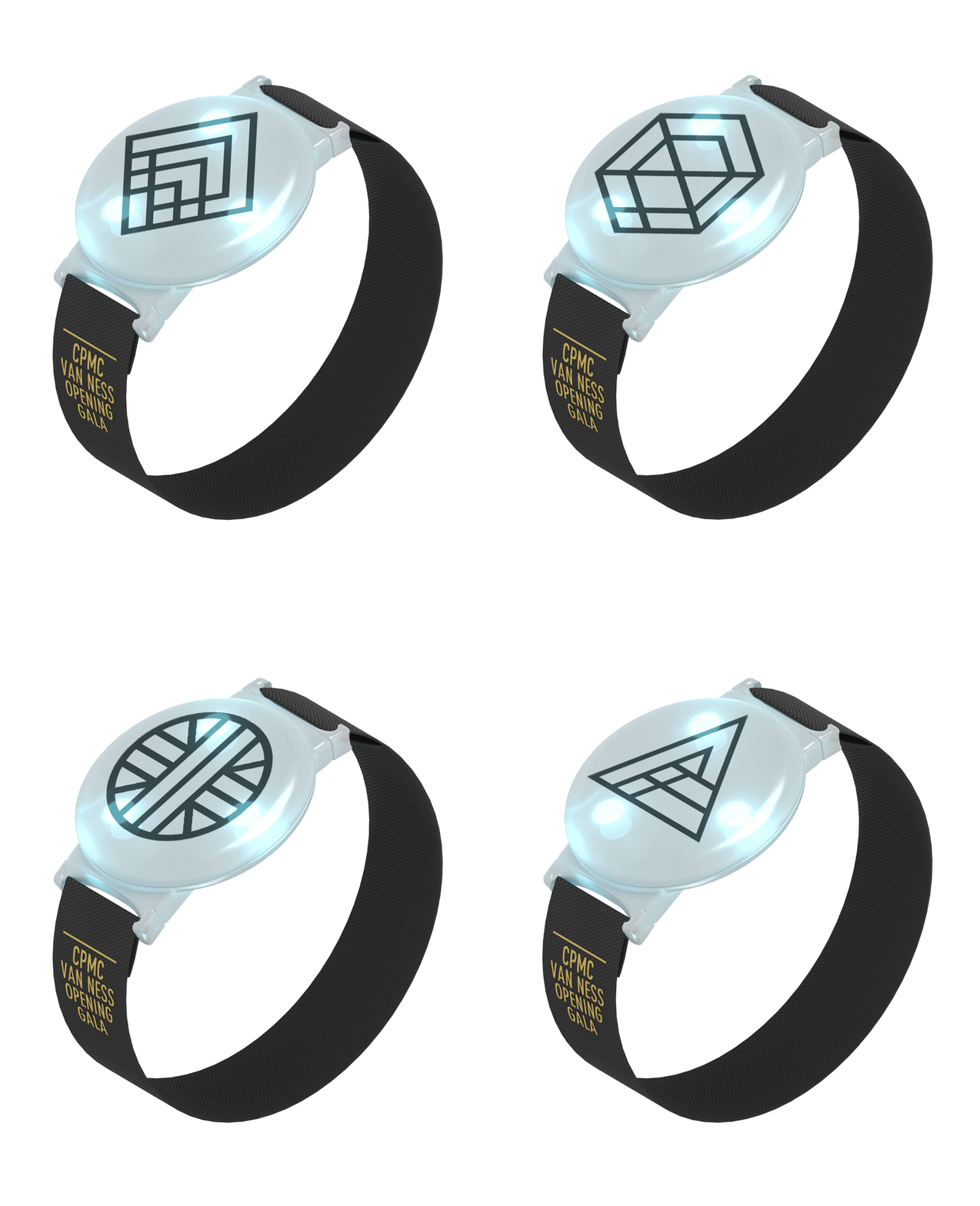
With five floors of the hospital activated and over 750 guests expected—we knew early on that we wanted to create themed patient journeys for each guest. I conceived of and designed the patient journey icons to not only brand each track but to create a conversation piece between guests on different journeys. The emergency track represents power and a compass, pointing in the direction of a diagnosis; the maternity journey represents growth and water; the surgery track represents intelligence and precise science and lastly, the VIP diamond represents prestige.

The full icons language was used throughout all print communication, wayfinding, and to identify individual installations. Working with and managing a design contractor, we conceived and designed over 30 icons—each with their own narrative element to help direct guests throughout the hosptial.
Print Design
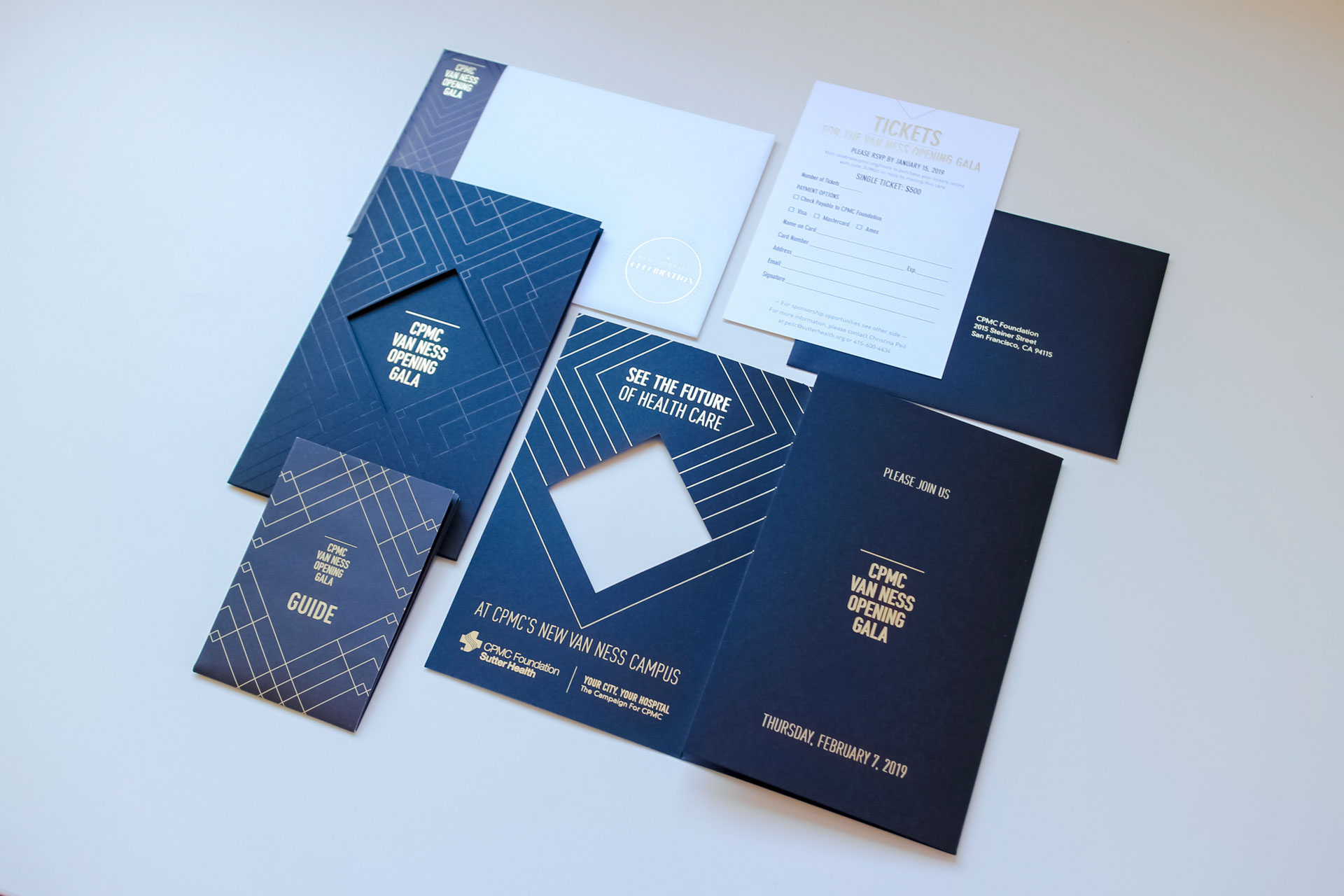
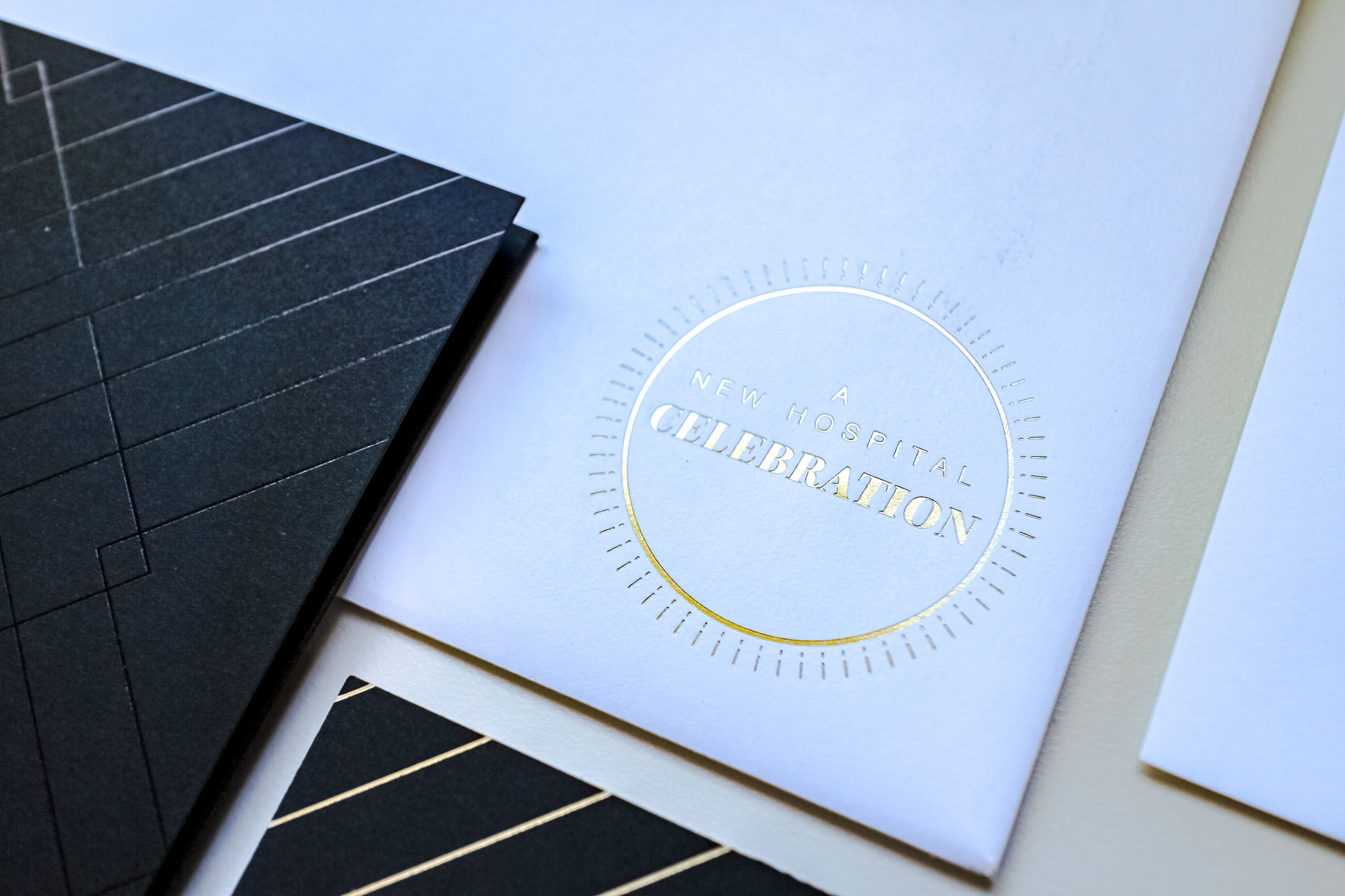
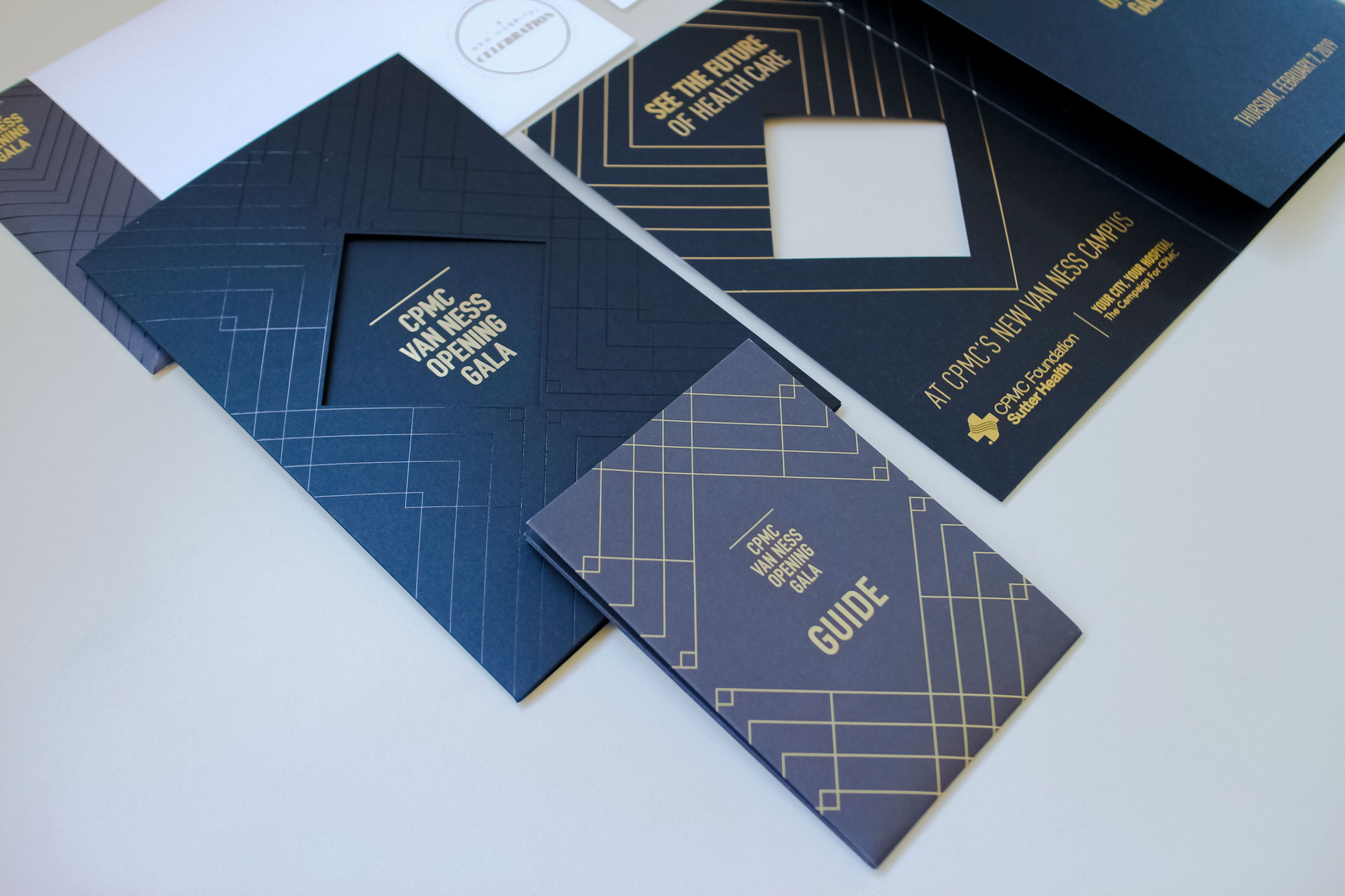
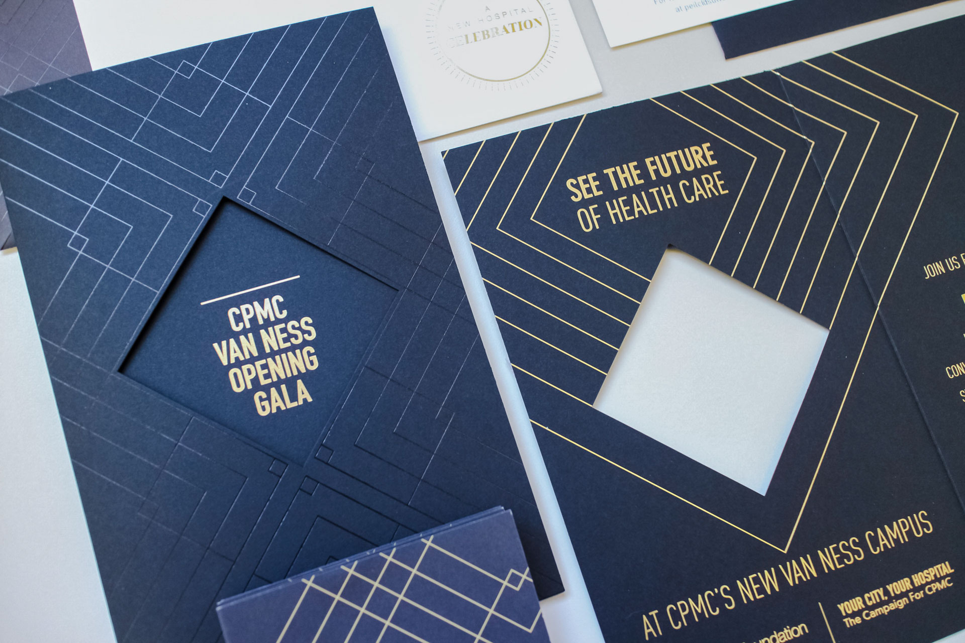
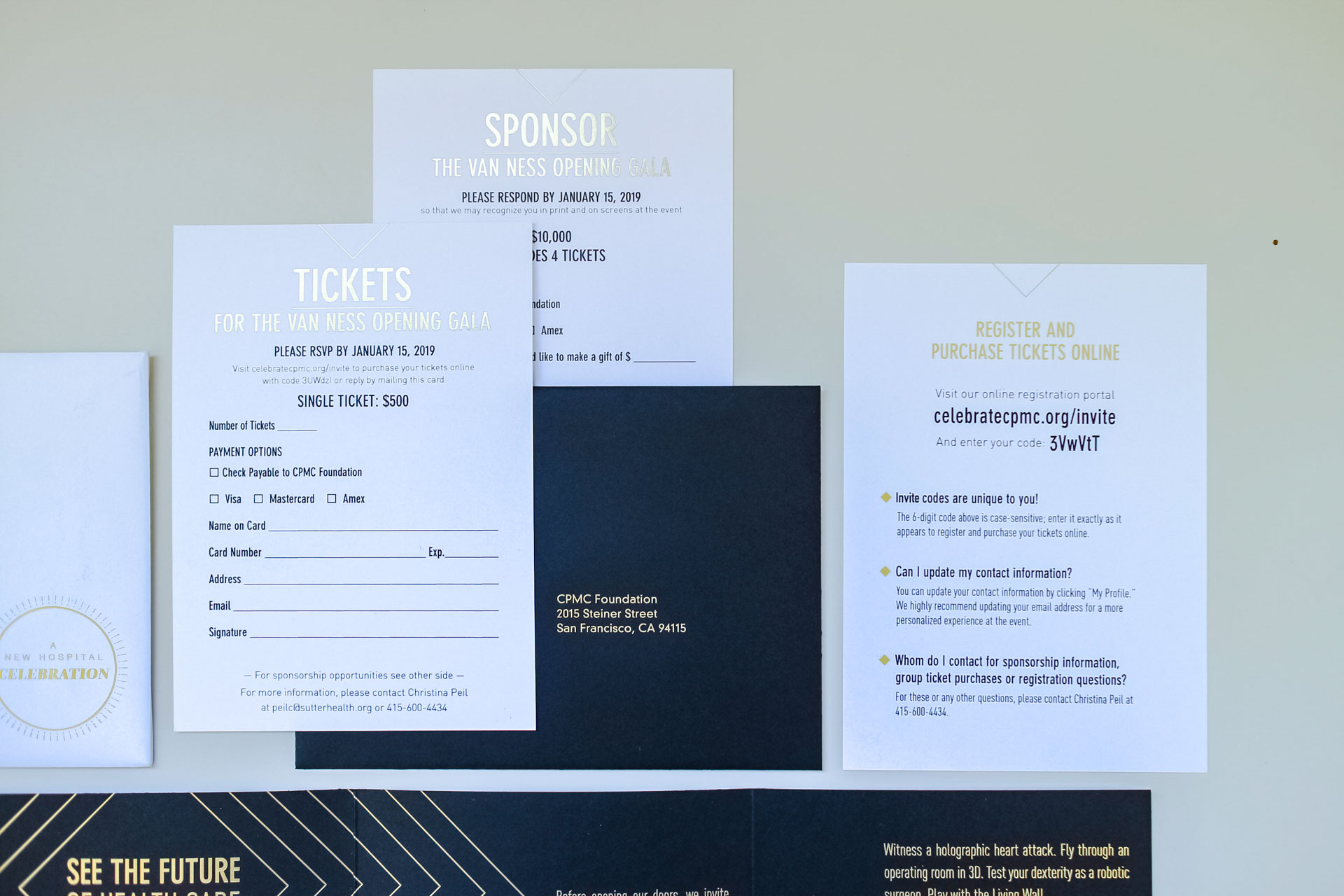
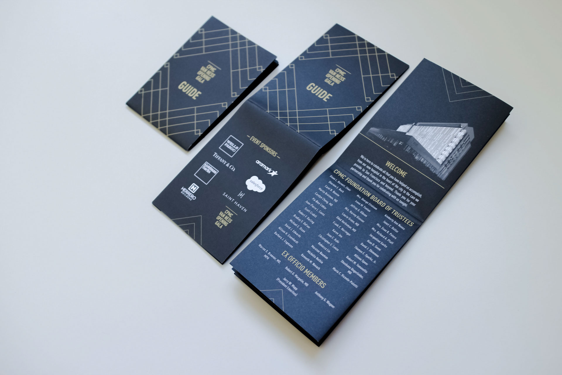
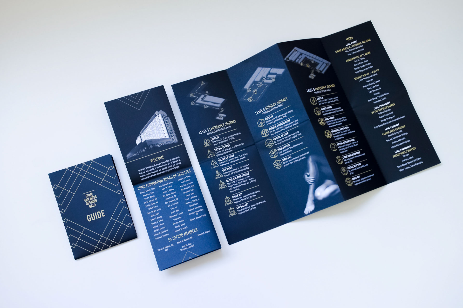
Guests were mailed elegantly printed invitations that leveraged key elements from the design system to provide guests with a consistent experience from save the date to gala night. I worked with and managed a designer who took our early explorations and designed the final invitation suite and pocket event guide. One key element on the invitation is a spot-varnished seamless pattern that is also used within the Living Wall experience.
Lobby
Experience.
Guest Check-In
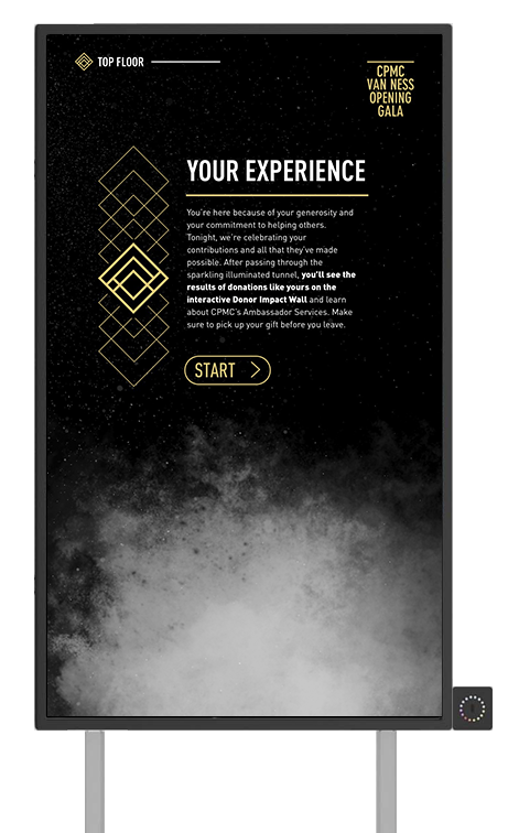
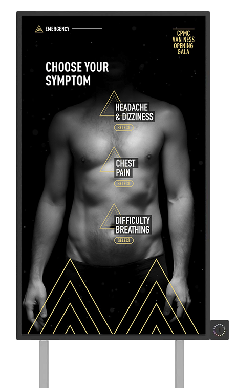
Guests were prompted at registration to choose from either the Emergency, Maternity, Surgery, or VIP experience and were provided with a Bluetooth wearable marked with their journey of choice. Upon arrival, attendees were greeted with nearly a dozen connected screens detailing the patient journey and how to use their wearable to personalize each screen they encountered. I was responsible for the design and creative direction of the lobby screens and spent a few nights before the event hand applying track stickers to each wearable.
Living Wall
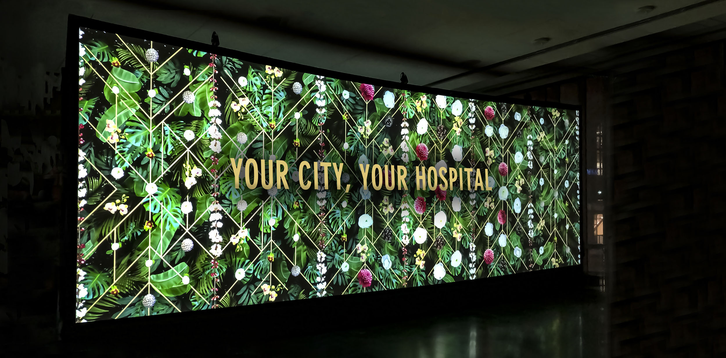
The living wall was a 30′ x 10′ project mapped interactive experience that represented the natural earth portion of our design system story. Built with Touch Designer, the experience featured five distinct layers of content: Particles, Leaves, Visual System Pattern, Flowers, and Easter Egg surprises. When guests walked past the wall, the flowers bloomed based on their movement. If a guest stood in the same place long enough, hummingbirds and butterflies would flutter into view. Having conceived, designed, and creative directed the wall—I learned from this installation how to build visually stunning large-scale interactive pieces in Touch Designer.
Wayfinding
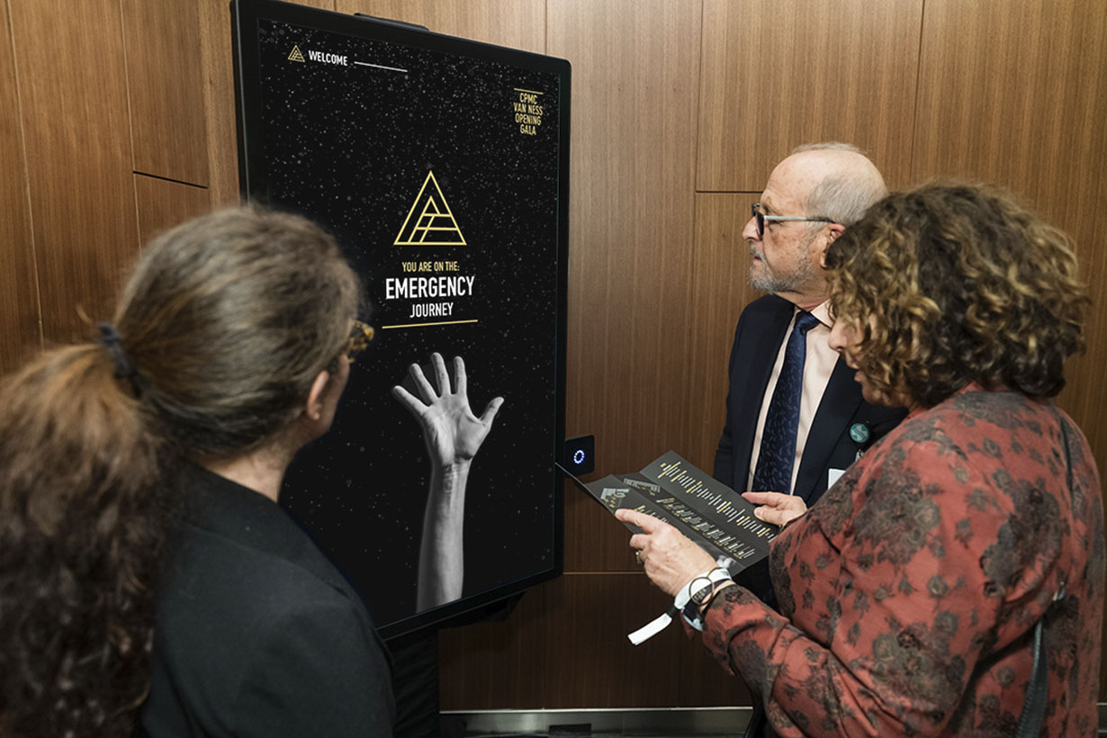
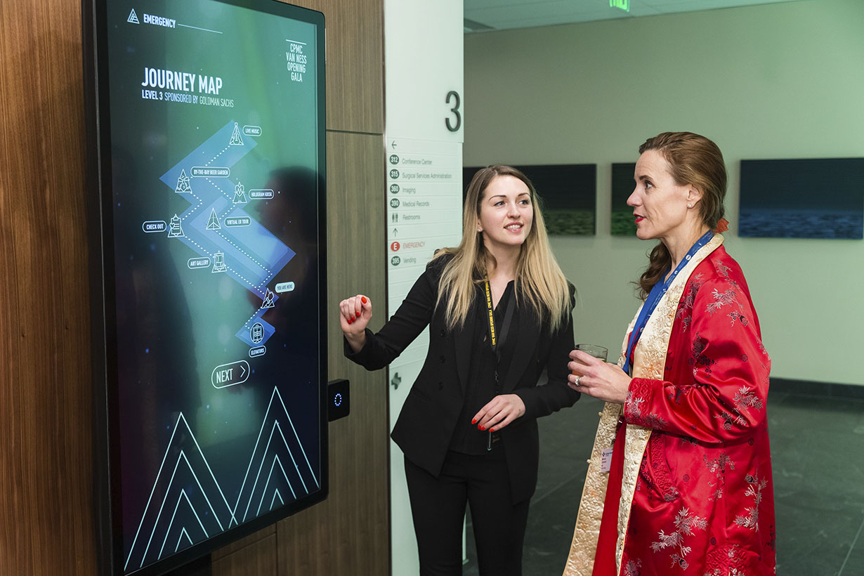
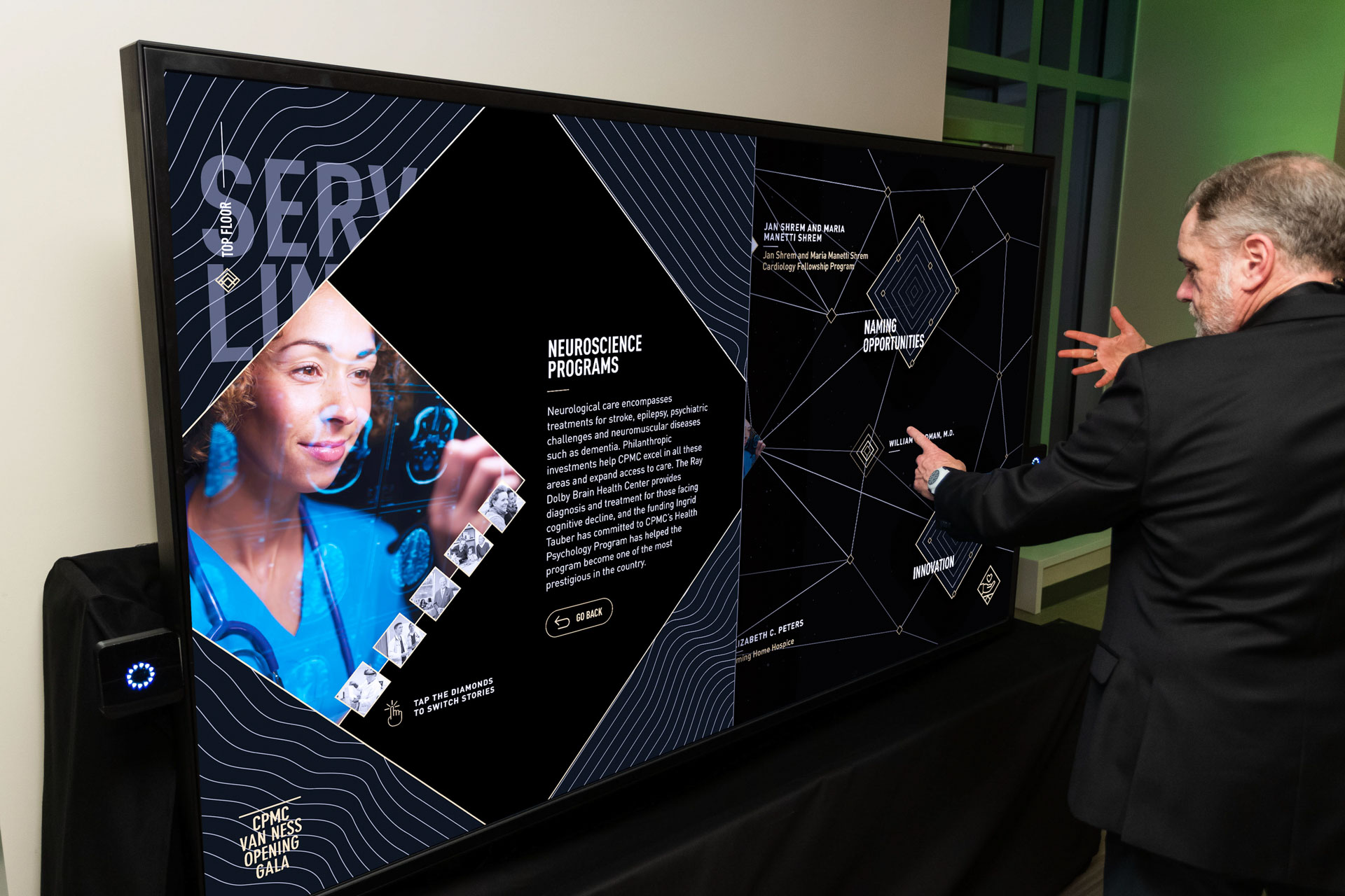
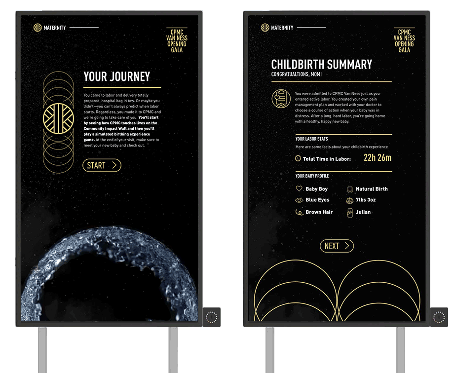
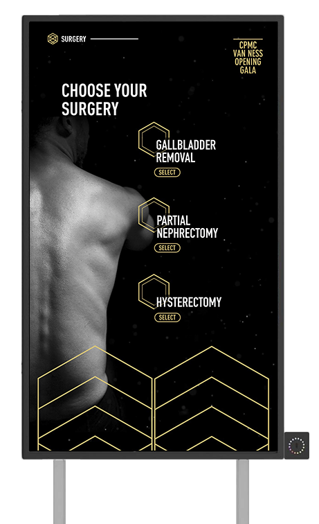
A key piece of the work I designed for this event is the wayfinding system, which was placed across each floor of the hospital on 15+ connected screens all with journey specific content. Affixed to each screen was a Bluetooth sensor that would read a guest’s wearable and personalize the content on the screen. Each user journey had its unique look and feel consistent with the visual system and ended with a menu system laid out like a solar system.
Emergency
Journey.
ER Check-In
The user journey we designed for guests on the Emergency Journey was created with the close collaboration of Sutter’s incredible physicians. At check-in, a guest chose which ailment they were there to treat: Double Vision, Chest Pain, or Difficulty Breathing. These selections were stored in a user’s profile and as the guest moved through the emergency department—their ailment followed them at each installation, taking them through a simulated patient experience based on the recommended treatment.
ER Check Out
The narrative continued on a separate emergency journey checkout wayfinding screen where guests received their treatment summary for the ailment they selected at the start. In addition to a live interactive treatment report, guests also received a duplicate version at their personal email—creating and end to end experience for attendees.
Hologram Kiosk
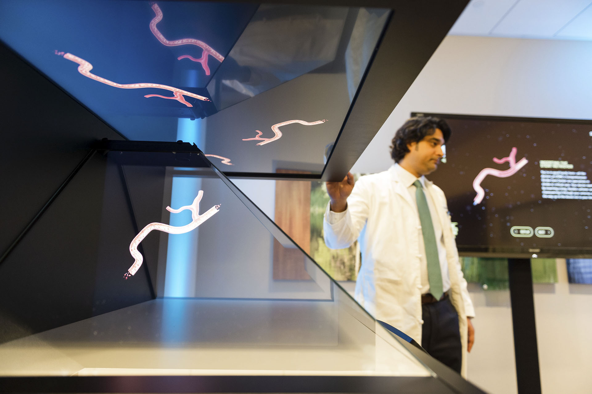
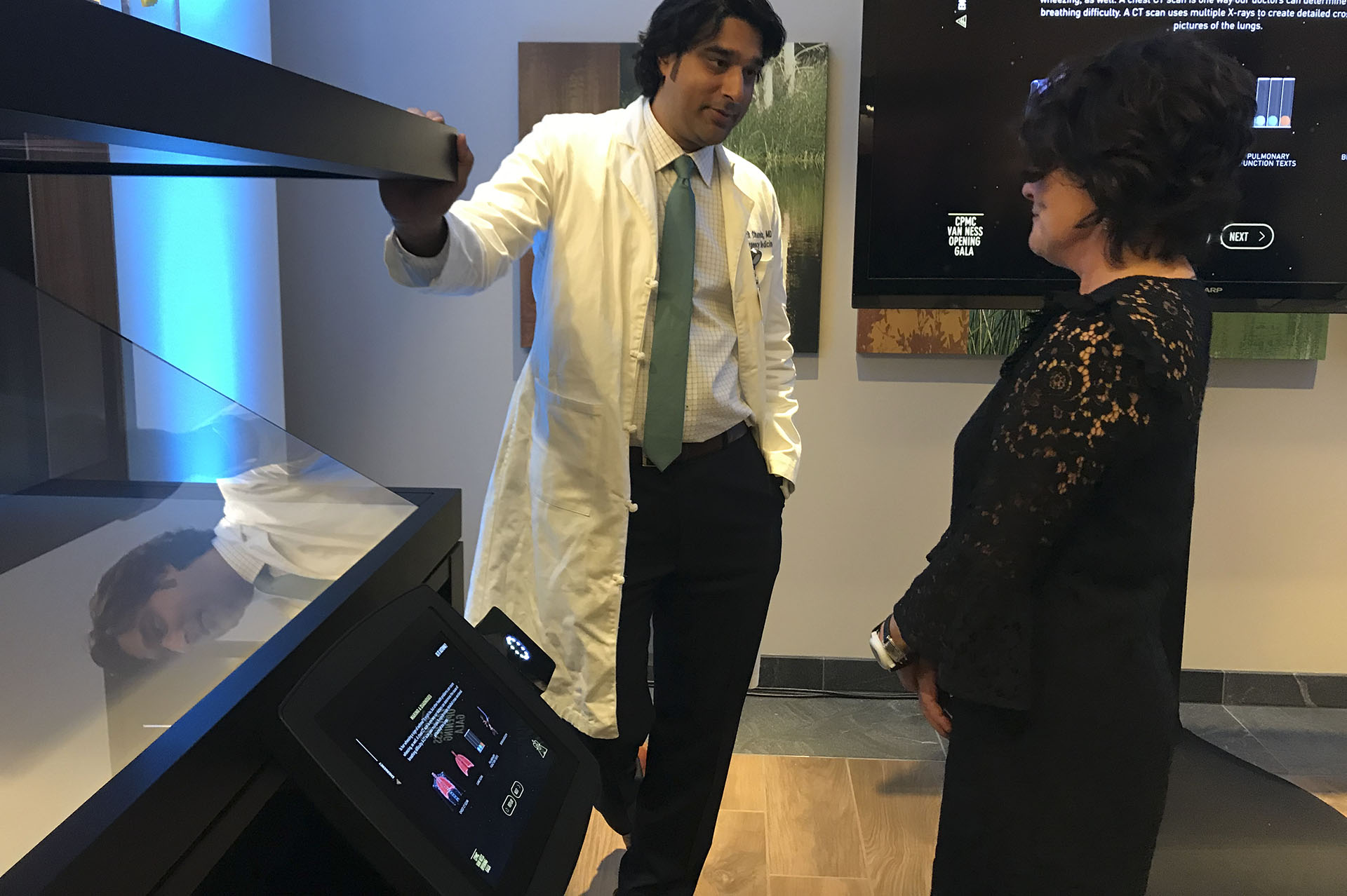
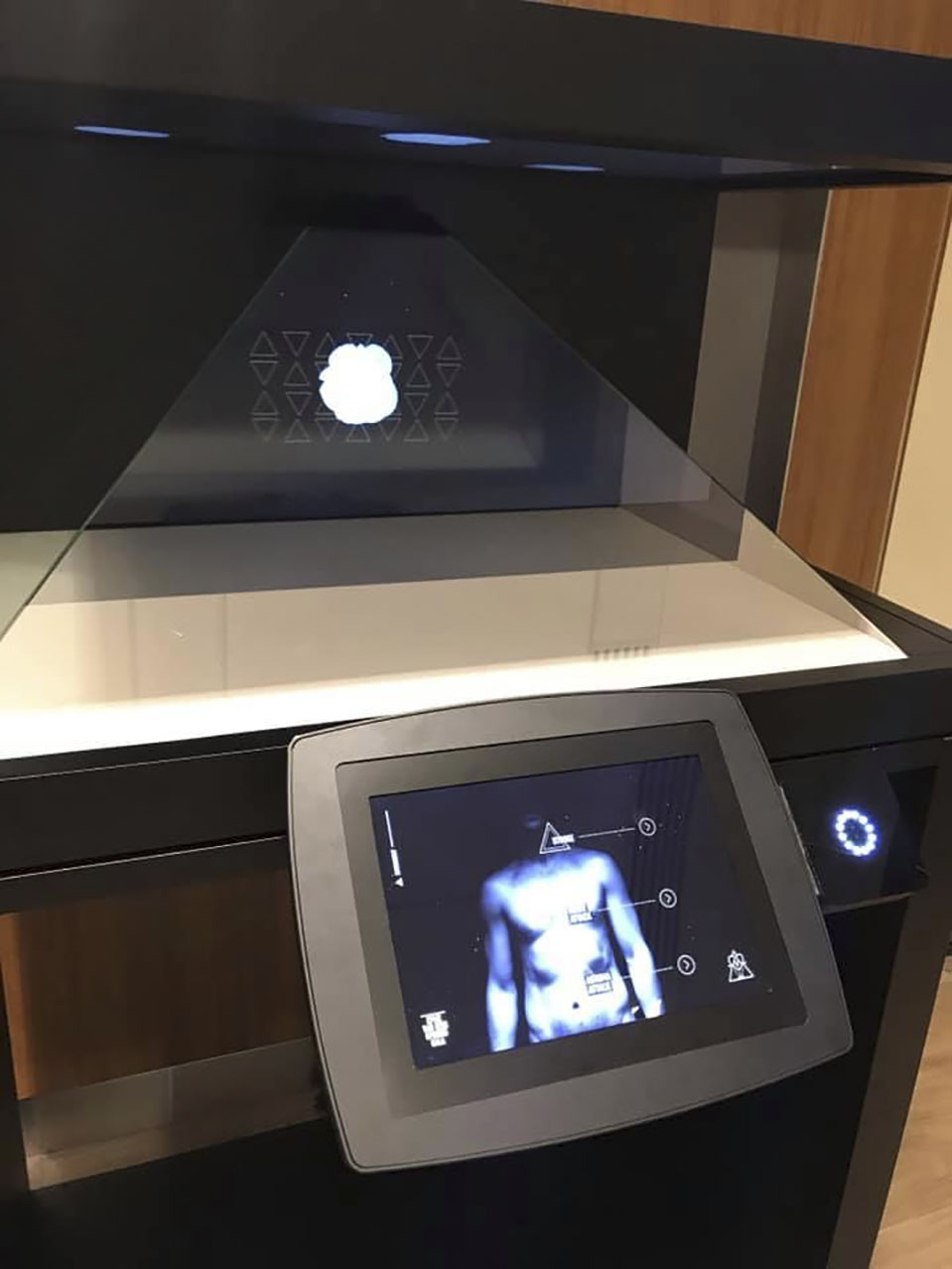
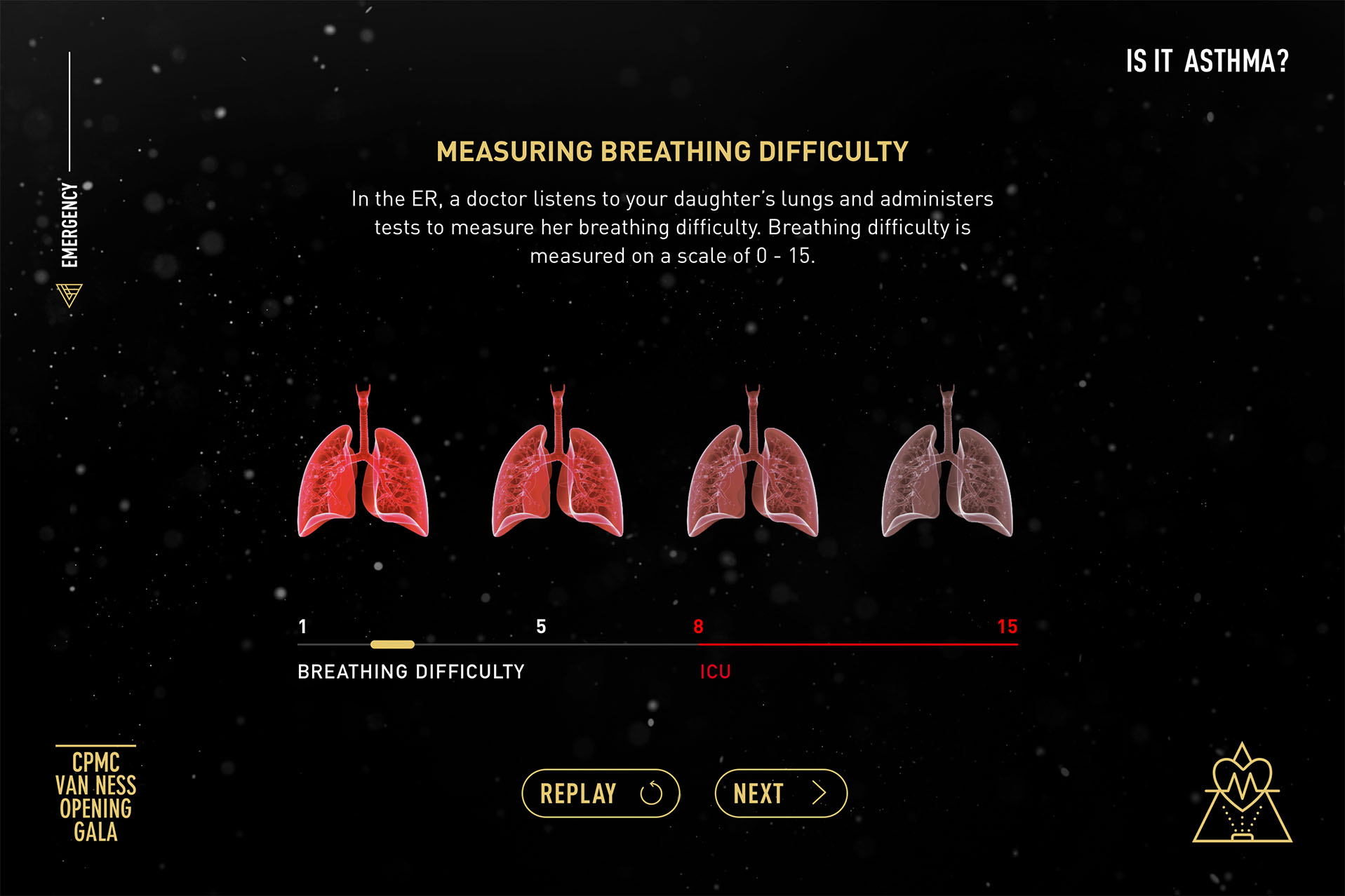
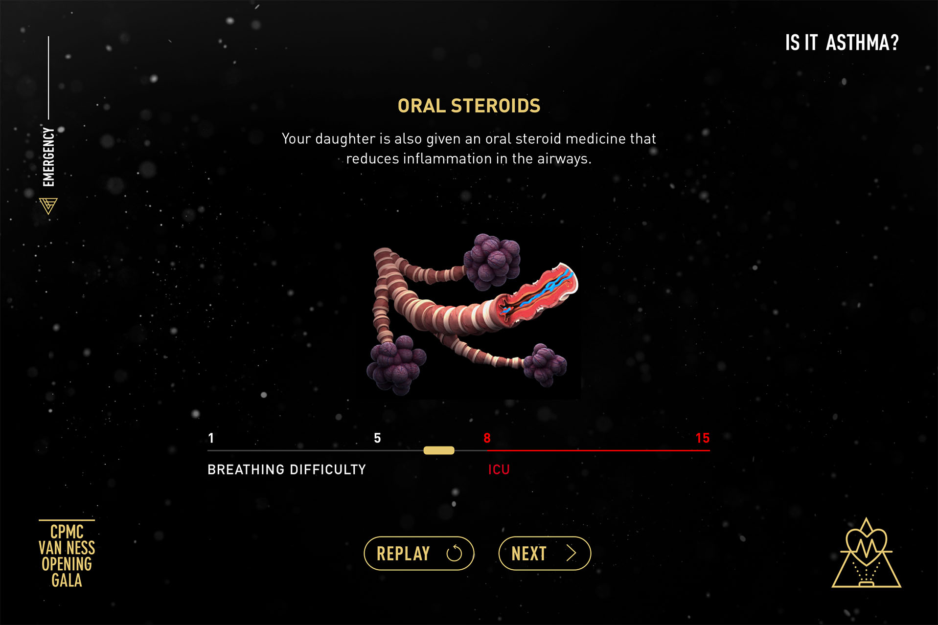
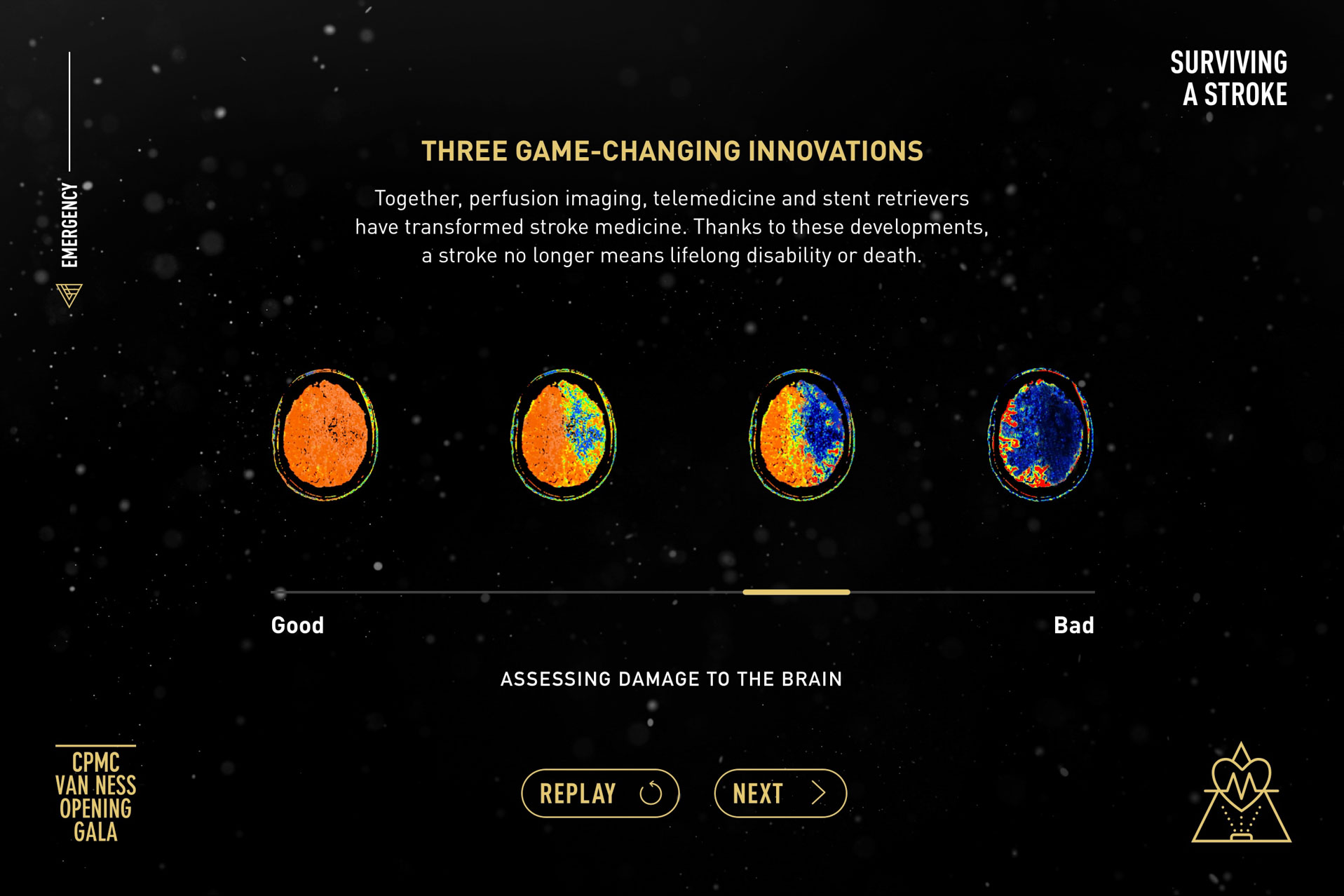
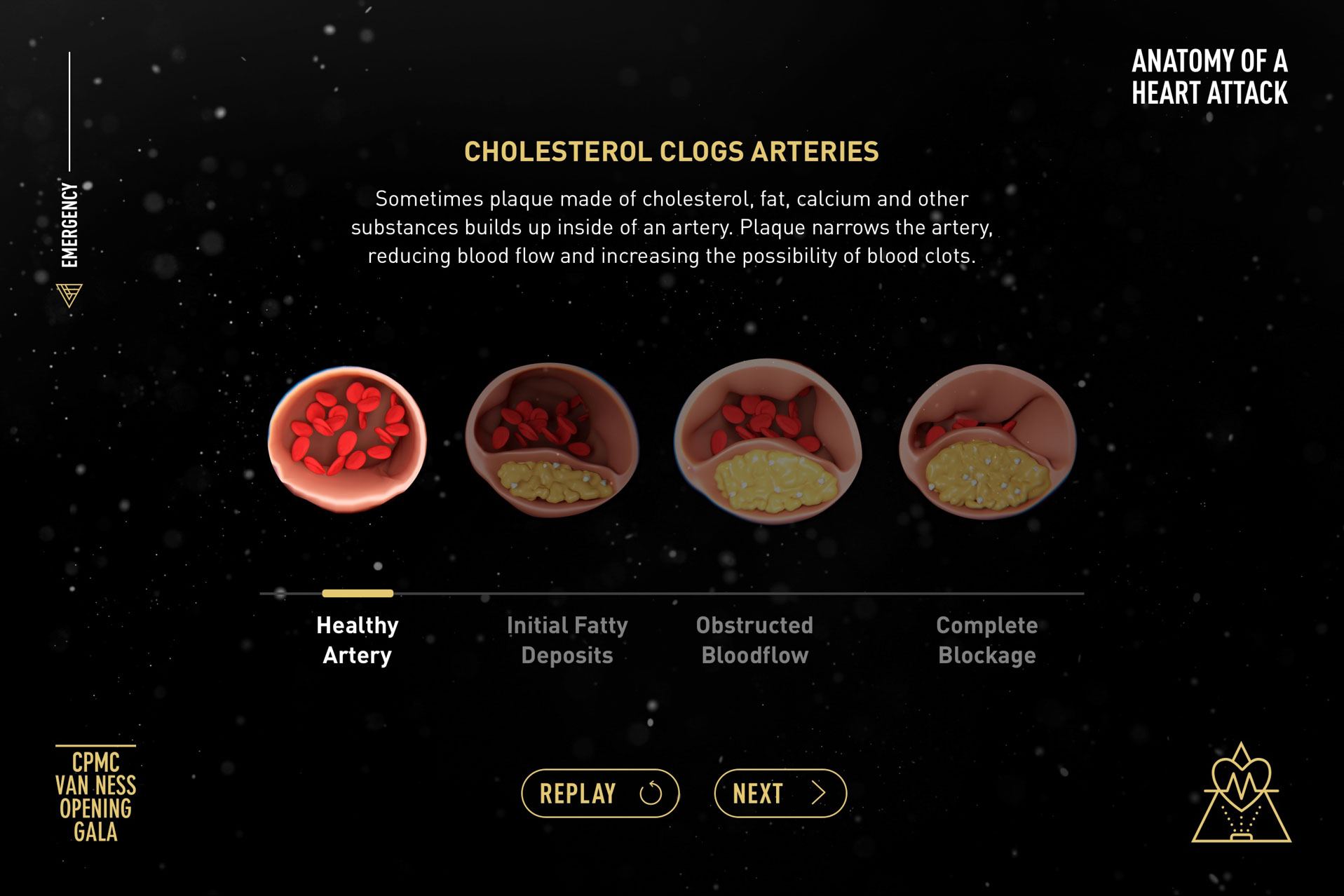
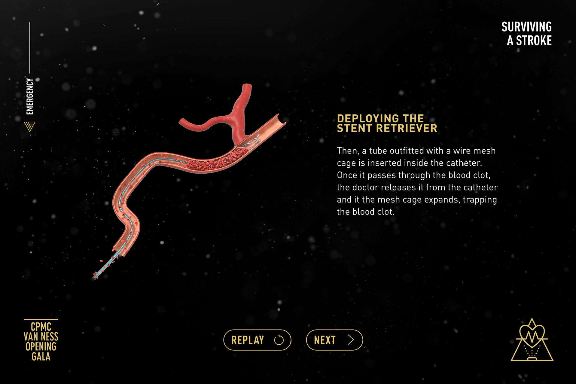
Working closely with Sutter’s emergency department physicians, we created a 3-screen educational experience featuring a DreamOC Hologram machine. This experience within the Emergency Journey was where guests learned about the groundbreaking treatments being pioneered by Sutter’s physicians to treat: Cranial Blood Clots, Pediatric Asthma, and Heart Attacks. This experience required a significant amount of scientific research and collaboration in order to break down these incredibly complicated procedures into an engaging interactive tablet and hologram-based narrative. My role encompassed research, user journey development, design concept development, and management of an interactive and 3D designer.
Maternity
Journey.
Maternity Check-In
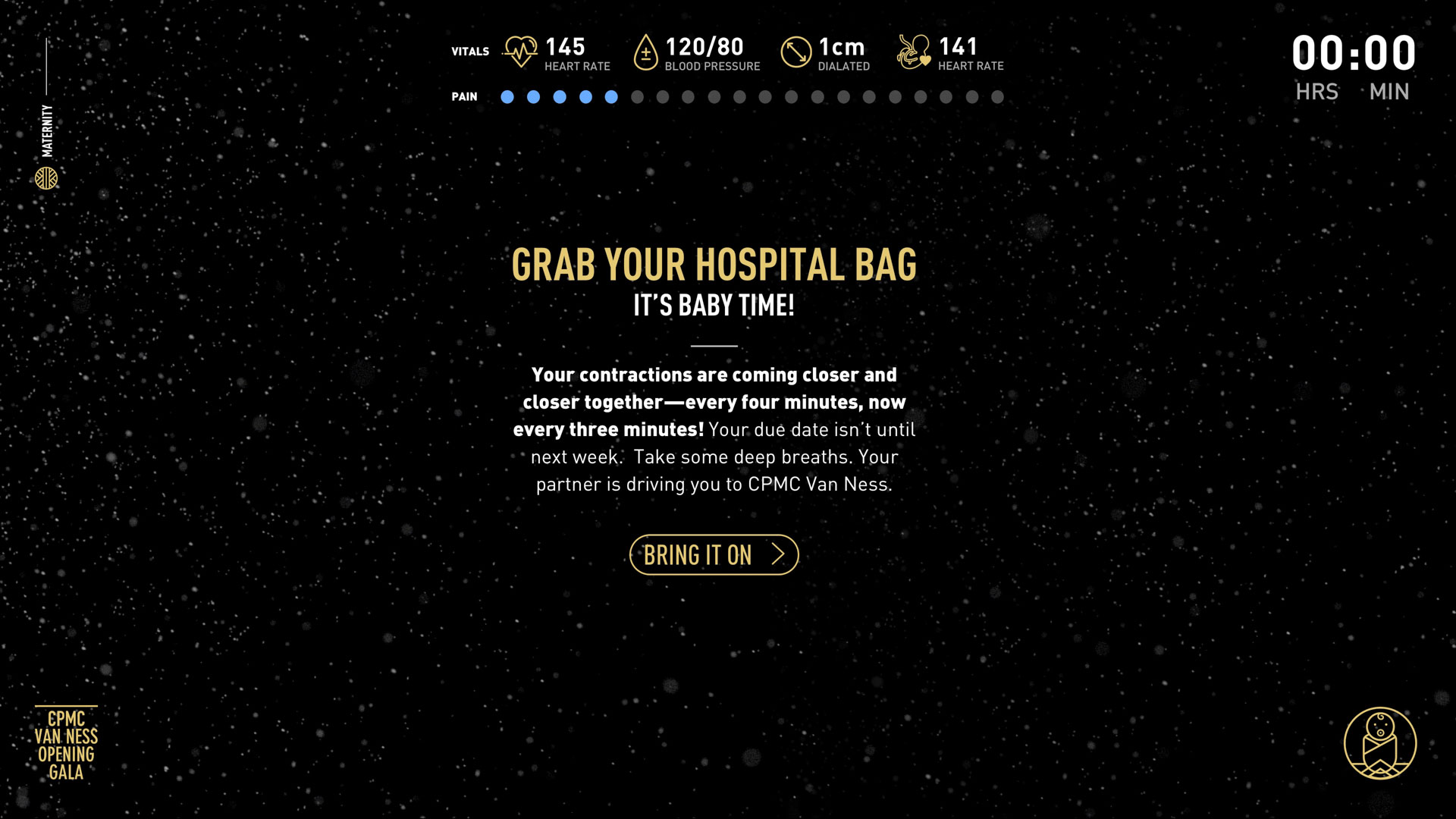
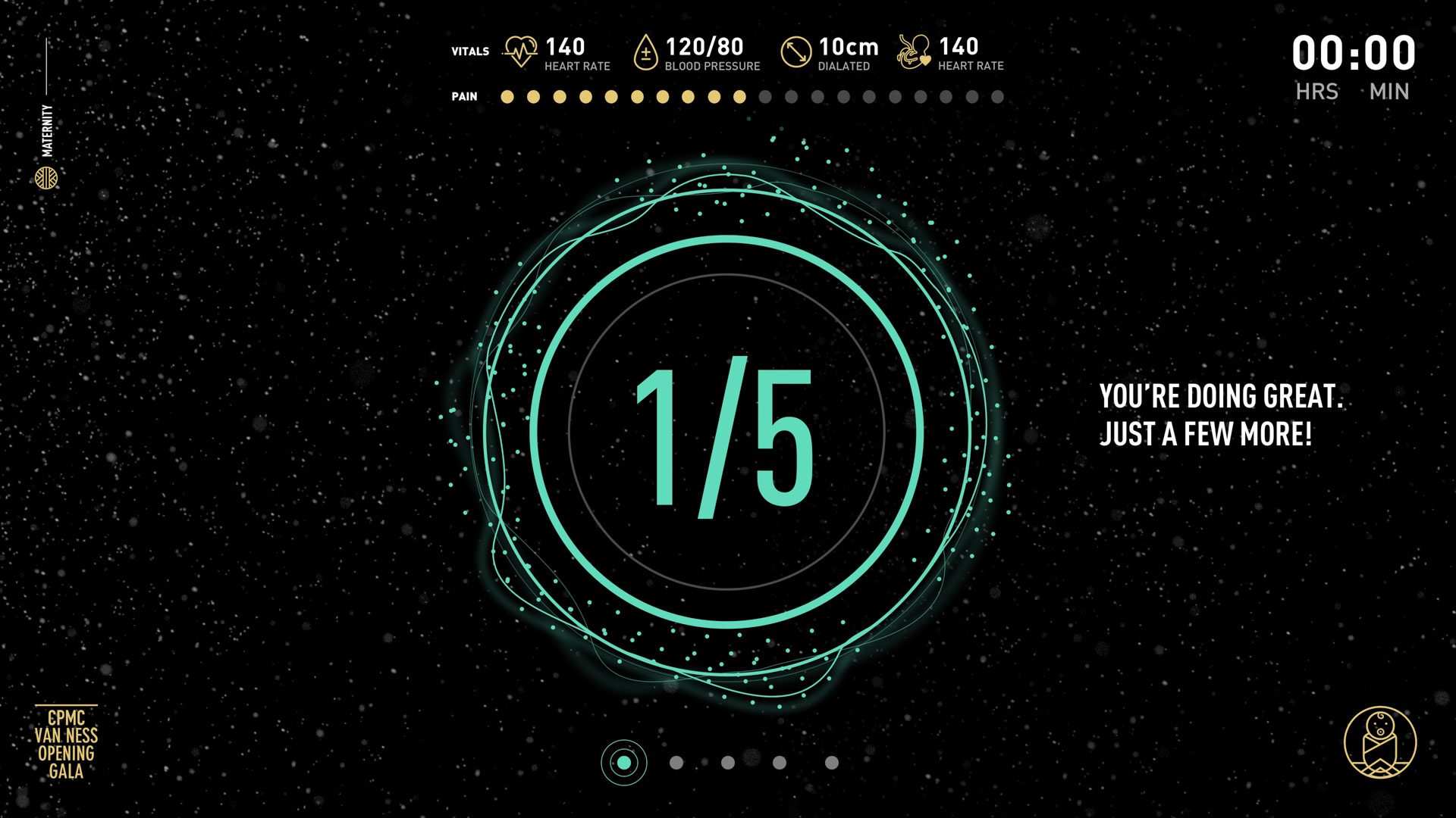
The user journey we designed for guests on the Maternity Journey was created with the close collaboration of Sutter’s incredible physicians. At check-in, guests learned about their labor status and given an overview of the experiences on the floor. Once an expectant guest was checked in, they were led towards the labor and delivery department where a labor simulation game awaited.
Maternity Check Out
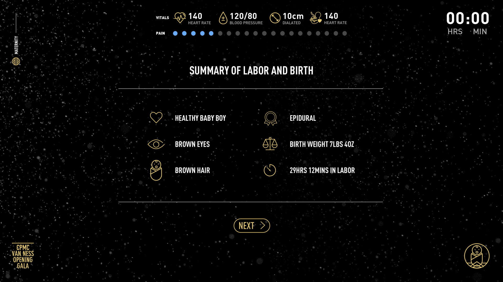
The narrative continued on a separate maternity journey checkout wayfinding screen where guests were able to name their baby and receive their childbirth summary. In addition to a live interactive childbirth summary, guests also received a duplicate version at their personal email—creating and end to end experience for attendees.
Community Mural
The community mural was an interactive map of San Francisco that showcased twenty authentic Sutter patient stories. Working with a design contractor, we conceived a split-screen experience that infused the circular water theme for this track into each UI element. My role for this installation was the overall creative direction and management of the interactive and motion design contractors.
Labor Simulation Game
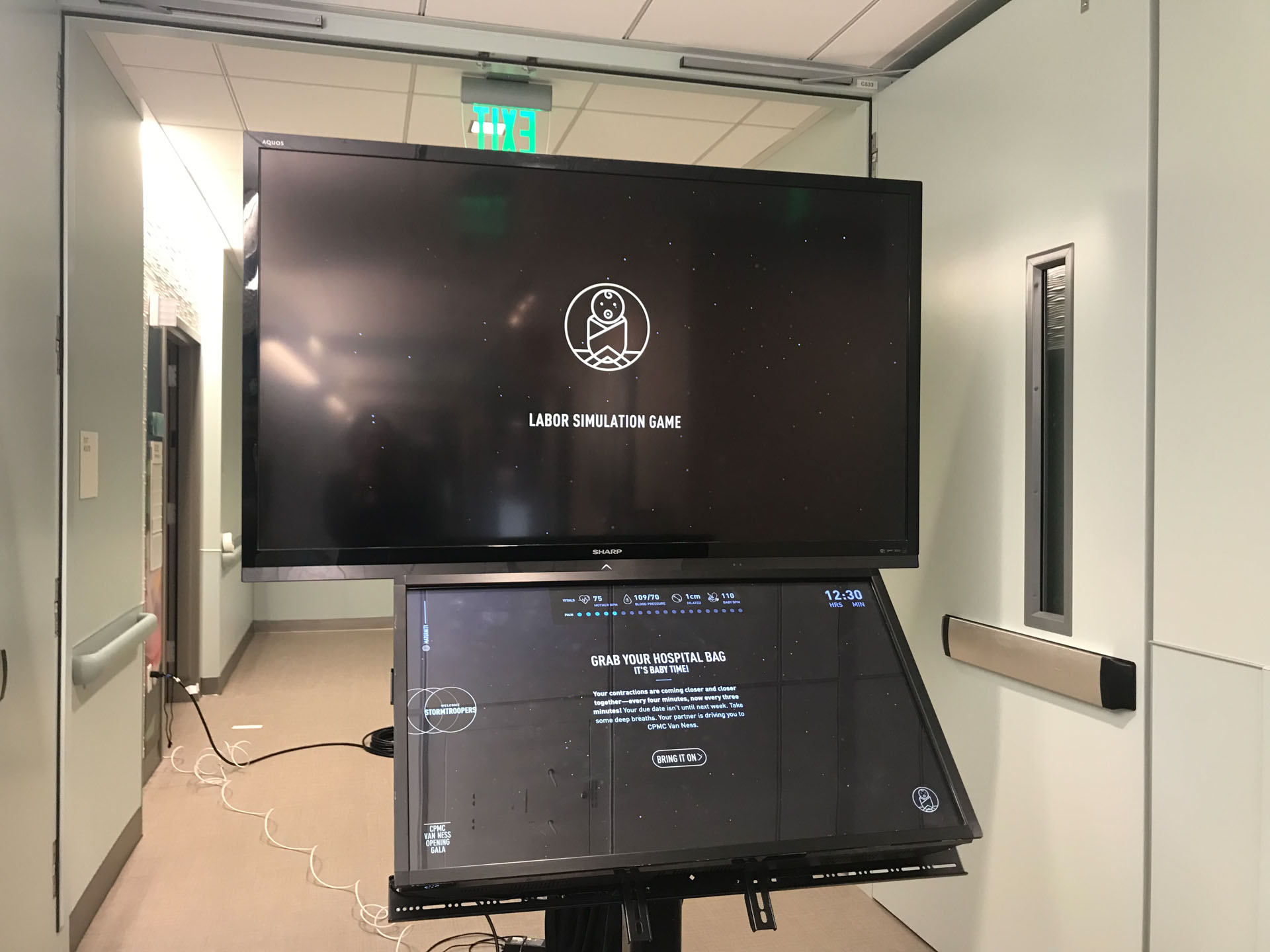
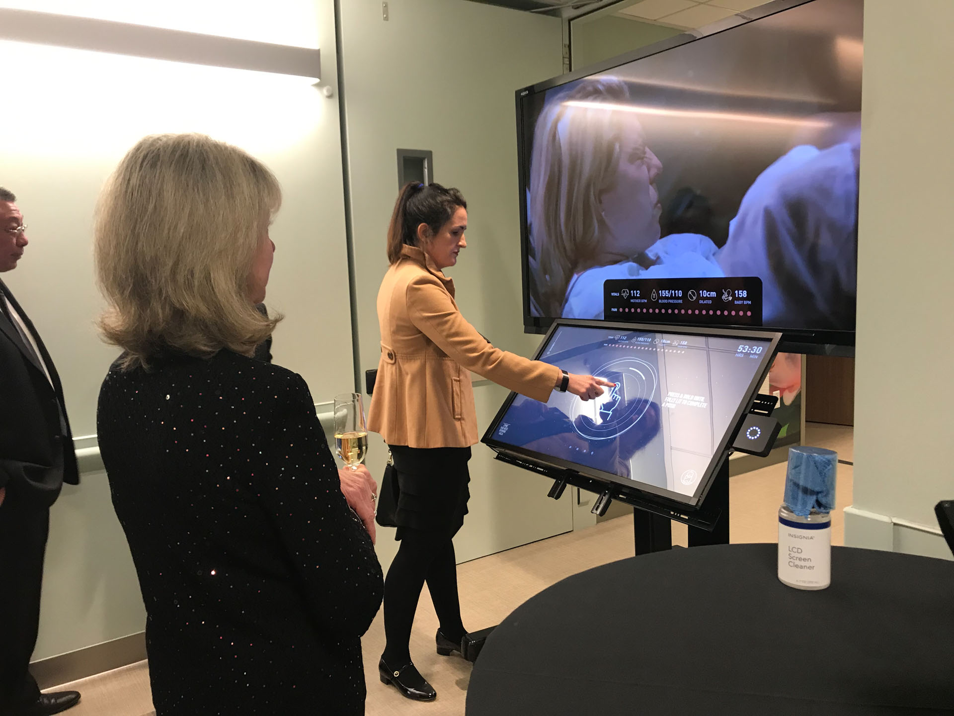
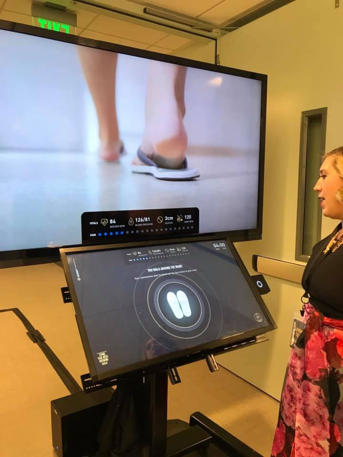
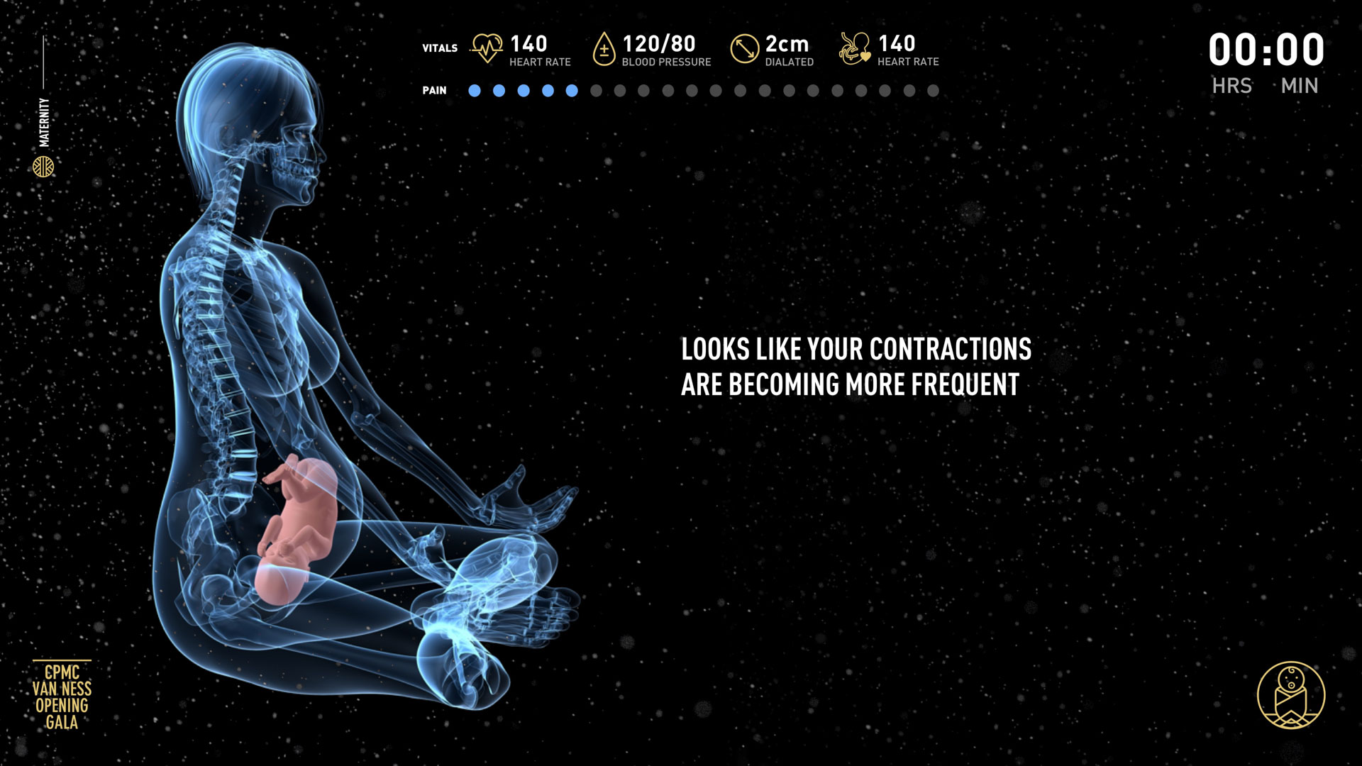
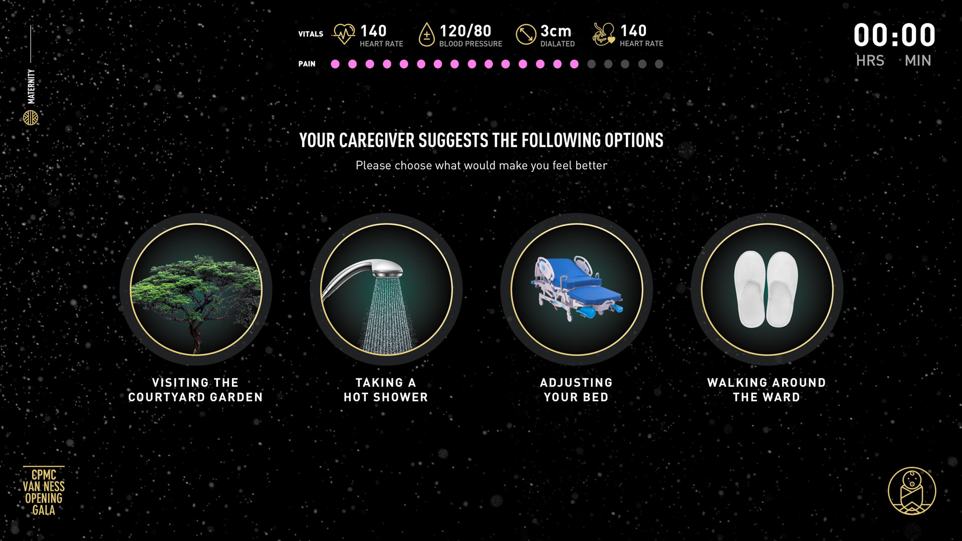
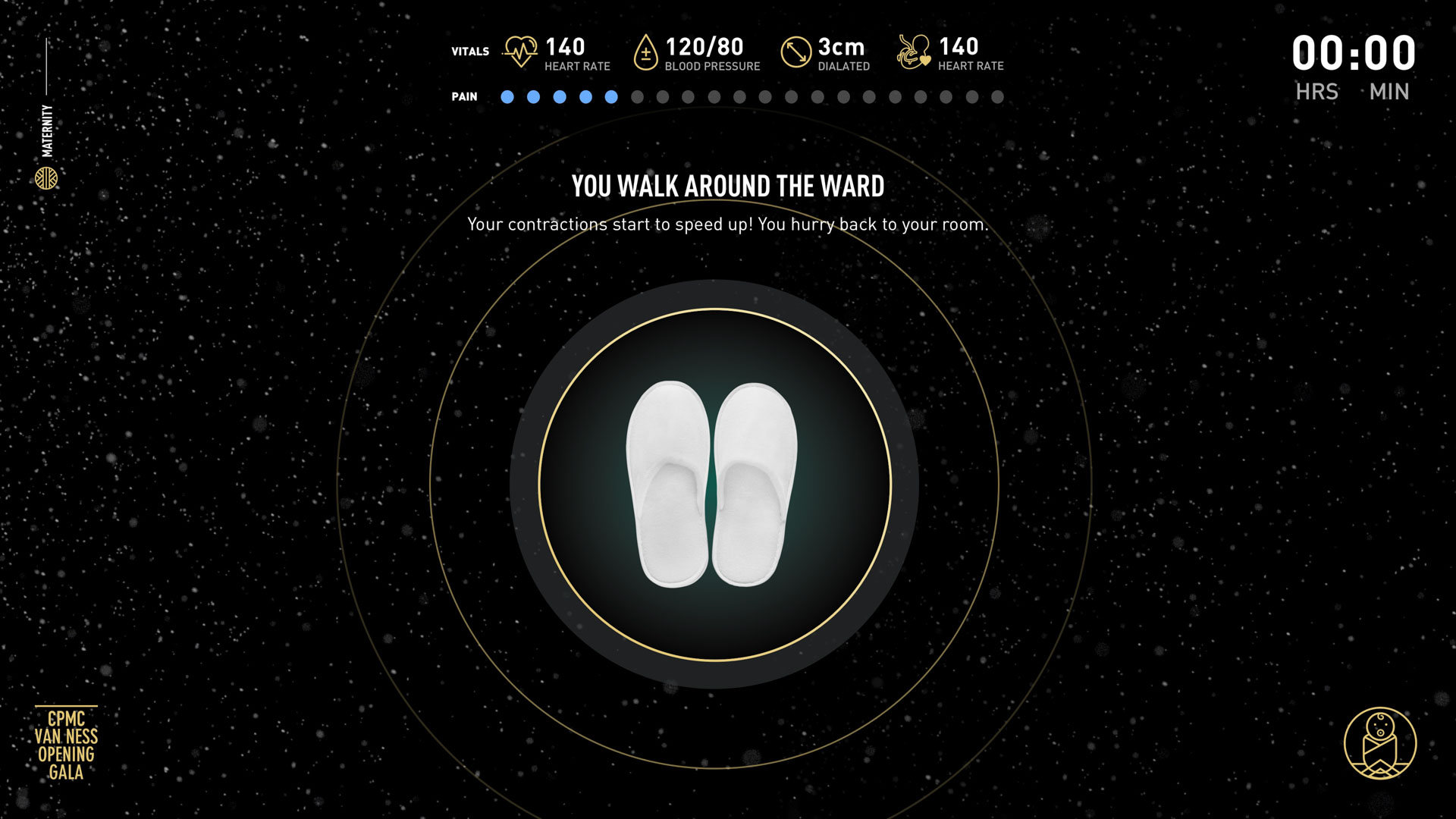
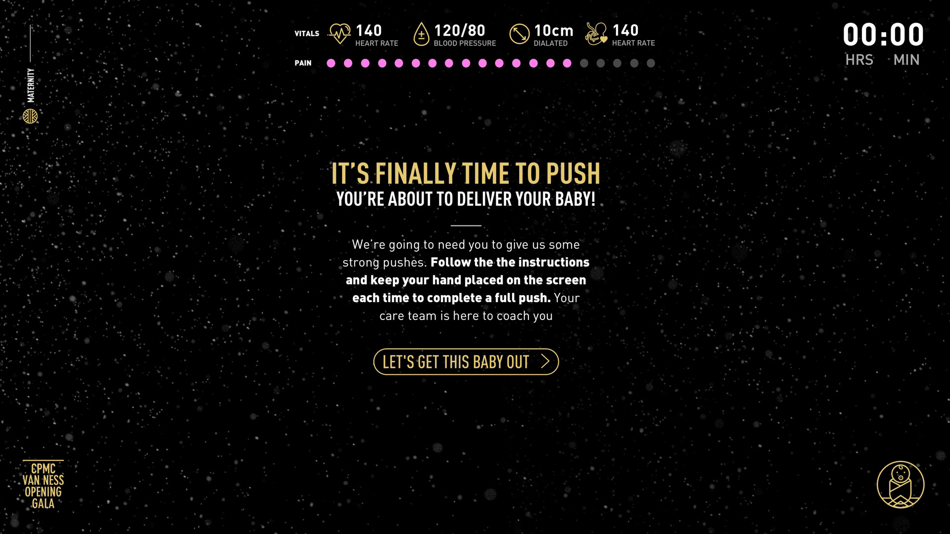
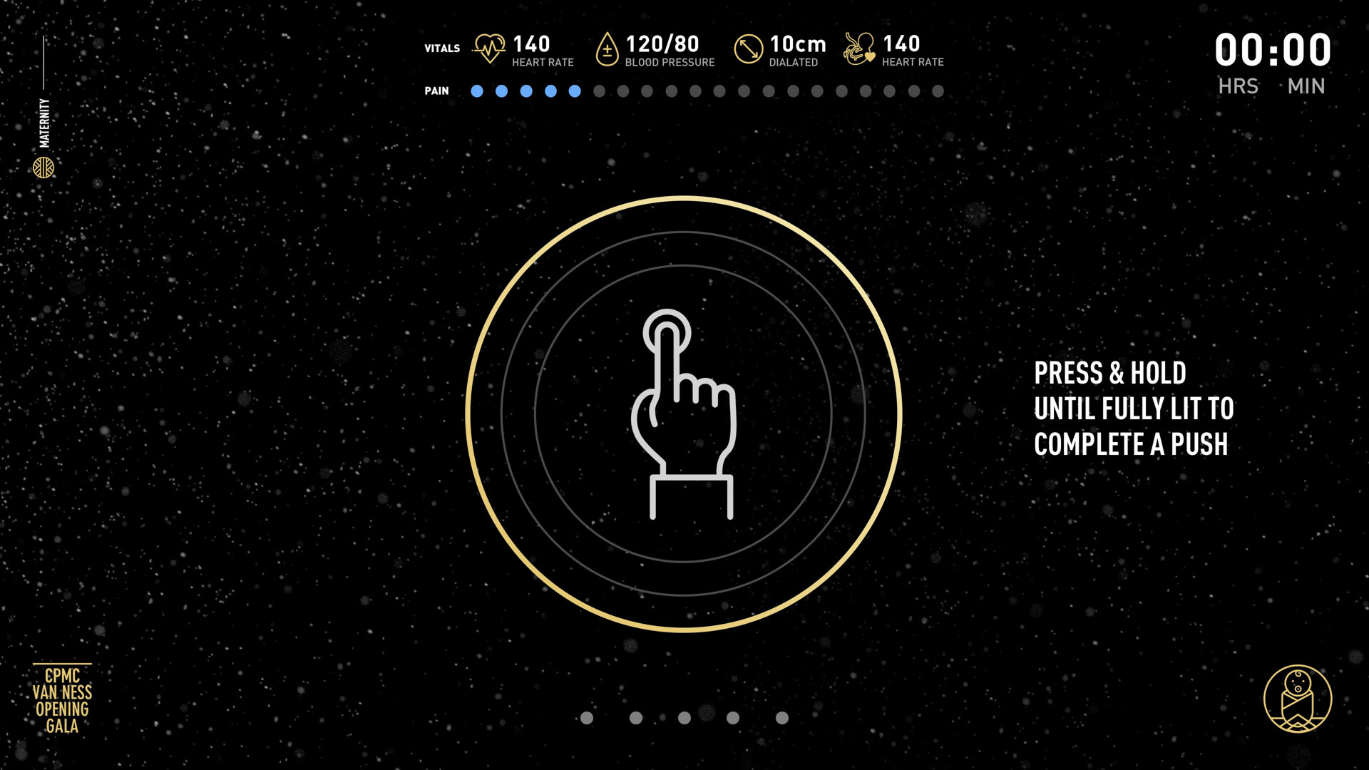
Working closely with Sutter’s labor and delivery physicians, we created a two-screen game experience simulating the childbirth experience for guests on the Maternity journey. While participants made choices on the lower screen about their birthing process, videos corresponding to specific interactions played on the upper screen. When guests reached the pushing phase of the game, we devised an interaction where they had to press and hold the screen to complete five pushes. Randomization was built into the experience to include complications and even surprise twins! My role encompassed the overall creative direction, research, user journey development, design concept development, interactive design, and video asset acquisition.
Surgery
Journey.
Surgery Check-In
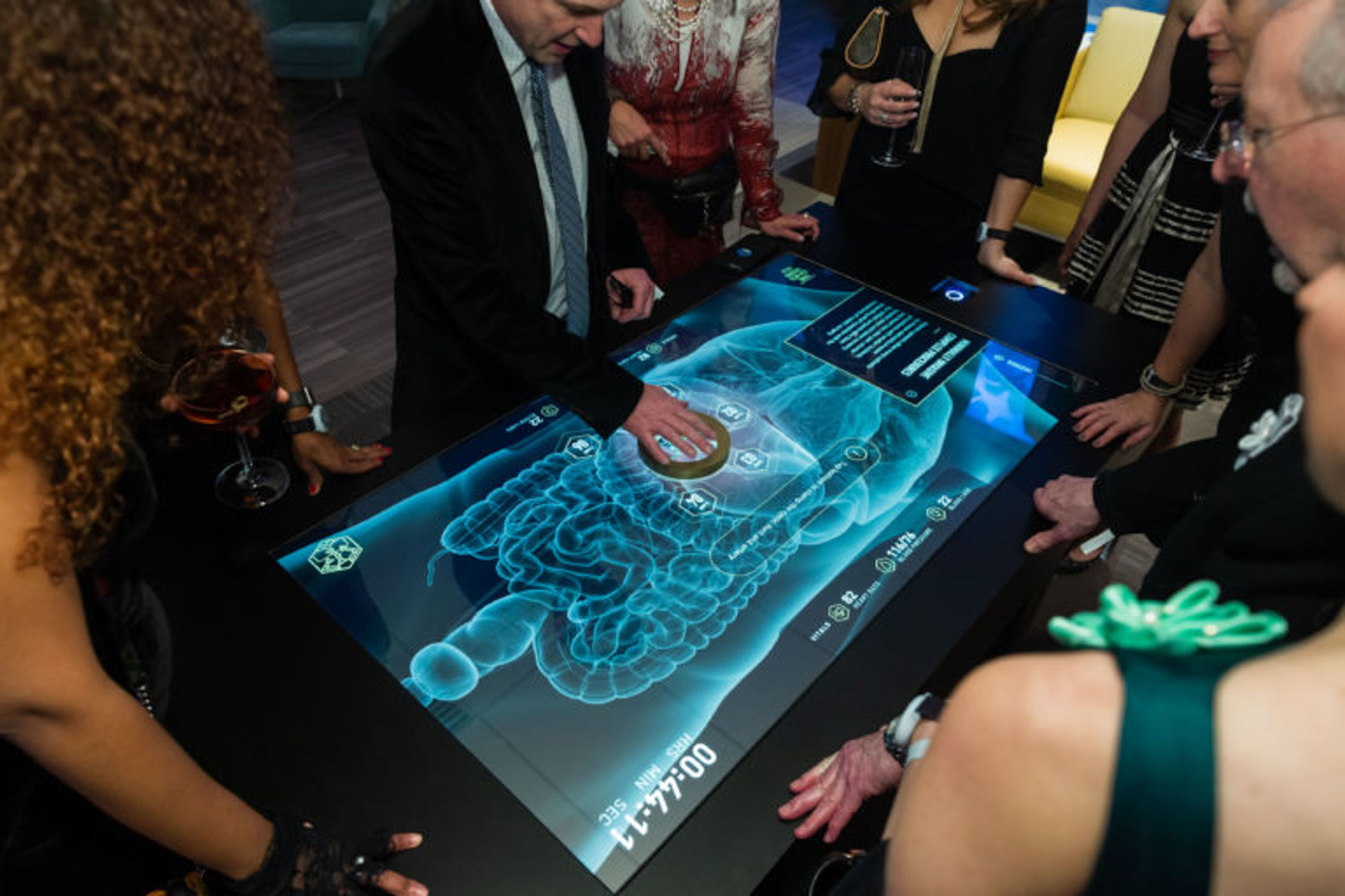
The user journey we designed for guests on the Surgery Journey was created with the close collaboration of Sutter’s incredible physicians. At check-in, a guest chose which surgery they were there to perform: Gallbladder Removal, Kidney Tumor Removal, or a Hysterectomy. These selections were stored in a user’s profile and as the guest moved through the surgery department—their procedure followed them at each installation, taking them through a simulated physician experience based on their chosen surgery.
Surgery Check Out
The narrative continued on a separate surgery journey checkout wayfinding screen where guests received their surgery summary for the procedure they performed. In addition to a live interactive treatment report, guests also received a duplicate version at their personal email—creating and end to end experience for attendees.
Robotic Surgery Game
Working closely with Sutter’s Robotic Surgery Committee, we conceived of a first-person robotic surgery game experience that put guests in the shoes of surgeons. This experience within the Surgery Journey was where guests learned about the groundbreaking robotic surgery procedures being pioneered by Sutter’s physicians to perform: Gallbladder Removals, Kidney Tumor Removals, and Hysterectomies. This experience required a significant amount of scientific research and collaboration in order to break down these incredibly complex procedures into an engaging interactive game that demystified the use of robotic surgery. Our goal from the start was to teach guests and respect the surgeon’s work, but what we wound up creating was an incredible teaching tool for the everyday public that reduced the inhernet fears of robotic surgery. The game was the most high-trafficked installation at the event with over 300 individual users taking a hand at robotic surgery over a 4-hour period. My role encompassed research, user journey development, design concept development, visual design, 3D fabrication design direction, and management of a 3D designer.
VIP
Experience.
VIP Check-In
The VIP experience was reserved for Sutter’s most generous donors in attendance, with this wayfinding screen acting as a digital menu for everything these guests could enjoy throughout the hospital. The theme for this journey was fog, representing the moment when the San Francisco fog lifts away revealing the healing energy of the sun.
